


This practical article is about the TabBar, TabBarView, and TabPageSelector widgets in Flutter. We’ll have a glance at the fundamentals of those things and then examine a concrete example that demonstrates how they work together in action.
Table of Contents
Overview
A tab view presents multiple panes (pages) of content in the same area, which your users can switch between by swiping right/left or using a tab bar. The number of children in the tab view is equal to the number of tabs in the corresponding tab bar. More specifically, each child in the tab view corresponds to a tab in the tab bar.
TabBarView constructor:
TabBarView({
  Key? key,
  required List<Widget> children,
  TabController? controller,
  ScrollPhysics? physics,
  DragStartBehavior dragStartBehavior = DragStartBehavior.start,
  double viewportFraction = 1.0,
  Clip clipBehavior = Clip.hardEdge
})
TabBar constructor:
TabBar({
  Key? key,
  required List<Widget> tabs,
  TabController? controller,
  bool isScrollable = false,
  EdgeInsetsGeometry? padding,
  Color? indicatorColor,
  bool automaticIndicatorColorAdjustment = true,
  double indicatorWeight = 2.0,
  EdgeInsetsGeometry indicatorPadding = EdgeInsets.zero,
  Decoration? indicator,
  TabBarIndicatorSize? indicatorSize,
  Color? dividerColor,
  Color? labelColor,
  TextStyle? labelStyle,
  EdgeInsetsGeometry? labelPadding,
  Color? unselectedLabelColor,
  TextStyle? unselectedLabelStyle,
  DragStartBehavior dragStartBehavior = DragStartBehavior.start,
  MaterialStateProperty<Color?>? overlayColor,
  MouseCursor? mouseCursor,
  bool? enableFeedback,
  ValueChanged<int>? onTap,
  ScrollPhysics? physics,
  InteractiveInkFeatureFactory? splashFactory,
  BorderRadius? splashBorderRadius,
  TabAlignment? tabAlignment
})
The TabPageSelector widget is used to display a row of small circular indicators, one per tab. The selected tab’s indicator will have a different appearance from the others. TabBar, TabBarView, and TabPageSelector can be wired up with a controller, which can be declared and initialized like so:
// Declare the tab controller
TabController? _tabController;

// The list of children of the TabView
final _tabViewChildren = [/* a list of widget here */];

// initialize the tab controller
@override
  void initState() {
    _tabController =
        TabController(length: _tabViewChildren.length, vsync: this);
    super.initState();
}
Words and small pieces of code might be confusing and ambiguous. For more clarity, see the full example below.
The Complete Example
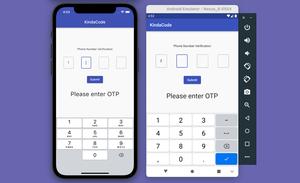
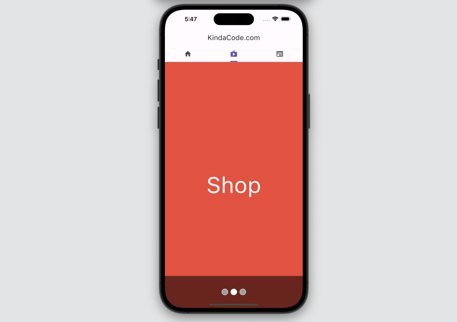
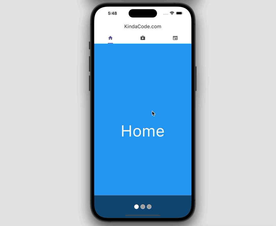
App Preview
The tiny demo we’re going to make has a tab bar right at the bottom of the app bar. It consists of 3 tabs: Home, Shop, and News. When you tap each tab, the page associated with it will come to light. In addition, we have a row of dots at the bottom of the screen that indicates the currently selected tab. Here’s how it works:
The Code
The full source code in main.dart with explanations in the comments:
// main.dart
import 'package:flutter/material.dart';

void main() {
  runApp(const MyApp());
}

class MyApp extends StatelessWidget {
  const MyApp({Key? key}) : super(key: key);

  @override
  Widget build(BuildContext context) {
    return MaterialApp(
      // Remove the debug banner
      debugShowCheckedModeBanner: false,
      title: 'KindaCode.com',
      theme: ThemeData(useMaterial3: true),
      home: const KindaCodeDemo(),
    );
  }
}

class KindaCodeDemo extends StatefulWidget {
  const KindaCodeDemo({Key? key}) : super(key: key);

  @override
  State<KindaCodeDemo> createState() => _KindaCodeDemoState();
}

// Don't forget TickerProviderStateMixin
// because we will use "vsync: this" later
class _KindaCodeDemoState extends State<KindaCodeDemo>
    with TickerProviderStateMixin {
  // Declare the tab controller
  TabController? _tabController;

  // the children of the TabView
  final _tabViewChildren = [
    Container(
      color: Colors.blue,
      child: const Center(
        child: Text(
          'Home',
          style: TextStyle(color: Colors.white, fontSize: 70),
        ),
      ),
    ),
    Container(
      color: Colors.red,
      child: const Center(
        child: Text(
          'Shop',
          style: TextStyle(color: Colors.white, fontSize: 70),
        ),
      ),
    ),
    Container(
      color: Colors.green,
      child: const Center(
        child: Text(
          'News',
          style: TextStyle(color: Colors.white, fontSize: 70),
        ),
      ),
    )
  ];

  // initialize the tab controller
  @override
  void initState() {
    _tabController =
        TabController(length: _tabViewChildren.length, vsync: this);
    super.initState();
  }

  @override
  Widget build(BuildContext context) {
    return Scaffold(
      appBar: AppBar(
        title: const Text('KindaCode.com'),
        centerTitle: true,
        // implement the tab bar
        bottom: TabBar(
          controller: _tabController,
          tabs: const [
            Tab(
              icon: Icon(Icons.home),
            ),
            Tab(
              icon: Icon(Icons.shop),
            ),
            Tab(
              icon: Icon(Icons.newspaper),
            ),
          ],
        ),
      ),
      body: Stack(
        children: [
          // implement the tab view
          TabBarView(
            controller: _tabController,
            children: _tabViewChildren,
          ),
          // implement the dots indicator
          Positioned(
            bottom: 0,
            left: 0,
            right: 0,
            height: 100,
            child: Container(
              height: 100,
              color: Colors.black54,
              alignment: Alignment.center,
              child: TabPageSelector(
                controller: _tabController,
                indicatorSize: 20,
                selectedColor: Colors.white,
                color: Colors.grey,
              ),
            ),
          ),
        ],
      ),
    );
  }
}
Epilogue
You’ve learned about the TabBar, TabBarView, and TabPageSelector widgets. Using them in conjunction will help you build more meaningful and powerful interfaces as well as give your users a better experience.
Flutter is amazing and its realm is so broad. Continue exploring more new stuff and consolidating your skills by taking a look at the following articles:
- Flutter: PageView examples
- Flutter: Creating a Fullscreen Modal with Search Form
- Adding a Border to an Image in Flutter (3 Examples)
- Flutter + Firebase Storage: Upload, Retrieve, and Delete files
- Flutter StatefulBuilder example
- Flutter StreamBuilder examples (null safety)
You can also tour around our Flutter topic page or Dart topic page for the most recent tutorials and examples.


