
Most mobile and web applications have buttons that allow users to press to interact. In Flutter, you can use the ElevatedButton widget to create elevated buttons.
ElevatedButton is the replacement for RaisedButton, which is now obsolete (and unusable in recent versions of Flutter).
Note: To use ElevatedButton without warnings or errors, you should update to Flutter 1.22.0 or a higher version. The simplest way to do that is to run this command: flutter upgrade. The code snippets in this article were recently updated to work properly with the latest version of Flutter (3.3.10+).
This tutorial will guide you through implementing elevated buttons as well as styling and customizing them. At the very end of this article, we create some elevated buttons with the Material 3 look and feel.
What is an ElevatedButton in Flutter?
An elevated button is a labeled child displayed on a Material widget whose Material.elevation increases when the button is pressed. The label’s Text and Icon widgets are displayed in style’s ButtonStyle.foregroundColor, and the button’s filled background is the ButtonStyle.backgroundColor.
Constructors
ElevatedButton:
ElevatedButton({
  Key? key,
  required VoidCallback? onPressed,
  VoidCallback? onLongPress,
  ValueChanged<bool>? onHover,
  ValueChanged<bool>? onFocusChange,
  ButtonStyle? style,
  FocusNode? focusNode,
  bool autofocus = false,
  Clip clipBehavior = Clip.none,
  MaterialStatesController? statesController,
  required Widget? child
})
ElevatedButton with icon:
ElevatedButton.icon({
Key? key,
required VoidCallback? onPressed,
VoidCallback? onLongPress,
ValueChanged<bool>? onHover,
ValueChanged<bool>? onFocusChange,
ButtonStyle? style,
FocusNode? focusNode,
bool? autofocus,
Clip? clipBehavior,
required Widget icon,
required Widget label
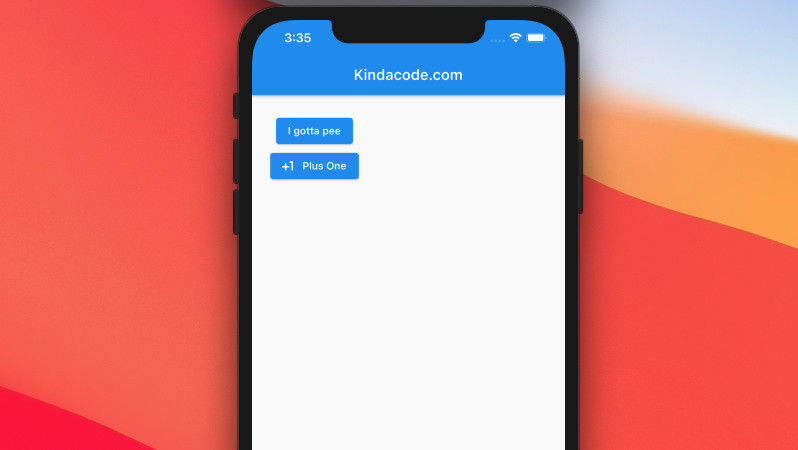
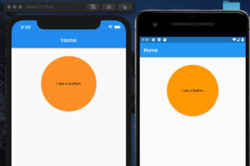
})Basic example:
class MyHomePage extends StatelessWidget {
const MyHomePage({Key? key}) : super(key: key);
@override
Widget build(BuildContext context) {
return Scaffold(
appBar: AppBar(
title: const Text('Kindacode.com'),
),
body: Padding(
padding: const EdgeInsets.all(25),
child: Column(children: [
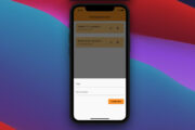
ElevatedButton(onPressed: () {}, child: const Text('I gotta pee')),
ElevatedButton.icon(
onPressed: () {},
label: const Text('Plus One'),
icon: const Icon(Icons.plus_one),
)
]),
));
}
}Output:
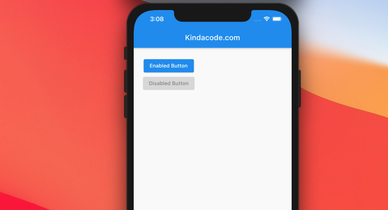
Enable/Disable
To disable an ElevatedButton, just set the onPressed parameter to null. To enable an ElevatedButton, set the onPressed parameter to a void function.
Example:
class MyHomePage extends StatelessWidget {
const MyHomePage({Key? key}) : super(key: key);
@override
Widget build(BuildContext context) {
return Scaffold(
appBar: AppBar(
title: const Text('Kindacode.com'),
),
body: Padding(
padding: const EdgeInsets.all(25),
child: Column(
children: [
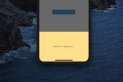
// An enabled button
ElevatedButton(
child: const Text('Enabled Button'),
onPressed: () {},
),
// A disabled button
const ElevatedButton(
onPressed: null, child: Text('Disabled Button'))
],
),
),
);
}
}Output:
Style (Color, Border, Elevation…)
You can style ElevatedButton by using the styleFrom static method or the ButtonStyle class. The first approach is more convenient than the second one.
Using styleFrom to style an ElevatedButton:
styleFrom({
Color? foregroundColor,
Color? backgroundColor,
Color? disabledForegroundColor,
Color? disabledBackgroundColor,
Color? shadowColor,
Color? surfaceTintColor,
double? elevation,
TextStyle? textStyle,
EdgeInsetsGeometry? padding,
Size? minimumSize,
Size? fixedSize,
Size? maximumSize,
BorderSide? side,
OutlinedBorder? shape,
MouseCursor? enabledMouseCursor,
MouseCursor? disabledMouseCursor,
VisualDensity? visualDensity,
MaterialTapTargetSize? tapTargetSize,
Duration? animationDuration,
bool? enableFeedback,
AlignmentGeometry? alignment,
InteractiveInkFeatureFactory? splashFactory,
Color? primary,
Color? onPrimary,
Color? onSurface
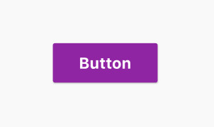
}) This example creates an elevated button whose background color is purple:
ElevatedButton(
            onPressed: () {},
            style: ElevatedButton.styleFrom(
                backgroundColor: Colors.purple,
                padding:
                    const EdgeInsets.symmetric(horizontal: 50, vertical: 20),
                textStyle:
                    const TextStyle(fontSize: 30, fontWeight: FontWeight.bold)),
            child: const Text('Button'),
),
Output:
Using ButtonStyle to style an ElevatedButton:
ButtonStyle({
MaterialStateProperty<TextStyle?>? textStyle,
MaterialStateProperty<Color?>? backgroundColor,
MaterialStateProperty<Color?>? foregroundColor,
MaterialStateProperty<Color?>? overlayColor,
MaterialStateProperty<Color?>? shadowColor,
MaterialStateProperty<Color?>? surfaceTintColor,
MaterialStateProperty<double?>? elevation,
MaterialStateProperty<EdgeInsetsGeometry?>? padding,
MaterialStateProperty<Size?>? minimumSize,
MaterialStateProperty<Size?>? fixedSize,
MaterialStateProperty<Size?>? maximumSize,
MaterialStateProperty<Color?>? iconColor,
MaterialStateProperty<double?>? iconSize,
MaterialStateProperty<BorderSide?>? side,
MaterialStateProperty<OutlinedBorder?>? shape,
MaterialStateProperty<MouseCursor?>? mouseCursor,
VisualDensity? visualDensity,
MaterialTapTargetSize? tapTargetSize,
Duration? animationDuration,
bool? enableFeedback,
AlignmentGeometry? alignment,
InteractiveInkFeatureFactory? splashFactory
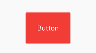
})This example creates a red background elevated button with padding of 50:
ElevatedButton(
            onPressed: () {},
            style: ButtonStyle(
                backgroundColor: MaterialStateProperty.all(Colors.red),
                padding: MaterialStateProperty.all(const EdgeInsets.all(50)),
                textStyle:
                    MaterialStateProperty.all(const TextStyle(fontSize: 30))),
            child: const Text('Button'),
),
Output:
Width & Height
There are several ways to size an elevated button.
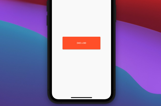
1. You can set the width and height for an elevated button precisely as you want by using the fixedSize parameter of the styleFrom static method, like this:
style: ElevatedButton.styleFrom(fixedSize: Size([width], [height])),This code snippet creates an elevated button with a width of 240 and a height of 80:
ElevatedButton(
            onPressed: () {},
            style: ElevatedButton.styleFrom(
                fixedSize: const Size(240, 80), backgroundColor: Colors.deepOrange),
            child: const Text('240 x 80'),
),
Output:
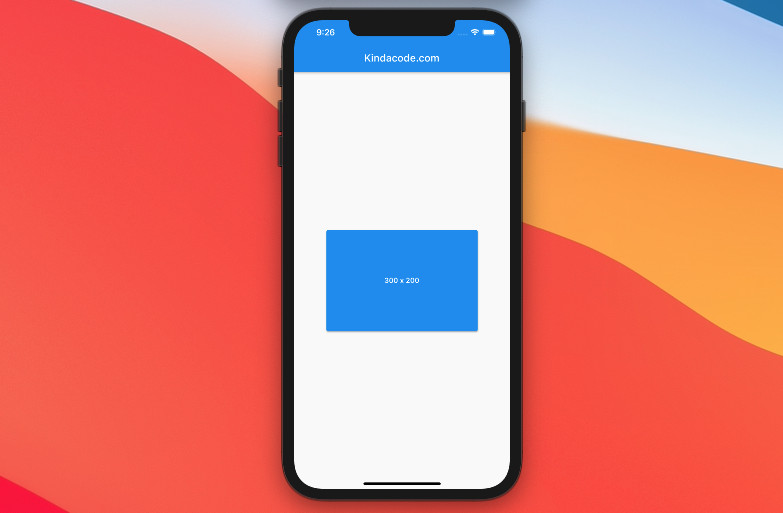
2. You can also set the width and height for an elevated button by wrapping it inside a ConstrainedBox widget.
The following sample code shows you how to make an elevated button with a size of 300 x 200:
Widget build(BuildContext context) {
    return Scaffold(
      appBar: AppBar(
        title: const Text('KindaCode.com'),
      ),
      body: Center(
        child: ConstrainedBox(
          constraints: const BoxConstraints.tightFor(width: 300, height: 200),
          child: ElevatedButton(
            child: const Text('300 x 200'),
            onPressed: () {},
          ),
        ),
      ),
    );
  }
Output:
You can learn more about ConstrainedBox in this article: Flutter ConstrainedBox – Tutorial and Examples.
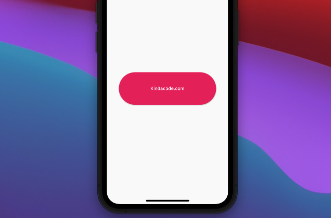
Button Shape
You can customize the shape of an elevated button by using the shape parameter of the styleFrom method.
This example creates an elevated button that looks like a pill:
ElevatedButton(
          onPressed: () {},
          style: ElevatedButton.styleFrom(
              backgroundColor: Colors.pink,
              fixedSize: const Size(300, 100),
              shape: RoundedRectangleBorder(
                  borderRadius: BorderRadius.circular(50))),
          child: const Text('Kindacode.com'),
),
Output:
You can find more details about shaping a button in Flutter by having a glance at the following guides:
ElevatedButton Theme
You can use ElevatedButtonTheme classes to set the look and behavior of descendant elevated buttons. This helps you set the look and behavior of multiple elevated buttons at a time.
Example:
// main.dart
import 'package:flutter/material.dart';

void main() {
  runApp(const MyApp());
}

class MyApp extends StatelessWidget {
  const MyApp({Key? key}) : super(key: key);

  @override
  Widget build(BuildContext context) {
    return MaterialApp(
        // Remove the debug banner
        debugShowCheckedModeBanner: false,
        title: 'Kindacode.com',
        theme: ThemeData(
            primarySwatch: Colors.green,
            elevatedButtonTheme: ElevatedButtonThemeData(
                style: ElevatedButton.styleFrom(
                    backgroundColor: Colors.red,
                    padding: const EdgeInsets.symmetric(
                        vertical: 10, horizontal: 30),
                    textStyle: const TextStyle(
                      fontStyle: FontStyle.italic,
                      fontSize: 24,
                    )))),
        home: const HomePage());
  }
}

class HomePage extends StatelessWidget {
  const HomePage({Key? key}) : super(key: key);

  @override
  Widget build(BuildContext context) {
    return Scaffold(
      appBar: AppBar(
        title: const Text('Kindacode.com'),
      ),
      body: Padding(
        padding: const EdgeInsets.all(20),
        child: Column(
          crossAxisAlignment: CrossAxisAlignment.start,
          children: [
            ElevatedButton(onPressed: () {}, child: const Text('Button 1')),
            const SizedBox(
              height: 30,
            ),
            ElevatedButton.icon(
                onPressed: () {},
                icon: const Icon(Icons.play_arrow),
                label: const Text('Play Video'))
          ],
        ),
      ),
    );
  }
}
Output:
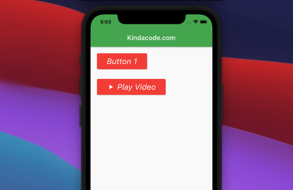
Note that these settings can be overridden if you style each button individually, as we did in the above sections.
ElevatedButton and Material 3
At the time of writing, Flutter uses Material 2 design by default because some widgets are migrated while others have yet to be. You should think twice before enabling Material 3 because the outcome can be inconsistent in look and feel.
To turn on Material 3 in Flutter, just set the useMaterial3 flag in the ThemeData block to true, like this:
MaterialApp(
theme: ThemeData(
useMaterial3: true,
/* other code */
),
/* ...*/
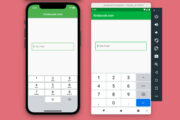
);Once Material 3 is on, a default style elevated button will have a rounded shape and a light background color, and the text color is the theme’s primary color.
Example screenshot:
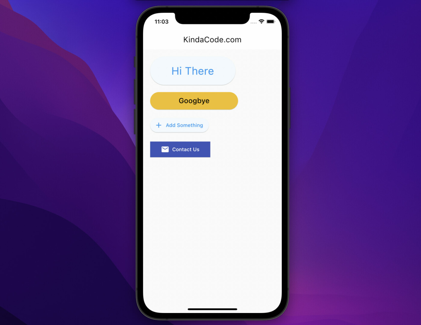
The complete code:
// kindacode.com
// main.dart
import 'package:flutter/material.dart';
void main() {
runApp(const MyApp());
}
class MyApp extends StatelessWidget {
const MyApp({super.key});
// This widget is the root of your application.
@override
Widget build(BuildContext context) {
return MaterialApp(
// hide the debug banner
debugShowCheckedModeBanner: false,
title: 'KindaCode.com',
theme: ThemeData(
useMaterial3: true, // enable Material 3
primarySwatch: Colors.blue,
),
home: const KindaCodeDemo());
}
}
class KindaCodeDemo extends StatelessWidget {
const KindaCodeDemo({super.key});
@override
Widget build(BuildContext context) {
return Scaffold(
appBar: AppBar(title: const Text('KindaCode.com')),
body: Padding(
padding: const EdgeInsets.all(20),
child: Column(
crossAxisAlignment: CrossAxisAlignment.start,
children: [
ElevatedButton(
onPressed: () {},
style: ElevatedButton.styleFrom(
fixedSize: const Size(240, 80),
textStyle: const TextStyle(fontSize: 30)),
child: const Text('Hi There')),
const SizedBox(height: 20),
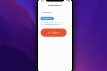
ElevatedButton(
onPressed: () {},
style: ElevatedButton.styleFrom(
backgroundColor: Colors.amber,
padding: const EdgeInsets.symmetric(
vertical: 10, horizontal: 80)),
child: const Text(
'Googbye',
style: TextStyle(fontSize: 20, color: Colors.black),
)),
const SizedBox(height: 20),
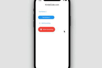
ElevatedButton.icon(
onPressed: () {},
icon: const Icon(Icons.add),
label: const Text('Add Something')),
const SizedBox(height: 20),
ElevatedButton.icon(
onPressed: () {},
style: ElevatedButton.styleFrom(
padding: const EdgeInsets.symmetric(
vertical: 10, horizontal: 30),
backgroundColor: Colors.indigo,
shape: const RoundedRectangleBorder(
borderRadius: BorderRadius.zero)),
icon: const Icon(
Icons.email,
color: Colors.white,
),
label: const Text(
'Contact Us',
style: TextStyle(color: Colors.white),
)),
],
),
),
);
}
}References
- ElevatedButton class (flutter.dev).
- Buttons – Material Design (material.io).
- Material 3 design (material.io).
Afterword
This tutorial went over the basics of working with the ElevatedButton class in Flutter. You also explored several examples of how to implement, style, set background color, change text color, set width and height, etc., for an ElevatedButton.
Continue learning more about Flutter by taking a look at the following tutorials:
- Examples of using ClipRRect in Flutter
- Flutter & SQLite: CRUD Example
- Using GetX (Get) for Navigation and Routing in Flutter
- Flutter and Firestore Database: CRUD example (null safety)
- Flutter StreamBuilder examples (null safety)
- Working with TextButton in Flutter
- Example of sortable DataTable in Flutter
- Write a simple BMI Calculator with Flutter.
You can also check out our Flutter topic page or Dart topic page for the latest tutorials and examples.


This one saves my life. Thanks!
very informative
I’m actually disgusted, what if I need a button height and width to be responsive according to the device….I prefer Raised button honestly
That makes sense
Very Informative and useful. I really like this information.
It’s good
Nice
Really helped. Thanks!!
Perfect article. Thank you.
thanks
Super..
thanks
super
[…] Related: FlutterElevatedButton example […]