

Buttons are an essential component of every Flutter mobile and web application. In this article, we are going to take a look at the TextButton widget. You will learn how to implement text buttons and how to disable them. We will also cover what we can do to style and customize a text button. Without any further ado, let’s dive right in.
New Update: We just added a section about using text buttons and Material 3 together near the end of this article.
What is a TextButton?
A TextButton widget is just a text label displayed on a zero-elevation Material widget. By default, it doesn’t have visible borders and reacts to touches by filling with a background color.
TextButton is the replacement for FlatButton, which used to be a very popular widget but is now obsolete, and you should no longer use it in new projects.
Note: To get rid of annoying warnings or errors with TextButton, you should use Flutter 1.22.0 or newer. The examples in this article were recently updated to work properly with the most recent version of Flutter (3.3.10+).
TextButton Constructors
TextButton
TextButton({
Key? key,
required VoidCallback? onPressed,
VoidCallback? onLongPress,
ValueChanged<bool>? onHover,
ValueChanged<bool>? onFocusChange,
ButtonStyle? style,
FocusNode? focusNode,
bool autofocus = false,
Clip clipBehavior = Clip.none,
MaterialStatesController? statesController,
required Widget child
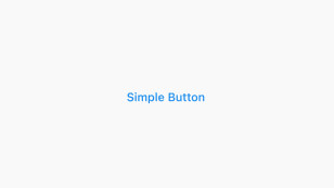
})Example:
TextButton(
    onPressed: () {},
    child: const Text('Simple Button'),
),
Screenshot:
TextButton with icon
TextButton.icon({
Key? key,
required VoidCallback? onPressed,
VoidCallback? onLongPress,
ValueChanged<bool>? onHover,
ValueChanged<bool>? onFocusChange,
ButtonStyle? style,
FocusNode? focusNode,
bool? autofocus,
Clip? clipBehavior,
MaterialStatesController? statesController,
required Widget icon,
required Widget label
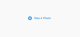
})Example:
TextButton.icon(
    icon: const Icon(Icons.camera),
    label: const Text('Take A Photo'),
    onPressed: () {},
)
Screenshot:
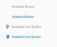
How to disable a TextButton
A disabled button is a button that doesn’t react to touch. To disable a text button, just set onPressed and onLongPress to null (onLongPress is null by default).
Example:
Column(
        children: [
          const TextButton(
            onPressed: null,
            child: Text('Disabled Button'),
          ),
          TextButton(
            onPressed: () {},
            child: const Text('Enabled Button'),
          ),
          TextButton.icon(
              onPressed: null,
              icon: const Icon(Icons.room_rounded),
              label: const Text('Disabled Icon Button')),
          TextButton.icon(
              onPressed: () {},
              icon: const Icon(Icons.room_rounded),
              label: const Text('Enabled Icon Button'))
        ],
),
Screenshot:
How to style a TextButton
You can style a text button by using the TextButton.styleFrom static method or using the ButtonStyle class. The first approach is more convenient and intuitive than the second one.
Using TextButton.styleFrom
All of the available options:
styleFrom({
Color? foregroundColor,
Color? backgroundColor,
Color? disabledForegroundColor,
Color? disabledBackgroundColor,
Color? shadowColor,
Color? surfaceTintColor,
double? elevation,
TextStyle? textStyle,
EdgeInsetsGeometry? padding,
Size? minimumSize,
Size? fixedSize,
Size? maximumSize,
BorderSide? side,
OutlinedBorder? shape,
MouseCursor? enabledMouseCursor,
MouseCursor? disabledMouseCursor,
VisualDensity? visualDensity,
MaterialTapTargetSize? tapTargetSize,
Duration? animationDuration,
bool? enableFeedback,
AlignmentGeometry? alignment,
InteractiveInkFeatureFactory? splashFactory,
Color? primary,
Color? onSurface
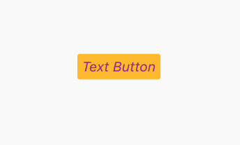
})This example creates an amber background text button with an italic font style:
TextButton(
            onPressed: () {},
            style: TextButton.styleFrom(
                foregroundColor: Colors.purple,
                backgroundColor: Colors.amber,
                textStyle:
                    const TextStyle(fontSize: 24, fontStyle: FontStyle.italic)),
            child: const Text(
              'Text Button',
            ),
),
Screenshot:
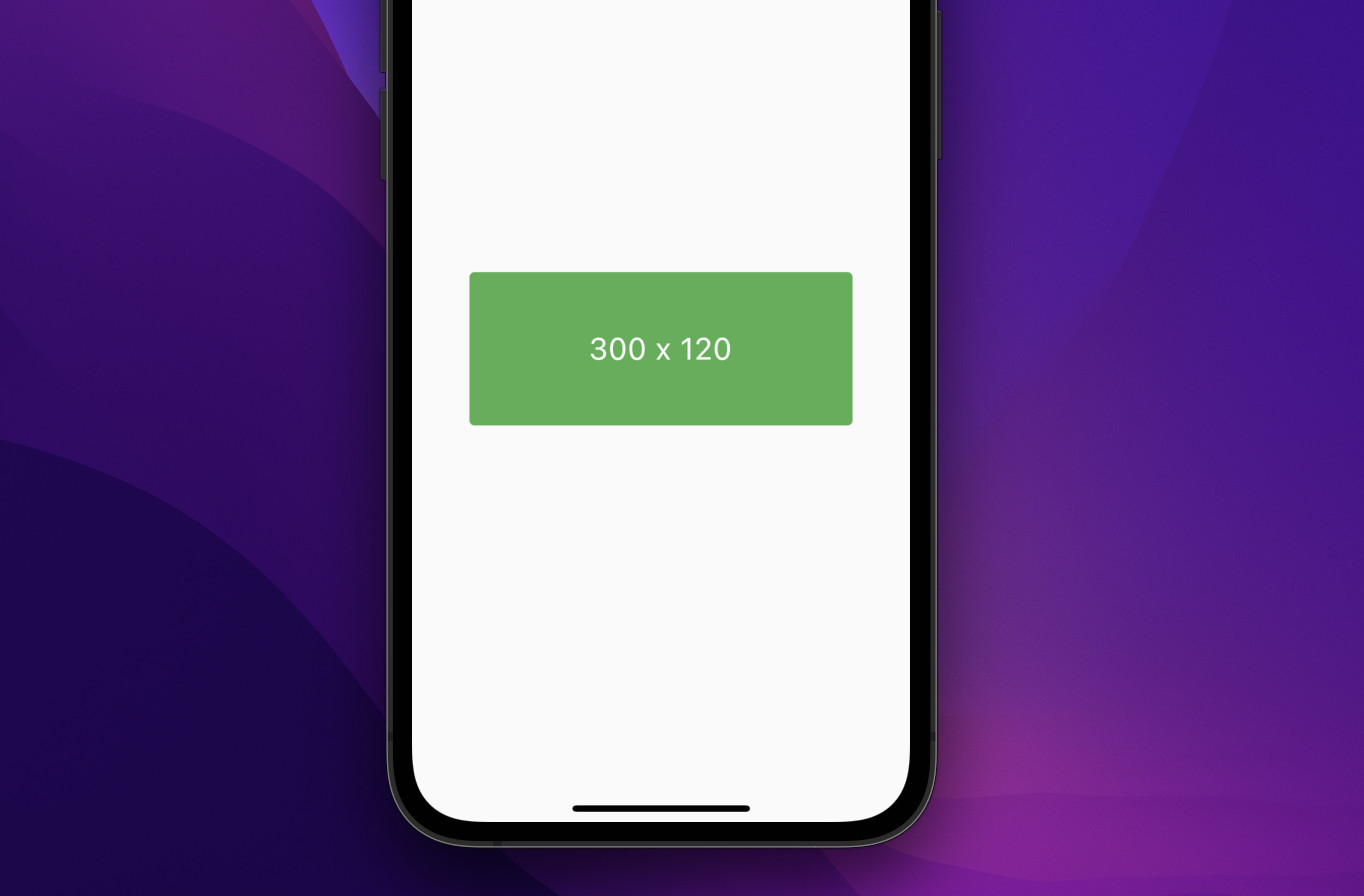
Width & Height
You can size a text button precisely as you want by using the fixedSize parameter like this:
TextButton(
        style: TextButton.styleFrom(
            fixedSize: const Size(300, 120),
            backgroundColor: Colors.green,
            foregroundColor: Colors.white,
            textStyle: const TextStyle(fontSize: 24)),
        onPressed: () {},
        child: const Text('300 x 120'),
)
Screenshot:
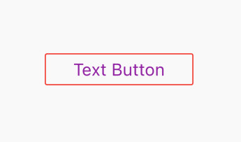
Using ButtonStyle
Parameters:
ButtonStyle({
  MaterialStateProperty<TextStyle?>? textStyle,
  MaterialStateProperty<Color?>? backgroundColor,
  MaterialStateProperty<Color?>? foregroundColor,
  MaterialStateProperty<Color?>? overlayColor,
  MaterialStateProperty<Color?>? shadowColor,
  MaterialStateProperty<Color?>? surfaceTintColor,
  MaterialStateProperty<double?>? elevation,
  MaterialStateProperty<EdgeInsetsGeometry?>? padding,
  MaterialStateProperty<Size?>? minimumSize,
  MaterialStateProperty<Size?>? fixedSize,
  MaterialStateProperty<Size?>? maximumSize,
  MaterialStateProperty<BorderSide?>? side,
  MaterialStateProperty<OutlinedBorder?>? shape,
  MaterialStateProperty<MouseCursor?>? mouseCursor,
  VisualDensity? visualDensity,
  MaterialTapTargetSize? tapTargetSize,
  Duration? animationDuration,
  bool? enableFeedback,
  AlignmentGeometry? alignment,
  InteractiveInkFeatureFactory? splashFactory
})
This quick example creates a text button with a red border and some padding:
TextButton(
              onPressed: () {},
              style: ButtonStyle(
                  side: MaterialStateProperty.all(
                      const BorderSide(width: 2, color: Colors.red)),
                  foregroundColor: MaterialStateProperty.all(Colors.purple),
                  padding: MaterialStateProperty.all(
                      const EdgeInsets.symmetric(vertical: 10, horizontal: 50)),
                  textStyle:
                      MaterialStateProperty.all(const TextStyle(fontSize: 30))),
              child: const Text(
                'Text Button',
)),
Screenshot:
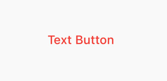
Styling The Child
If you only want to style the text, you can simply do like this:
TextButton(
            onPressed: () {},
            child: const Text(
              'Text Button',
              style: TextStyle(fontSize: 30, color: Colors.red),
            ),
),
Screenshot:
TextButton Theming
Using a theme allows you to style multiple text buttons at once and create a uniform look and feel for text buttons throughout your app.
Example:
// main.dart
import 'package:flutter/material.dart';
void main() {
runApp(const MyApp());
}
class MyApp extends StatelessWidget {
const MyApp({Key? key}) : super(key: key);
@override
Widget build(BuildContext context) {
return MaterialApp(
// Remove the debug banner
debugShowCheckedModeBanner: false,
title: 'Kindacode.com',
theme: ThemeData(
primarySwatch: Colors.indigo,
textButtonTheme: TextButtonThemeData(
style: TextButton.styleFrom(
primary: Colors.red,
textStyle: const TextStyle(
fontSize: 24,
fontWeight: FontWeight.bold,
fontStyle: FontStyle.italic)))),
home: const HomePage());
}
}
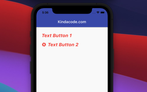
class HomePage extends StatelessWidget {
const HomePage({Key? key}) : super(key: key);
@override
Widget build(BuildContext context) {
return Scaffold(
appBar: AppBar(
title: const Text('Kindacode.com'),
),
body: Padding(
padding: const EdgeInsets.all(20),
child: Column(
crossAxisAlignment: CrossAxisAlignment.start,
children: [
TextButton(onPressed: () {}, child: const Text('Text Button 1')),
TextButton.icon(
onPressed: () {},
icon: const Icon(Icons.camera),
label: const Text('Text Button 2'))
],
),
),
);
}
}
Output:
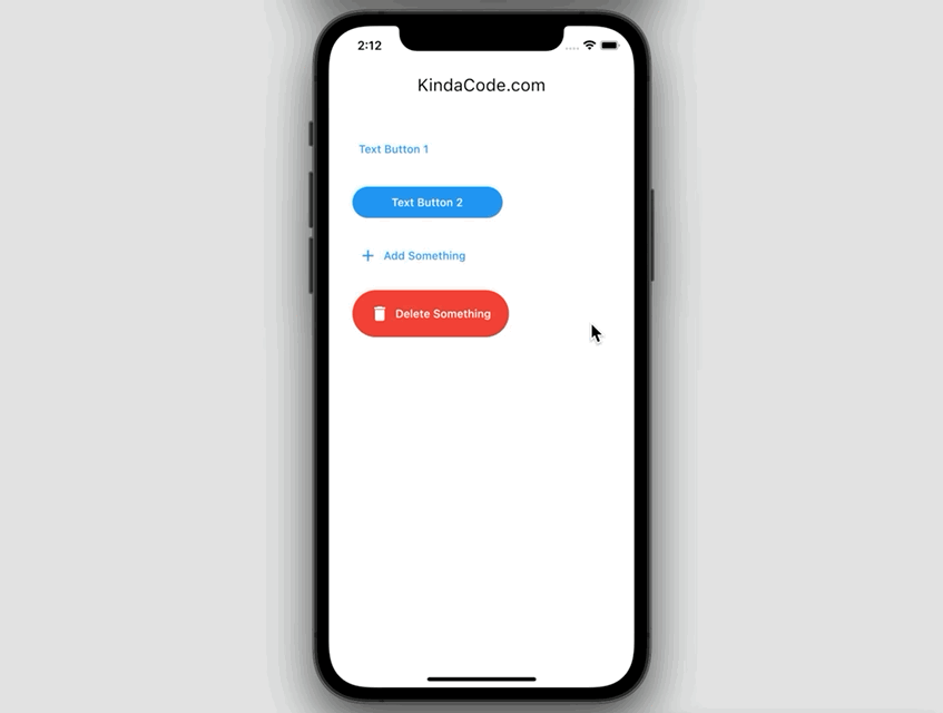
TextButton and Material 3
Material 3 brings new colors, typography, and other features of Material 3 design to your app. At the time of writing, Flutter uses Material 2 design by default because Material 3 specification isn’t complete, and not all widgets are migrated on stable.
To enable Material 3 in your app, just set the useMaterial3 property of the ThemeData class to true, like this:
MaterialApp(
        // hide the debug banner
        debugShowCheckedModeBanner: false,
        title: 'KindaCode.com',
        theme: ThemeData(
          useMaterial3: true, // enable Material 3
          primarySwatch: Colors.blue,
        ),
        home: const KindaCodeDemo()
);
With this setup, a text button will react to touch with a rounded background splash. Let’s see the complete example below to gain a better understanding:
The full code:
// kindacode.com
// main.dart
import 'package:flutter/material.dart';

void main() {
  runApp(const MyApp());
}

class MyApp extends StatelessWidget {
  const MyApp({super.key});

  // This widget is the root of your application.
  @override
  Widget build(BuildContext context) {
    return MaterialApp(
        // hide the debug banner
        debugShowCheckedModeBanner: false,
        title: 'KindaCode.com',
        theme: ThemeData(
          useMaterial3: true, // enable Material 3
          primarySwatch: Colors.blue,
        ),
        home: const KindaCodeDemo());
  }
}

class KindaCodeDemo extends StatelessWidget {
  const KindaCodeDemo({super.key});
  @override
  Widget build(BuildContext context) {
    return Scaffold(
      appBar: AppBar(title: const Text('KindaCode.com')),
      body: Padding(
        padding: const EdgeInsets.all(30),
        child: Column(
          crossAxisAlignment: CrossAxisAlignment.start,
          children: [
            // Text button 1
            TextButton(onPressed: () {}, child: const Text('Text Button 1')),
            const SizedBox(height: 20),
            // Text button 2
            TextButton(
                onPressed: () {},
                style: TextButton.styleFrom(
                    padding: const EdgeInsets.symmetric(
                        vertical: 10, horizontal: 50),
                    foregroundColor: Colors.white,
                    backgroundColor: Colors.blue,
                    shape: const StadiumBorder()),
                child: const Text('Text Button 2')),
            const SizedBox(height: 20),
            // Text button with icon
            TextButton.icon(
                onPressed: () {},
                icon: const Icon(Icons.add),
                label: const Text('Add Something')),
            const SizedBox(height: 20),
            // Text button with icon & background color
            TextButton.icon(
                onPressed: () {},
                style: TextButton.styleFrom(
                    fixedSize: const Size(200, 60),
                    foregroundColor: Colors.white,
                    backgroundColor: Colors.red,
                    shape: const StadiumBorder()),
                icon: const Icon(Icons.delete),
                label: const Text('Delete Something'))
          ],
        ),
      ),
    );
  }
}
One More Example
The code in ./lib/main.dart:
import 'package:flutter/material.dart';
void main() {
runApp(const MyApp());
}
class MyApp extends StatelessWidget {
const MyApp({Key? key}) : super(key: key);
@override
Widget build(BuildContext context) {
return const MaterialApp(
// Hide the debug banner
debugShowCheckedModeBanner: false,
title: 'Kindacode.com',
home: MyHomePage(),
);
}
}
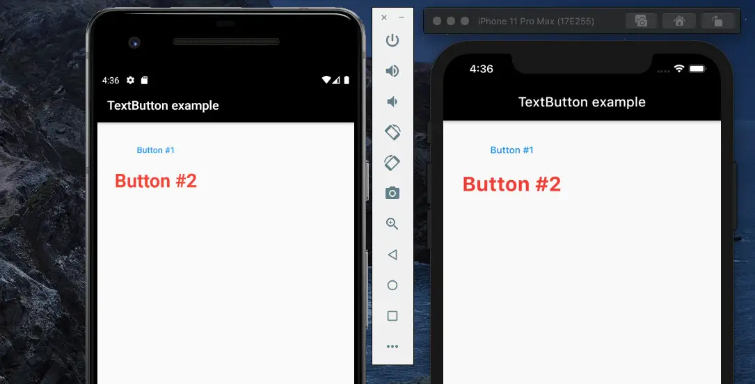
class MyHomePage extends StatelessWidget {
const MyHomePage({Key? key}) : super(key: key);
@override
Widget build(BuildContext context) {
return Scaffold(
appBar: AppBar(
title: const Text('TextButton example'),
backgroundColor: Colors.black,
),
body: Padding(
padding: const EdgeInsets.all(20),
child: Column(children: [
/// Text Button #1
TextButton(
child: const Text(
'Button #1',
),
onPressed: () {
debugPrint('Button #1 is clicked!');
}),
/// Text Button #2
TextButton(
child: const Text('Button #2',
style: TextStyle(
color: Colors.red,
fontSize: 30,
fontWeight: FontWeight.bold)),
onPressed: () {
debugPrint('Button #2 is clicked');
},
onLongPress: () {
debugPrint('Button #2 is long clicked!');
},
)
]),
),
);
}
}The results on Android and iOS:
References
- TextButton class (flutter.dev)
- Buttons – Material Design (material.io)
- Material Design 3 (material.io)
Afterword
This article went through the most important aspects of using text buttons in Flutter. You should avoid using text buttons where they would blend in with other content because they look like a link. If you’d like to learn more about Flutter, also read the following articles:
- Working with ElevatedButton in Flutter
- Flutter & Hive Database: CRUD Example
- Using Provider for State Management in Flutter
- How to make Circular Buttons in Flutter
- Flutter: 2 Ways to Create Gradient Background Buttons
- How to use OutlinedButton in Flutter
- Implementing Pull-To-Refresh in Flutter
- How to fetch data from APIs in Flutter
You can also check out our Flutter topic page or Dart topic page for the latest tutorials and examples.