


This short article walks you through a few examples of customizing the borders of a TextField (or TextFormField) widget in Flutter. Without any further ado, let’s get started.
Example 1: TextField enabledBorder and focusedBorder
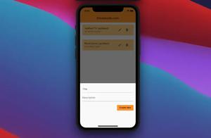
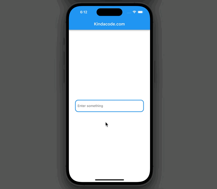
This sample app contains a text field in the center of the screen. The text field’s borders are blue when non-focused and red when focused.
Preview
The full code:
// main.dart
import 'package:flutter/material.dart';

void main() {
  runApp(const MyApp());
}

class MyApp extends StatelessWidget {
  const MyApp({Key? key}) : super(key: key);

  @override
  Widget build(BuildContext context) {
    return const MaterialApp(
      // Hide the debug banner
      debugShowCheckedModeBanner: false,
      title: 'Kindacode.com',
      home: HomePage(),
    );
  }
}

class HomePage extends StatefulWidget {
  const HomePage({Key? key}) : super(key: key);

  @override
  State<HomePage> createState() => _HomePageState();
}

class _HomePageState extends State<HomePage> {
  @override
  Widget build(BuildContext context) {
    return Scaffold(
      appBar: AppBar(
        title: const Text('Kindacode.com'),
      ),
      body: Padding(
        padding: const EdgeInsets.all(30.0),
        child: Center(
          child: TextField(
            decoration: InputDecoration(
                labelText: 'Enter something',
                // Set border for enabled state (default)
                enabledBorder: OutlineInputBorder(
                  borderSide: const BorderSide(width: 3, color: Colors.blue),
                  borderRadius: BorderRadius.circular(15),
                ),
                // Set border for focused state
                focusedBorder: OutlineInputBorder(
                  borderSide: const BorderSide(width: 3, color: Colors.red),
                  borderRadius: BorderRadius.circular(15),
                )),
          ),
        ),
      ),
    );
  }
}
Example 2: TextFormField errorBorder
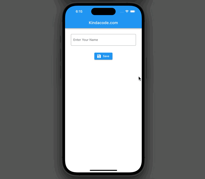
This example app contains a TextFormField that lets the user enter his or her name. An entered name is considered valid if it is 3 characters or more in length. If invalid, error borders with red color will appear.
Preview:
The full code:
// main.dart
import 'package:flutter/foundation.dart';
import 'package:flutter/material.dart';

void main() {
  runApp(const MyApp());
}

class MyApp extends StatelessWidget {
  const MyApp({Key? key}) : super(key: key);

  @override
  Widget build(BuildContext context) {
    return const MaterialApp(
      // Hide the debug banner
      debugShowCheckedModeBanner: false,
      title: 'Kindacode.com',
      home: HomePage(),
    );
  }
}

class HomePage extends StatefulWidget {
  const HomePage({Key? key}) : super(key: key);

  @override
  State<HomePage> createState() => _HomePageState();
}

class _HomePageState extends State<HomePage> {
  final GlobalKey<FormState> _formKey = GlobalKey();

  // This function is triggered when the "Save" button is pressed
  void _saveForm() {
    final bool isValid = _formKey.currentState!.validate();
    if (isValid) {
      if (kDebugMode) {
        print('Got a valid input');
      }
      // And do something here
    }
  }

  @override
  Widget build(BuildContext context) {
    return Scaffold(
      appBar: AppBar(
        title: const Text('Kindacode.com'),
      ),
      body: Padding(
        padding: const EdgeInsets.all(30.0),
        child: Form(
          key: _formKey,
          child: Column(
            children: [
              TextFormField(
                validator: (value) {
                  if (value != null && value.trim().length < 3) {
                    return 'This field requires a minimum of 3 characters';
                  }

                  return null;
                },
                decoration: const InputDecoration(
                    labelText: 'Enter Your Name',

                    // This is the normal border
                    border: OutlineInputBorder(),

                    // This is the error border
                    errorBorder: OutlineInputBorder(
                        borderSide: BorderSide(color: Colors.red, width: 5))),
              ),
              const SizedBox(
                height: 30,
              ),
              ElevatedButton.icon(
                  onPressed: _saveForm,
                  icon: const Icon(Icons.save),
                  label: const Text('Save'))
            ],
          ),
        ),
      ),
    );
  }
}
Example 3: Non-border TextField
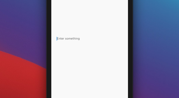
This example creates a text field with neither borders nor an underline.
The code:
TextField(
    decoration: InputDecoration(
               hintText: 'Enter something',
               border: InputBorder.none
   )
),
Screenshot:
Conclusion
We’ve gone over some examples of customizing the borders of a TextField. At this point, you should get a better understanding and become more comfortable when working with that stuff. Continue learning about Flutter by having a look at the following articles:
- Flutter TextField: Styling labelText, hintText, and errorText
- How to set width, height, and padding of TextField in Flutter
- Flutter: Show/Hide Password in TextField/TextFormField
- Flutter Cupertino Button – Tutorial and Examples
- Flutter and Firestore Database: CRUD example
- Flutter SliverAppBar Example (with Explanations)
You can also check out our Flutter topic page or Dart topic page for the latest tutorials and examples.


