

An OutlinedButton in Flutter is a labeled child displayed on a (zero elevation) Material widget that can react to touches by filling with a background color.
OutlinedButton is the replacement for OutlineButton, which is now depreciated (and causes errors in new code bases).
Note: In order to use OutlinedButton without warnings or errors, you should upgrade Flutter to version 1.22.0 or newer. All code snippets you will see in this article were recently updated to work properly with the most recent versions of Flutter (3.3.10+).
In this article, we’ll have a look at OutlinedButton’s constructors, then go over how to style and disable an outlined button and many other things.
New update: We’ve recently added a section about using outlined buttons with Material 3.
Constructors
OutlinedButton:
OutlinedButton({
Key? key,
required VoidCallback? onPressed,
VoidCallback? onLongPress,
ValueChanged<bool>? onHover,
ValueChanged<bool>? onFocusChange,
ButtonStyle? style,
FocusNode? focusNode,
bool autofocus = false,
Clip clipBehavior = Clip.none,
MaterialStatesController? statesController,
required Widget? child
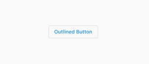
})The simplest example:
OutlinedButton(
    onPressed: () {},
    child: const Text('Outlined Button'),
),
Output:
OutlinedButton.icon
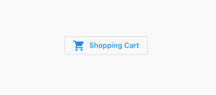
You can use this constructor to implement an outlined button with a pair of an icon and a text label:
OutlinedButton.icon({
  Key? key,
  required VoidCallback? onPressed,
  VoidCallback? onLongPress,
  ButtonStyle? style,
  FocusNode? focusNode,
  bool? autofocus,
  Clip? clipBehavior,
  MaterialStatesController? statesController,
  required Widget icon,
  required Widget label
})
Example:
OutlinedButton.icon(
          onPressed: () {},
          icon: const Icon(Icons.shopping_cart),
          label: const Text('Shopping Cart'),
        ),
Output:
How to style an OutlinedButton
You can style an OutlinedButton by using the OutlinedButton.styleFrom static method or by using the ButtonStyle class.
Using OutlinedButton.styleFrom is much handier:
Parameters:
styleFrom({
Color? foregroundColor,
Color? backgroundColor,
Color? disabledForegroundColor,
Color? disabledBackgroundColor,
Color? shadowColor,
Color? surfaceTintColor,
double? elevation,
TextStyle? textStyle,
EdgeInsetsGeometry? padding,
Size? minimumSize,
Size? fixedSize,
Size? maximumSize,
BorderSide? side,
OutlinedBorder? shape,
MouseCursor? enabledMouseCursor,
MouseCursor? disabledMouseCursor,
VisualDensity? visualDensity,
MaterialTapTargetSize? tapTargetSize,
Duration? animationDuration,
bool? enableFeedback,
AlignmentGeometry? alignment,
InteractiveInkFeatureFactory? splashFactory,
Color? primary, Color? onSurface
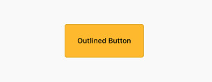
})This example creates an outlined button with an amber background and inner padding of 25 (both vertical and horizontal):
OutlinedButton(
          onPressed: () {},
          style: OutlinedButton.styleFrom(
              foregroundColor: Colors.black,
              backgroundColor: Colors.amber,
              padding: const EdgeInsets.all(25)),
          child: const Text('Outlined Button'),
        ),
Output:
Using the ButtonStyle class
Constructors:
ButtonStyle({
MaterialStateProperty<TextStyle?>? textStyle,
MaterialStateProperty<Color?>? backgroundColor,
MaterialStateProperty<Color?>? foregroundColor,
MaterialStateProperty<Color?>? overlayColor,
MaterialStateProperty<Color?>? shadowColor,
MaterialStateProperty<Color?>? surfaceTintColor,
MaterialStateProperty<double?>? elevation,
MaterialStateProperty<EdgeInsetsGeometry?>? padding,
MaterialStateProperty<Size?>? minimumSize,
MaterialStateProperty<Size?>? fixedSize,
MaterialStateProperty<Size?>? maximumSize,
MaterialStateProperty<BorderSide?>? side,
MaterialStateProperty<OutlinedBorder?>? shape,
MaterialStateProperty<MouseCursor?>? mouseCursor,
VisualDensity? visualDensity,
MaterialTapTargetSize? tapTargetSize,
Duration? animationDuration,
bool? enableFeedback,
AlignmentGeometry? alignment,
InteractiveInkFeatureFactory? splashFactory
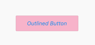
})Example:
OutlinedButton(
          onPressed: () {},
          style: ButtonStyle(
              backgroundColor: MaterialStateProperty.all(Colors.pink[100]),
              padding: MaterialStateProperty.all(
                  const EdgeInsets.symmetric(vertical: 20, horizontal: 50)),
              textStyle: MaterialStateProperty.all(
                  const TextStyle(fontSize: 24, fontStyle: FontStyle.italic))),
          child: const Text('Outlined Button'),
),
Output:
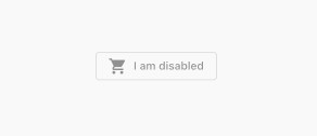
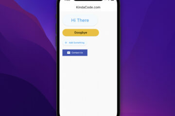
How to disable an OutlinedButton
An OutlinedButton is disabled and will not react to touches when both onPressed and onLongPress are equal to null. onLongPress is null by default so to disable an OutlinedButton, you just need to set onPressed to null.
Example:
 OutlinedButton.icon(
          onPressed: null,
          icon: const Icon(Icons.shopping_cart),
          label: const Text('I am disabled'),
),
Output:
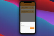
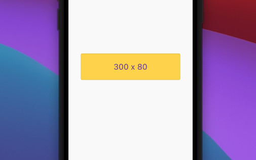
Size (Width & Height)
We can control the size of an outlined button by using the fixedSize parameter of the styleFrom static method.
This example implements an outlined button with a width of 300 and a height of 80:
OutlinedButton(
          onPressed: () {},
          style: OutlinedButton.styleFrom(
              foregroundColor: Colors.deepPurple,
              fixedSize: const Size(300, 80),
              backgroundColor: Colors.amberAccent,
              textStyle: const TextStyle(fontSize: 24)),
          child: const Text('300 x 80'),
),
Screenshot:
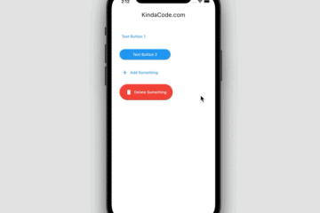
Theme
Using OutlinedButtonTheme helps you set the default looks and behavior of multiple outlined buttons in your app.
Example:
// main.dart
import 'package:flutter/material.dart';
void main() {
runApp(const MyApp());
}
class MyApp extends StatelessWidget {
const MyApp({Key? key}) : super(key: key);
@override
Widget build(BuildContext context) {
return MaterialApp(
// Remove the debug banner
debugShowCheckedModeBanner: false,
title: 'Kindacode.com',
theme: ThemeData(
primarySwatch: Colors.green,
outlinedButtonTheme: OutlinedButtonThemeData(
style: OutlinedButton.styleFrom(
foregroundColor: Colors.red,
backgroundColor: Colors.purple[100],
padding: const EdgeInsets.symmetric(
vertical: 10, horizontal: 30),
textStyle: const TextStyle(
fontSize: 24, fontStyle: FontStyle.italic)))),
home: const HomePage());
}
}
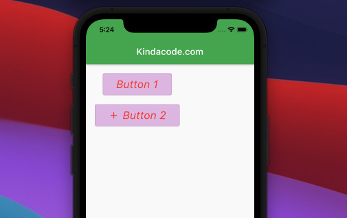
class HomePage extends StatelessWidget {
const HomePage({Key? key}) : super(key: key);
@override
Widget build(BuildContext context) {
return Scaffold(
appBar: AppBar(
title: const Text('Kindacode.com'),
),
body: Padding(
padding: const EdgeInsets.all(20),
child: Column(
children: [
OutlinedButton(onPressed: () {}, child: const Text('Button 1')),
const SizedBox(
height: 20,
),
OutlinedButton.icon(
onPressed: () {},
icon: const Icon(Icons.add),
label: const Text('Button 2'))
],
),
),
);
}
}Output:
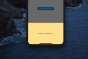
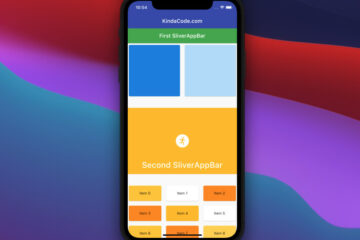
OutlinedButton and Material 3
At the time of writing, Flutter uses Material 2 design by default. The main reason for this is that there are still some widgets that have not been migrated to Material Design 3. However, you can enable Material 3 by setting the useMaterial3 flag to true when constructing your ThemeData, like this:
MaterialApp(
// hide the debug banner
debugShowCheckedModeBanner: false,
title: 'KindaCode.com',
theme: ThemeData(
useMaterial3: true,
primarySwatch: Colors.blue,
),
home: const KindaCodeDemo());
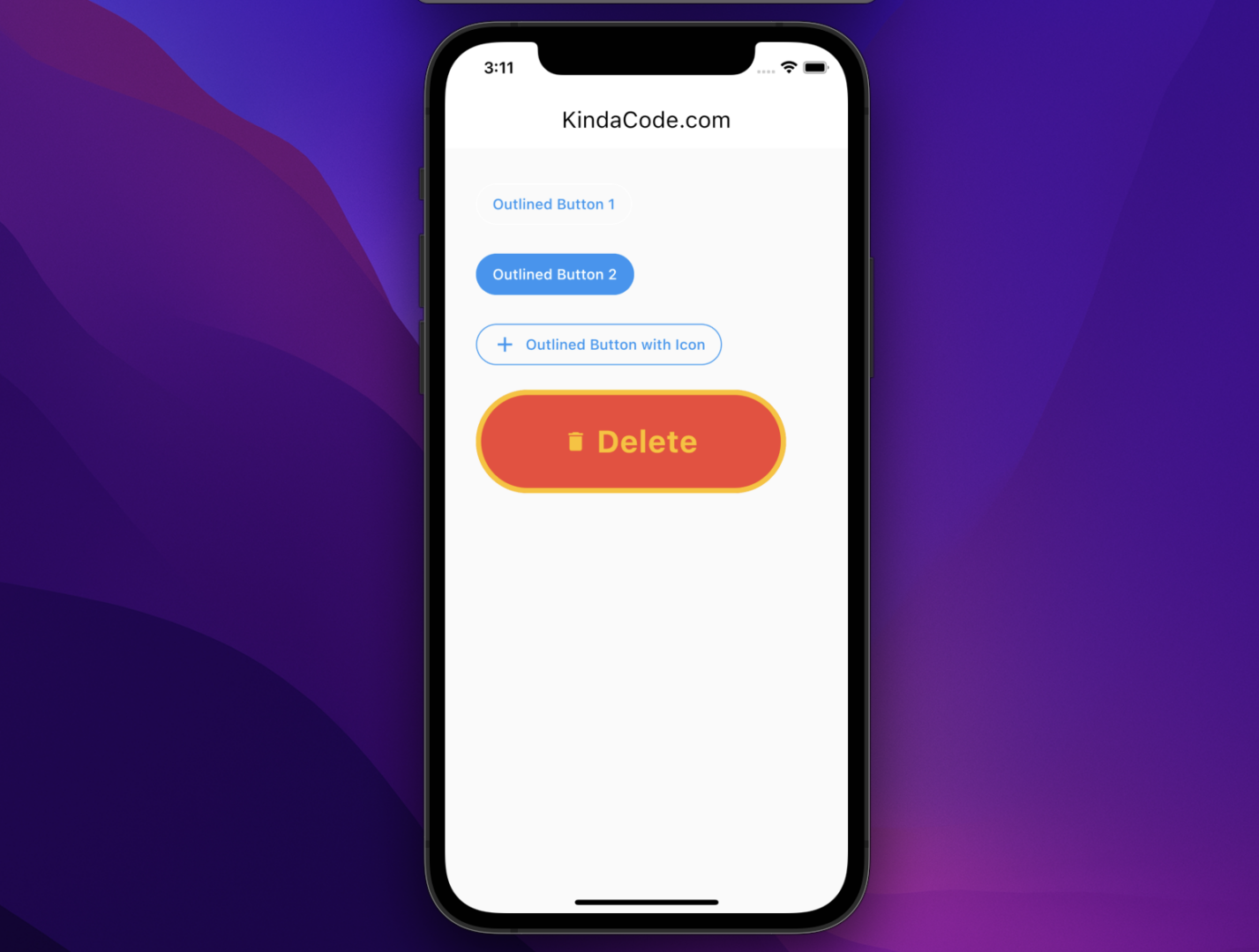
}Once your turn on Material 3, all of your outlined buttons will have rounded shapes by default. Let’s examine a fruitful example for more clarity. Here’s the screenshot:
The full code:
// kindacode.com
// main.dart
import 'package:flutter/material.dart';
void main() {
runApp(const MyApp());
}
class MyApp extends StatelessWidget {
const MyApp({super.key});
// This widget is the root of your application.
@override
Widget build(BuildContext context) {
return MaterialApp(
// hide the debug banner
debugShowCheckedModeBanner: false,
title: 'KindaCode.com',
theme: ThemeData(
useMaterial3: true,
primarySwatch: Colors.blue,
),
home: const KindaCodeDemo());
}
}
class KindaCodeDemo extends StatelessWidget {
const KindaCodeDemo({super.key});
@override
Widget build(BuildContext context) {
return Scaffold(
appBar: AppBar(title: const Text('KindaCode.com')),
body: Padding(
padding: const EdgeInsets.all(30),
child: Column(
crossAxisAlignment: CrossAxisAlignment.start,
children: [
// Outlined button 1
OutlinedButton(
onPressed: () {}, child: const Text('Outlined Button 1')),
const SizedBox(height: 20),
// Outlined button 2
OutlinedButton(
style: OutlinedButton.styleFrom(
foregroundColor: Colors.white,
backgroundColor: Colors.blue,
side: const BorderSide(color: Colors.blue)),
onPressed: () {},
child: const Text('Outlined Button 2')),
const SizedBox(height: 20),
// Outlined button with icon
OutlinedButton.icon(
style: OutlinedButton.styleFrom(
foregroundColor: Colors.blue,
side: const BorderSide(color: Colors.blue)),
onPressed: () {},
icon: const Icon(Icons.add),
label: const Text('Outlined Button with Icon')),
const SizedBox(height: 20),
// Another outlined button with icon
OutlinedButton.icon(
style: OutlinedButton.styleFrom(
fixedSize: const Size(300, 100),
foregroundColor: Colors.amber,
backgroundColor: Colors.red,
side: const BorderSide(color: Colors.amber, width: 5)),
onPressed: () {},
icon: const Icon(Icons.delete),
label: const Text(
'Delete',
style: TextStyle(fontSize: 30, fontWeight: FontWeight.bold),
)),
],
),
),
);
}
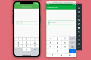
}The Last Example
Screenshot:
The code with the explanations in the comments:
import 'package:flutter/material.dart';
void main() {
runApp(const MyApp());
}
class MyApp extends StatelessWidget {
const MyApp({Key? key}) : super(key: key);
@override
Widget build(BuildContext context) {
return const MaterialApp(
// Hide the debug banner
debugShowCheckedModeBanner: false,
title: 'Flutter Example',
home: MyHomePage(),
);
}
}
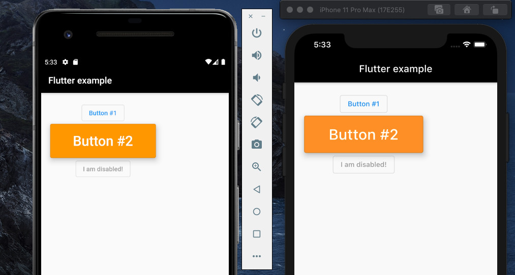
class MyHomePage extends StatelessWidget {
const MyHomePage({Key? key}) : super(key: key);
@override
Widget build(BuildContext context) {
return Scaffold(
appBar: AppBar(
title: const Text('Flutter example'),
backgroundColor: Colors.black,
),
body: Padding(
padding: const EdgeInsets.all(20),
child: Column(children: [
/////////////////
/// Outlined Button #1
OutlinedButton(
onPressed: () {
debugPrint('Button #1 got pressed');
},
child: const Text('Button #1'),
),
/// Outlined Button #2 with style property
OutlinedButton(
onPressed: () {
debugPrint('Button #2 got pressed');
},
style: OutlinedButton.styleFrom(
padding: const EdgeInsets.symmetric(horizontal: 50, vertical: 20),
elevation: 10,
backgroundColor: Colors.orange,
),
child: const Text(
'Button #2',
style: TextStyle(color: Colors.white, fontSize: 30),
),
),
/// Disabled buttion
const OutlinedButton(onPressed: null, child: Text('I am disabled!'))
]),
),
);
}
}References
- Buttons – Material Design (material.io)
- OutlinedButton class (flutter.dev)
- Material Design 3 (material.io)
Final Words
In this tutorial, you have learned how to implement, style, and disable an OutlinedButton. Continue moving and keep the ball rolling by taking a look at the following articles:
- Working with TextButton in Flutter
- Working with ElevatedButton in Flutter
- How to make round buttons in Flutter
- Flutter: 2 Ways to Create Gradient Background Buttons
- Flutter and Firestore Database: CRUD example
- Using Chip widget in Flutter: Tutorial & Examples
You can also explore more tutorials and examples about Flutter by checking our Flutter category page or Dart category page.


I decided, I really don’t know how much is right and beautiful
https://pastebin.com/unQ61hyn
I can’t figure out how to return the disabled button correctly… how to add changes not only to the color here, but also to say any other parameters, shape, border color, text color ElevatedButton( onPressed: null, style: ButtonStyle( backgroundColor: MaterialStateProperty.resolveWith<Color>((states) { if (states.contains(MaterialState.disabled)) { return Colors.brown; // Disabled color }… Read more »
there is not enough material, what if we need to change not only the background color, but also the text and frame color when the button is disabled
Yes sir