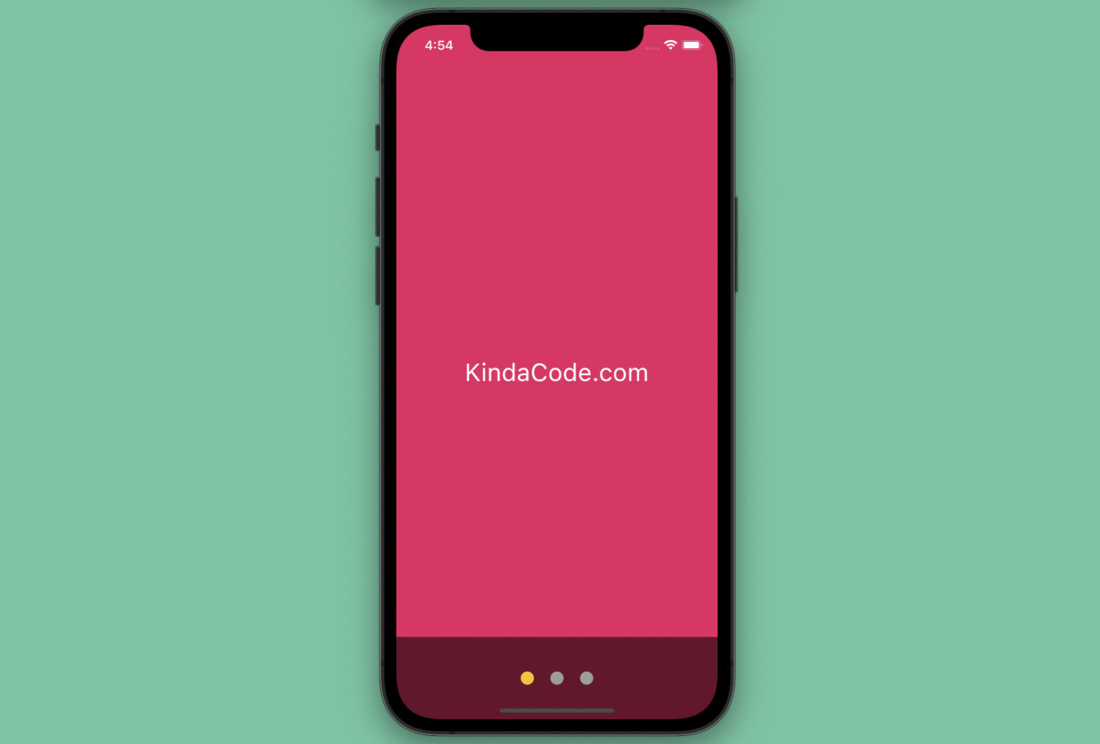
This practical article walks you through a couple of different examples of implementing the PageView widget in Flutter. The first example is simple and straightforward, while the second one is a little bit complex because it goes with a dot indicator. Before writing code, let’s explore the fundamentals.
The Fundamentals
According to the official docs, the PageView widget is used to create a scrollable list that works page by page. One of the most common use cases is carousel/slideshow images which you can come across in many places on the web or in mobile apps.
You can construct a PageView from an explicit list of widgets by using this constructor:
PageView({
  Key? key,
  Axis scrollDirection = Axis.horizontal,
  bool reverse = false,
  PageController? controller,
  ScrollPhysics? physics,
  bool pageSnapping = true,
  ValueChanged<int>? onPageChanged,
  List<Widget> children = const <Widget>[],
  DragStartBehavior dragStartBehavior = DragStartBehavior.start,
  bool allowImplicitScrolling = false,
  String? restorationId,
  Clip clipBehavior = Clip.hardEdge,
  ScrollBehavior? scrollBehavior,
  bool padEnds = true
})
If you want to implement a PageView that uses widgets that are created on demand (e.g., dynamic items loaded from a remote server), use this constructor:
PageView.builder({
  Key? key,
  Axis scrollDirection = Axis.horizontal,
  bool reverse = false,
  PageController? controller,
  ScrollPhysics? physics,
  bool pageSnapping = true,
  ValueChanged<int>? onPageChanged,
  required NullableIndexedWidgetBuilder itemBuilder,
  ChildIndexGetter? findChildIndexCallback,
  int? itemCount,
  DragStartBehavior dragStartBehavior = DragStartBehavior.start,
  bool allowImplicitScrolling = false,
  String? restorationId,
  Clip clipBehavior = Clip.hardEdge,
  ScrollBehavior? scrollBehavior,
  bool padEnds = true
})
To get a better understanding, let’s examine the upcoming examples
Minimum Viable Example
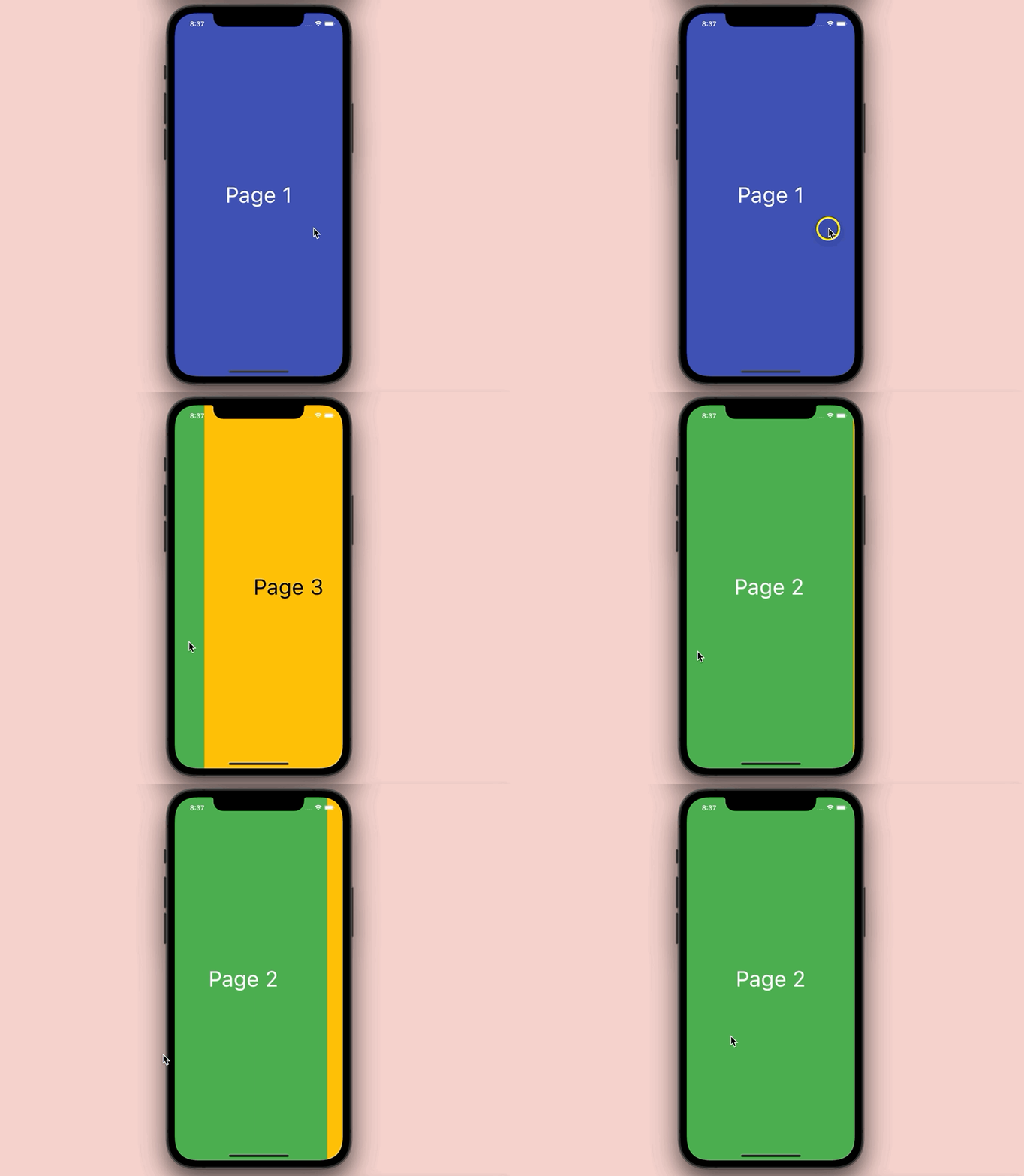
Preview
The Code
The full source code in main.dart with explanations:
// kindacode.com
// PageView example
import 'package:flutter/material.dart';

void main() => runApp(const MyApp());

class MyApp extends StatelessWidget {
  const MyApp({Key? key}) : super(key: key);

  @override
  Widget build(BuildContext context) {
    return MaterialApp(
        // remove the debug banner
        debugShowCheckedModeBanner: false,
        title: 'KindaCode.com',
        theme: ThemeData(
          colorScheme: ColorScheme.fromSeed(seedColor: Colors.blue),
          useMaterial3: true,
        ),
        home: const KindaCode());
  }
}

class KindaCode extends StatefulWidget {
  const KindaCode({Key? key}) : super(key: key);

  @override
  State<KindaCode> createState() => _KindaCodeState();
}

class _KindaCodeState extends State<KindaCode> {
  // Declare and Initialize the PageController
  final PageController _pageController =
      PageController(initialPage: 0, viewportFraction: 1);

  @override
  Widget build(BuildContext context) {
    return Scaffold(
      body: PageView(
        controller: _pageController,
        children: const [PageOne(), PageTwo(), PageThree()],
      ),
    );
  }

  // Dispose the PageController
  @override
  void dispose() {
    _pageController.dispose();
    super.dispose();
  }
}

// Page One
class PageOne extends StatelessWidget {
  const PageOne({Key? key}) : super(key: key);

  @override
  Widget build(BuildContext context) {
    return Container(
      alignment: Alignment.center,
      color: Colors.indigo,
      child: const Text(
        'Page 1',
        style: TextStyle(fontSize: 50, color: Colors.white),
      ),
    );
  }
}

// Page Two
class PageTwo extends StatelessWidget {
  const PageTwo({Key? key}) : super(key: key);

  @override
  Widget build(BuildContext context) {
    return Container(
        alignment: Alignment.center,
        color: Colors.green,
        child: const Text(
          'Page 2',
          style: TextStyle(fontSize: 50, color: Colors.white),
        ));
  }
}

// Page Three
class PageThree extends StatelessWidget {
  const PageThree({Key? key}) : super(key: key);

  @override
  Widget build(BuildContext context) {
    return Container(
        alignment: Alignment.center,
        color: Colors.amber,
        child: const Text(
          'Page 3',
          style: TextStyle(fontSize: 50, color: Colors.black),
        ));
  }
}
PageView with Dots Indicator
Preview
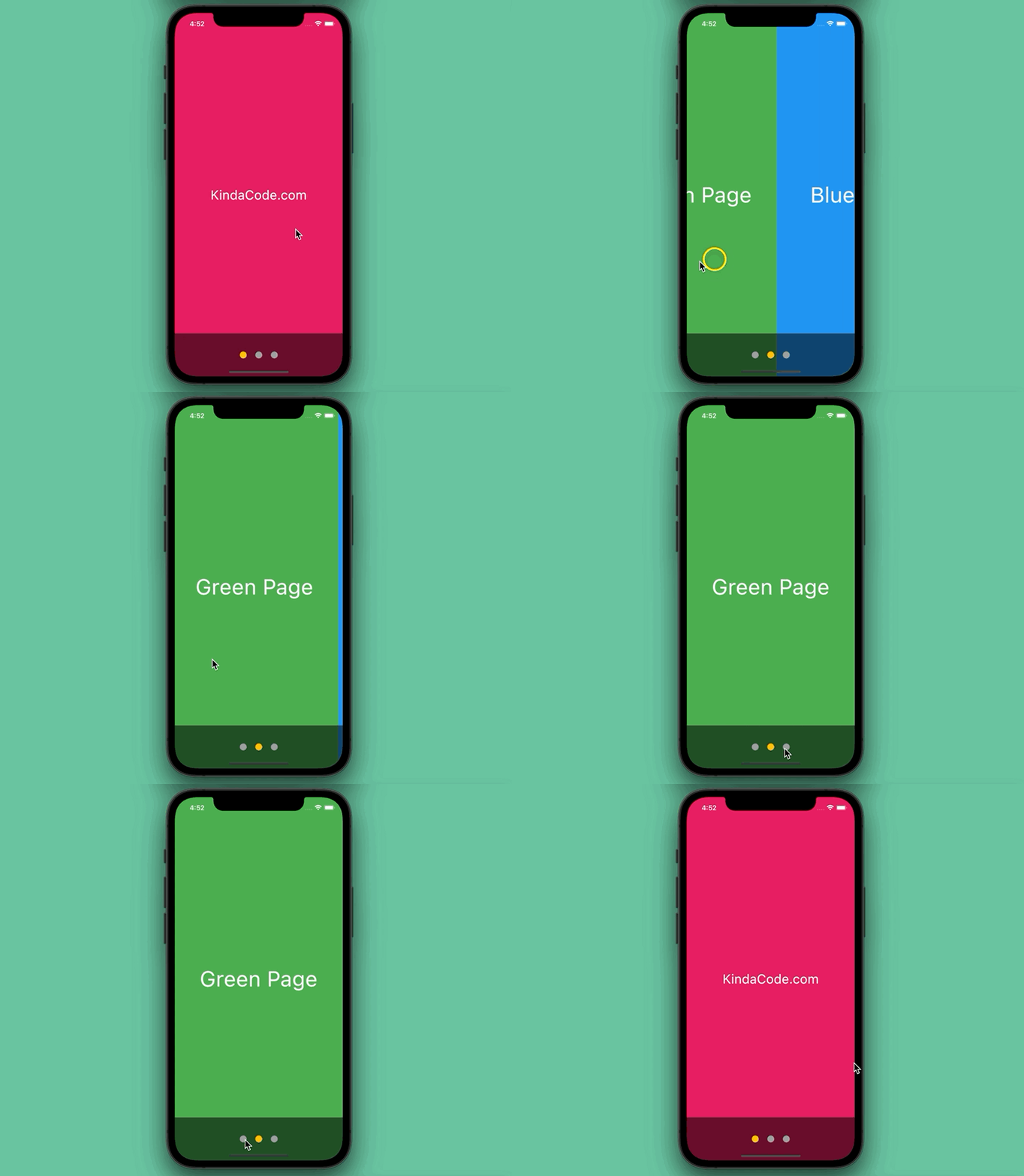
This example is an enhancement of the preceding one. It displays a PageView with a dot indicator. Each page is associated with a dot. The dot corresponding to the current page will have a different color than the other dots. Furthermore, users can move between pages by swiping left, right, or tapping on a dot. Here’s how it works in action:
The Code
The complete code in main.dart with explanations in the comments:
import 'package:flutter/material.dart';

void main() {
  runApp(const MyApp());
}

class MyApp extends StatelessWidget {
  const MyApp({Key? key}) : super(key: key);

  @override
  Widget build(BuildContext context) {
    return MaterialApp(
        // remove the debug banner
        debugShowCheckedModeBanner: false,
        title: 'KindaCode.com',
        theme: ThemeData(
          useMaterial3: true,
        ),
        home: const KindaCodeDemo());
  }
}

// Construct Dots Indicator

class KindaCodeDemo extends StatefulWidget {
  const KindaCodeDemo({Key? key}) : super(key: key);

  @override
  State<KindaCodeDemo> createState() => _KindaCodeDemoState();
}

class _KindaCodeDemoState extends State<KindaCodeDemo> {
  // declare and initizlize the page controller
  final PageController _pageController = PageController(initialPage: 0);

  // the index of the current page
  int _activePage = 0;

  // this list holds all the pages
  // all of them are constructed in the very end of this file for readability
  final List<Widget> _pages = [
    const PageOne(),
    const PageTwo(),
    const PageThree()
  ];

  @override
  Widget build(BuildContext context) {
    return Scaffold(
      body: Stack(
        children: [
          // the page view
          PageView.builder(
            controller: _pageController,
            onPageChanged: (int page) {
              setState(() {
                _activePage = page;
              });
            },
            itemCount: _pages.length,
            itemBuilder: (BuildContext context, int index) {
              return _pages[index % _pages.length];
            },
          ),
          // Display the dots indicator
          Positioned(
            bottom: 0,
            left: 0,
            right: 0,
            height: 100,
            child: Container(
              color: Colors.black54,
              child: Row(
                mainAxisAlignment: MainAxisAlignment.center,
                children: List<Widget>.generate(
                    _pages.length,
                    (index) => Padding(
                          padding: const EdgeInsets.symmetric(horizontal: 10),
                          child: InkWell(
                            onTap: () {
                              _pageController.animateToPage(index,
                                  duration: const Duration(milliseconds: 300),
                                  curve: Curves.easeIn);
                            },
                            child: CircleAvatar(
                              radius: 8,
                              // check if a dot is connected to the current page
                              // if true, give it a different color
                              backgroundColor: _activePage == index
                                  ? Colors.amber
                                  : Colors.grey,
                            ),
                          ),
                        )),
              ),
            ),
          ),
        ],
      ),
    );
  }
}

// Page One
class PageOne extends StatelessWidget {
  const PageOne({Key? key}) : super(key: key);

  @override
  Widget build(BuildContext context) {
    return Container(
      alignment: Alignment.center,
      color: Colors.pink,
      child: const Text(
        'KindaCode.com',
        style: TextStyle(fontSize: 30, color: Colors.white),
      ),
    );
  }
}

// Page Two
class PageTwo extends StatelessWidget {
  const PageTwo({Key? key}) : super(key: key);

  @override
  Widget build(BuildContext context) {
    return Container(
        alignment: Alignment.center,
        color: Colors.green,
        child: const Text(
          'Green Page',
          style: TextStyle(fontSize: 50, color: Colors.white),
        ));
  }
}

// Page Three
class PageThree extends StatelessWidget {
  const PageThree({Key? key}) : super(key: key);

  @override
  Widget build(BuildContext context) {
    return Container(
        alignment: Alignment.center,
        color: Colors.blue,
        child: const Text(
          'Blue Page',
          style: TextStyle(fontSize: 50, color: Colors.white),
        ));
  }
}
Afterword
We’ve walked through a few examples of the PageView widget in Flutter to create nice and interactive user interfaces. From this time forward, you’ll have a solid knowledge to harness in many situations related to lists of widgets that work page by page. Continue learning and strengthening your skills by taking a look at the following articles:
- Flutter & VS Code: Auto Trigger Hot Reload on Save
- How to Parse and Render XML Data in Flutter
- Flutter: Best Packages to Create Cool Bottom App Bars
- Flutter: Giving a Size to a CircularProgressIndicator
- Flutter: Get Current Scroll Offset in ListView/GridView
- How to make an image carousel in Flutter
You can also tour around our Flutter topic page or Dart topic page for the most recent tutorials and examples.

