


Today we’ll talk about the SliverAppBar widget in Flutter. The main part of this article is a complete example of implementing a SliverAppBar with a bottom section that consists of 2 tabs. The others are a few explanations and quick tips.
The Key Point
A SliverAppBar or other sliver widgets need to be placed inside a sliver group that wrapped by a CustomScrollView, like below:
 CustomScrollView(
     slivers: [
        SliverAppBar(),

        // Other sliver widgets
        SliverList(),
        SliverGrid()
     ],
 ),
In addition, you can add more than one SliverAppBar if you want.
The Example
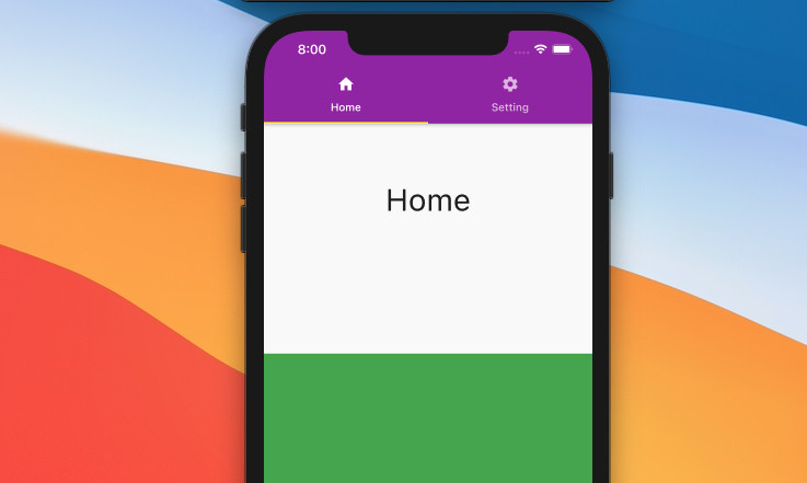
Preview
This example app has a SliverAppBar with a Home tab and a Settings tab at the bottom.
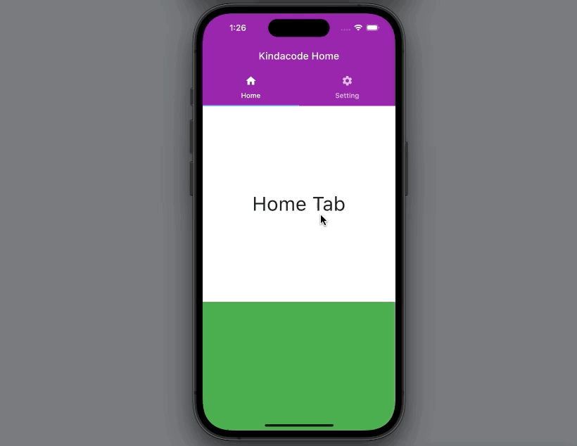
As you can see:
- When the user scrolls down a little bit, the title will disappear, and only the bottom area is visible.
- When the user scrolls up, the title shows up again.
The Code
The full code:
// main.dart
import 'package:flutter/material.dart';

void main() {
  runApp(const MyApp());
}

class MyApp extends StatelessWidget {
  const MyApp({Key? key}) : super(key: key);

  @override
  Widget build(BuildContext context) {
    return MaterialApp(
      debugShowCheckedModeBanner: false,
      title: 'Kindacode.com',
      theme: ThemeData(
          primaryColor: Colors.purple,
          colorScheme: ColorScheme.fromSwatch()
              .copyWith(secondary: Colors.yellowAccent)),
      home: const HomePage(),
    );
  }
}

class HomePage extends StatefulWidget {
  const HomePage({Key? key}) : super(key: key);

  @override
  State<HomePage> createState() => _HomePageState();
}

class _HomePageState extends State<HomePage> {
  // This function show the sliver app bar
  // It will be called in each child of the TabBarView
  SliverAppBar showSliverAppBar(String screenTitle) {
    return SliverAppBar(
      backgroundColor: Colors.purple,
      floating: true,
      pinned: true,
      snap: false,
      title: Text(screenTitle),
      bottom: const TabBar(
        tabs: [
          Tab(
            icon: Icon(Icons.home),
            text: 'Home',
          ),
          Tab(
            icon: Icon(Icons.settings),
            text: 'Setting',
          )
        ],
      ),
    );
  }

  @override
  Widget build(BuildContext context) {
    return Scaffold(
        body: DefaultTabController(
      length: 2,
      child: TabBarView(children: [
        // This CustomScrollView display the Home tab content
        CustomScrollView(
          slivers: [
            showSliverAppBar('Kindacode Home'),

            // Anther sliver widget: SliverList
            SliverList(
              delegate: SliverChildListDelegate([
                const SizedBox(
                  height: 400,
                  child: Center(
                    child: Text(
                      'Home Tab',
                      style: TextStyle(fontSize: 40),
                    ),
                  ),
                ),
                Container(
                  height: 1500,
                  color: Colors.green,
                ),
              ]),
            ),
          ],
        ),

        // This shows the Settings tab content
        CustomScrollView(
          slivers: [
            showSliverAppBar('Settings Screen'),

            // Show other sliver stuff
            SliverList(
              delegate: SliverChildListDelegate([
                Container(
                  height: 600,
                  color: Colors.blue[200],
                  child: const Center(
                    child: Text(
                      'Settings Tab',
                      style: TextStyle(fontSize: 40),
                    ),
                  ),
                ),
                Container(
                  height: 1200,
                  color: Colors.pink,
                ),
              ]),
            ),
          ],
        )
      ]),
    ));
  }
}
To avoid duplicate code, I assigned SliverAppBar to the function showSliverAppBar:
SliverAppBar showSliverAppBar(String screenTitle) {
    return SliverAppBar(
      backgroundColor: Colors.purple,
      floating: true,
      pinned: true,
      snap: false,
      title: Text(screenTitle),
      bottom: const TabBar(
        tabs: [
          Tab(
            icon: Icon(Icons.home),
            text: 'Home',
          ),
          Tab(
            icon: Icon(Icons.settings),
            text: 'Setting',
          )
        ],
      ),
    );
}
Common Parameters
Below are the most commonly used parameters of SliverAppBar:
| Option | Type | Description |
|---|---|---|
| title | Widget | The primary widget displayed in the app bar often is a Text widget |
| leading | Widget | The widget before the title |
| actions | List<Widget> | A group of widgets after the title |
| bottom | PreferredSizeWidget | Used to add the bottom section |
| floating | bool | Determines whether the app bar should become visible as soon as the user scrolls towards the app bar |
| pinned | bool | Determines whether the app bar should remain visible at the start of the scroll view |
| snap | bool | If both snap and floating are true, the floating app bar will snap to the view. |
References
- App bars: top (material.io)
- Navigation Bars (developer.apple.com)
- SliverAppBar class (flutter.dev)
- CustomScrollView class (flutter.dev)
Conclusion
In this article, we’ve examined an end-to-end example of using SliverAppBar in Flutter. If you would like to learn more about the sliver stuff and other interesting things in Flutter, take a look at the following articles:
- Flutter SliverList – Tutorial and Example
- Example of CupertinoSliverNavigationBar in Flutter
- Flutter AnimatedList – Tutorial and Examples
- Flutter: SliverGrid example
- Flutter: Creating OTP/PIN Input Fields (2 approaches)
- Flutter & Hive Database: CRUD Example
You can also check out our Flutter topic page or Dart topic page for the latest tutorials and examples.