


This article is about the SliverGrid widget in Flutter. We’ll take a glance at the basics of the widget and then walk through a complete example of implementing it in action. Without any further ado, let’s get started.
Table of Contents
The Fundamentals
A sliver is a part of a scrollable area. Using sliver widgets helps us create many fancy scrolling effects and can make the scrolling process through a large number of children more efficient due to the ability to lazily build each item when it scrolls into view.
All sliver widgets, including SliverGrid, must be placed inside a CustomScrollView, like this:
CustomScrollView(
      slivers: [
        SliverGrid(
         /** */
        ),

        // other sliver widgets
      ],
)
Constructors
You can create a sliver grid by using one of the following constructors:
1. When you need a sliver grid that displays dynamic content fetched from a database or an API:
SliverGrid({
  Key? key,
  required SliverChildDelegate delegate,
  required SliverGridDelegate gridDelegate
})
In the example that you will see later in this article, we implement a SliverGrid as follows:
// _gridItems: The data that will be shown in the sliver grid
// check the final example for more clarity
SliverGrid(
            gridDelegate: const SliverGridDelegateWithFixedCrossAxisCount(
              crossAxisCount: 3,
              mainAxisSpacing: 10,
              crossAxisSpacing: 10,
              childAspectRatio: 2.0,
            ),
            delegate: SliverChildBuilderDelegate(
              (context, index) {
                return Card(
                  // generate blues with random shades
                  color: Colors.amber[Random().nextInt(9) * 100],
                  child: Container(
                    alignment: Alignment.center,
                    child: Text(_gridItems[index]),
                  ),
                );
              },
              childCount: _gridItems.length,
            ),
          ),
2. In case you need a sliver grid whose tiles each has a maximum cross-axis extend, use this constructor:
SliverGrid.extent({
  Key? key,
  required double maxCrossAxisExtent,
  double mainAxisSpacing = 0.0,
  double crossAxisSpacing = 0.0,
  double childAspectRatio = 1.0,
  List<Widget> children = const <Widget>[]
})
3. If you need a sliver grid with a fixed number of cells (tiles) in the cors axis, use this:
SliverGrid.count({
  Key? key,
  required int crossAxisCount,
  double mainAxisSpacing = 0.0,
  double crossAxisSpacing = 0.0,
  double childAspectRatio = 1.0,
  List<Widget> children = const <Widget>[]
})
You can find more information about the SliverGridView class in the official docs. If you get confused by boring words and long sentences, see the practical example below.
The Example
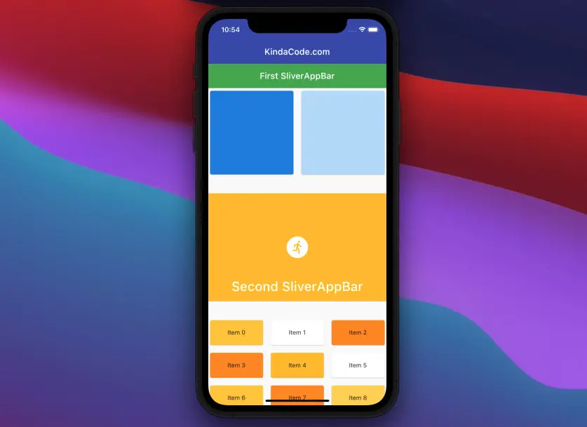
App Preview
The app we are going to build has a normal app bar (this will always remain the same), 2 sliver app bars, and 2 sliver grids. When we scroll down, the sliver app bars will collapse and change background colors. The first sliver grid only contains a small number of children while the second one displays a very large number of tiles (based on dynamic content).
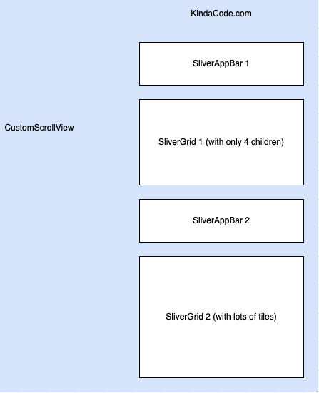
The diagram below shows you the order of those sliver widgets in our app:
Here’s how our app works in action:
The Code
The full source code in main.dart with explanations:
import 'package:flutter/material.dart';
import 'dart:math';

void main() => runApp(const MyApp());

class MyApp extends StatelessWidget {
  const MyApp({Key? key}) : super(key: key);

  @override
  Widget build(BuildContext context) {
    return MaterialApp(
      // Remove the debug banner
      debugShowCheckedModeBanner: false,
      title: 'KindaCode.com',
      theme: ThemeData(primarySwatch: Colors.indigo),
      home: const HomePage(),
    );
  }
}

class HomePage extends StatefulWidget {
  const HomePage({Key? key}) : super(key: key);

  @override
  State<HomePage> createState() => _HomePageState();
}

class _HomePageState extends State<HomePage> {
  // generate dummy data to feed the second SliverGrid
  final List _gridItems = List.generate(90, (i) => "Item $i");

  @override
  Widget build(BuildContext context) {
    return Scaffold(
      appBar: AppBar(
        title: const Text('KindaCode.com'),
        elevation: 0,
      ),
      body: CustomScrollView(
        slivers: [
          // SliverAppBar #1
          SliverAppBar(
            pinned: true,
            backgroundColor: Colors.green,
            expandedHeight: 200.0,
            elevation: 1,
            flexibleSpace: FlexibleSpaceBar(
              background: Container(
                color: Colors.deepOrange,
                child: const Center(
                    child: Icon(
                  Icons.favorite,
                  size: 70,
                  color: Colors.yellow,
                )),
              ),
              title: const Text(
                'First SliverAppBar',
                style: TextStyle(color: Colors.white),
              ),
            ),
          ),

          // SliverGrid #1
          SliverGrid.count(
            crossAxisCount: 2,
            mainAxisSpacing: 10.0,
            crossAxisSpacing: 10.0,
            childAspectRatio: 1,
            children: [
              Card(
                color: Colors.blue[200],
                child: Container(),
              ),
              Card(
                color: Colors.blue[400],
                child: Container(),
              ),
              Card(
                color: Colors.blue[600],
                child: Container(),
              ),
              Card(
                color: Colors.blue[100],
                child: Container(),
              ),
            ],
          ),

          // Just add some padding
          const SliverPadding(padding: EdgeInsets.symmetric(vertical: 20)),

          // SliverAppBar #2
          SliverAppBar(
            elevation: 5,
            pinned: true,
            backgroundColor: Colors.pink,
            expandedHeight: 250.0,
            flexibleSpace: FlexibleSpaceBar(
              background: Container(
                color: Colors.amber,
                child: const Center(
                    child: Icon(
                  Icons.run_circle,
                  size: 60,
                  color: Colors.white,
                )),
              ),
              title: const Text(
                'Second SliverAppBar',
                style: TextStyle(color: Colors.white),
              ),
            ),
          ),

          // Just add some padding
          const SliverPadding(padding: EdgeInsets.symmetric(vertical: 20)),

          // SliverGrid #2 (with dynamic content)
          SliverGrid(
            gridDelegate: const SliverGridDelegateWithFixedCrossAxisCount(
              crossAxisCount: 3,
              mainAxisSpacing: 10,
              crossAxisSpacing: 10,
              childAspectRatio: 2.0,
            ),
            delegate: SliverChildBuilderDelegate(
              (context, index) {
                return Card(
                  // generate ambers with random shades
                  color: Colors.amber[Random().nextInt(9) * 100],
                  child: Container(
                    alignment: Alignment.center,
                    child: Text(_gridItems[index]),
                  ),
                );
              },
              childCount: _gridItems.length,
            ),
          ),
        ],
      ),
    );
  }
}
Conclusion
We’ve examined an end-to-end example of using the SliverGrid widget to create a fancy user interface in our app. If you’d like to explore more about the sliver things and other awesome stuff in Flutter, take a look at the following articles:
- Flutter SliverList – Tutorial and Example
- Example of CupertinoSliverNavigationBar in Flutter
- Flutter: GridView.builder() Example
- Flutter AnimatedList – Tutorial and Examples
- How to create a Filter/Search ListView in Flutter
- Flutter: Making Beautiful Chat Bubbles (2 Approaches)
- Flutter: Creating OTP/PIN Input Fields (2 approaches)
You can also take a tour around our Flutter topic page and Dart topic page to see the latest tutorials and examples.


