

This article shows you a couple of different ways to implement OPT/PIN input fields in Flutter.
What is the point?
A real-world OTP (one-time password) or PIN input UI usually satisfies the following minimum requirements:
- There are 4 or 6 text fields, each text field can only accept 1 character (usually a number)
- Automatically focuses the next field as soon as a character is entered into the current field
You often see this feature in apps that require phone number confirmation, email, or two-factor authentication.
Making OTP fields from scratch
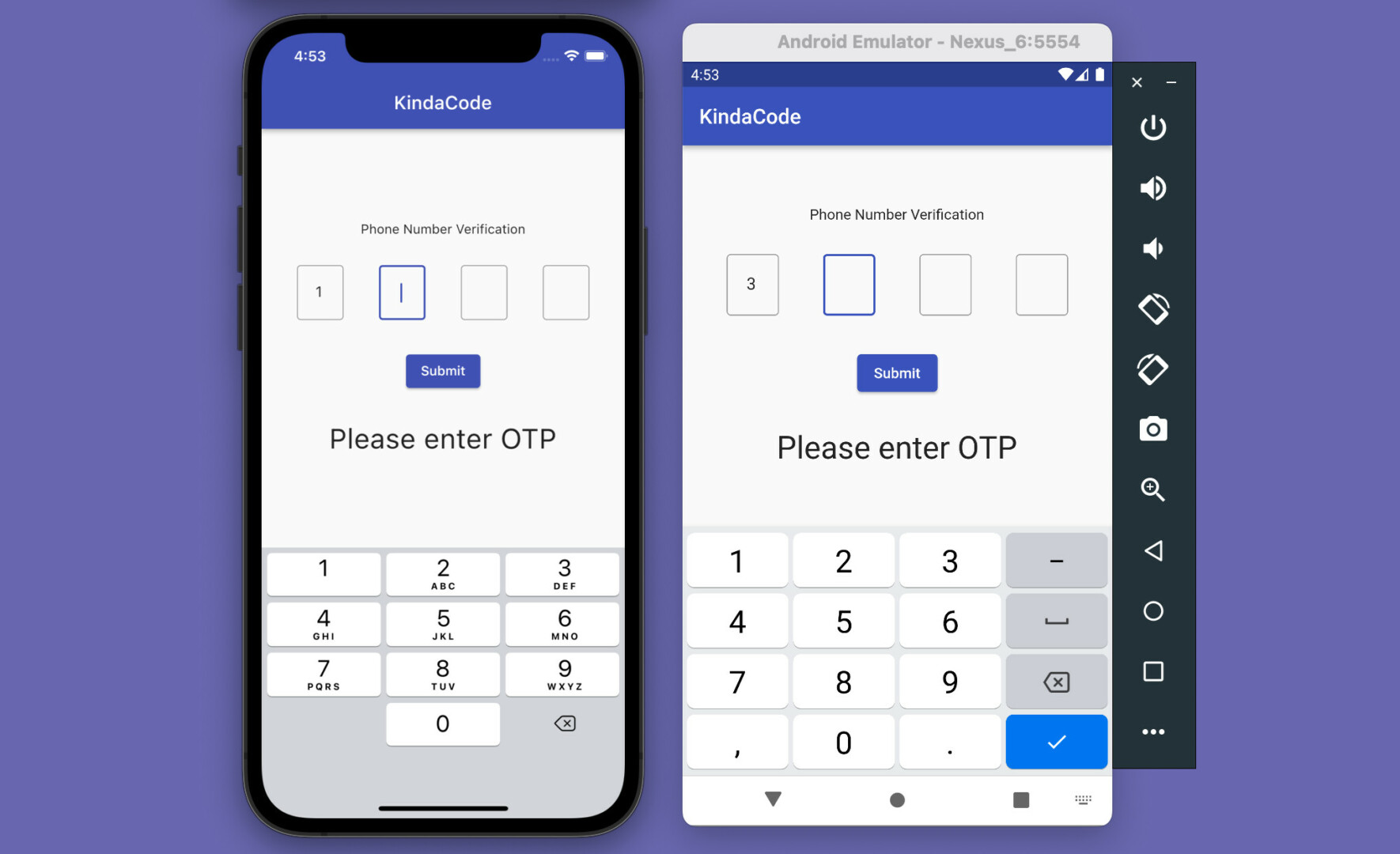
App Preview
This example creates a simple OTP screen. At first, the first input field is focused. When you enter a number, the cursor will automatically move to the next field. When the Submit button is pressed, the OTP code you’ve entered will be displayed on the screen.
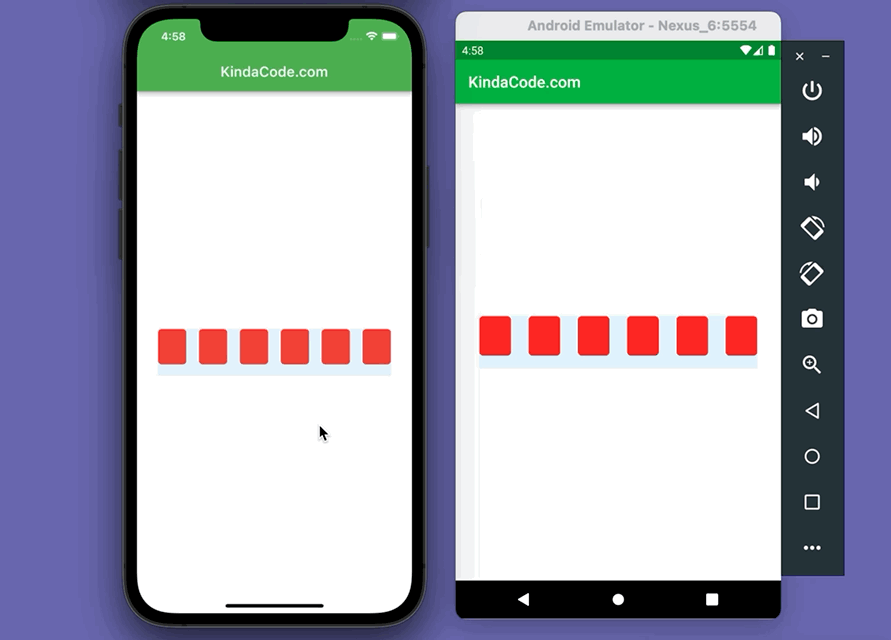
Here’s how it works on iOS and Android:
You should use the soft keyboard of the simulator instead of the hardware keyboard of your computer when testing this app.
The Code
Create a reusable widget named OtpInput:
// Create an input widget that takes only one digit
class OtpInput extends StatelessWidget {
  final TextEditingController controller;
  final bool autoFocus;
  const OtpInput(this.controller, this.autoFocus, {Key? key}) : super(key: key);

  @override
  Widget build(BuildContext context) {
    return SizedBox(
      height: 60,
      width: 50,
      child: TextField(
        autofocus: autoFocus,
        textAlign: TextAlign.center,
        keyboardType: TextInputType.number,
        controller: controller,
        maxLength: 1,
        cursorColor: Theme.of(context).primaryColor,
        decoration: const InputDecoration(
            border: OutlineInputBorder(),
            counterText: '',
            hintStyle: TextStyle(color: Colors.black, fontSize: 20.0)),
        onChanged: (value) {
          if (value.length == 1) {
            FocusScope.of(context).nextFocus();
          }
        },
      ),
    );
  }
}
The complete source code in main.dart with explanations (I put the OtpInput class at the bottom of the file):
// main.dart
import 'package:flutter/material.dart';

void main() {
  runApp(const MyApp());
}

class MyApp extends StatelessWidget {
  const MyApp({Key? key}) : super(key: key);

  @override
  Widget build(BuildContext context) {
    return MaterialApp(
      debugShowCheckedModeBanner: false,
      title: 'KindaCode',
      theme: ThemeData(
        primarySwatch: Colors.indigo,
      ),
      home: const HomePage(),
    );
  }
}

class HomePage extends StatefulWidget {
  const HomePage({Key? key}) : super(key: key);

  @override
  State<HomePage> createState() => _HomePageState();
}

class _HomePageState extends State<HomePage> {
  // 4 text editing controllers that associate with the 4 input fields
  final TextEditingController _fieldOne = TextEditingController();
  final TextEditingController _fieldTwo = TextEditingController();
  final TextEditingController _fieldThree = TextEditingController();
  final TextEditingController _fieldFour = TextEditingController();

  // This is the entered code
  // It will be displayed in a Text widget
  String? _otp;

  @override
  Widget build(BuildContext context) {
    return Scaffold(
      appBar: AppBar(
        title: const Text('KindaCode'),
      ),
      body: Column(
        mainAxisAlignment: MainAxisAlignment.center,
        children: [
          const Text('Phone Number Verification'),
          const SizedBox(
            height: 30,
          ),
          // Implement 4 input fields
          Row(
            mainAxisAlignment: MainAxisAlignment.spaceEvenly,
            children: [
              OtpInput(_fieldOne, true), // auto focus
              OtpInput(_fieldTwo, false),
              OtpInput(_fieldThree, false),
              OtpInput(_fieldFour, false)
            ],
          ),
          const SizedBox(
            height: 30,
          ),
          ElevatedButton(
              onPressed: () {
                setState(() {
                  _otp = _fieldOne.text +
                      _fieldTwo.text +
                      _fieldThree.text +
                      _fieldFour.text;
                });
              },
              child: const Text('Submit')),
          const SizedBox(
            height: 30,
          ),
          // Display the entered OTP code
          Text(
            _otp ?? 'Please enter OTP',
            style: const TextStyle(fontSize: 30),
          )
        ],
      ),
    );
  }
}

// Create an input widget that takes only one digit
class OtpInput extends StatelessWidget {
  final TextEditingController controller;
  final bool autoFocus;
  const OtpInput(this.controller, this.autoFocus, {Key? key}) : super(key: key);

  @override
  Widget build(BuildContext context) {
    return SizedBox(
      height: 60,
      width: 50,
      child: TextField(
        autofocus: autoFocus,
        textAlign: TextAlign.center,
        keyboardType: TextInputType.number,
        controller: controller,
        maxLength: 1,
        cursorColor: Theme.of(context).primaryColor,
        decoration: const InputDecoration(
            border: OutlineInputBorder(),
            counterText: '',
            hintStyle: TextStyle(color: Colors.black, fontSize: 20.0)),
        onChanged: (value) {
          if (value.length == 1) {
            FocusScope.of(context).nextFocus();
          }
        },
      ),
    );
  }
}
Using a 3rd package
In order to quickly achieve your goal with only a few lines of code, you can use a third-party plugin. Some good ones in our case are pin_code_fields, otp_text_field, etc. The example below will use pin_code_fileds which provides a lot of great features:
- Automatically focuses the next field on typing and focuses the previous field on delegation
- Can be set to any length
- Highly customizable
- 3 different types of animation for input texts
- Animated active, inactive, selected, and disabled field color switching
- Autofocus option
- OTP-code pasting from clipboard
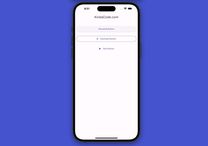
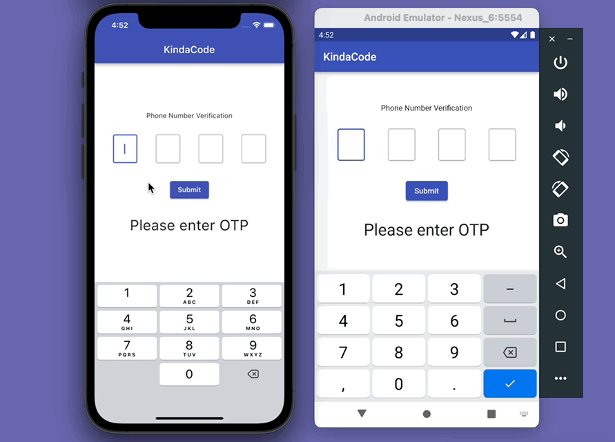
App Preview
In this example, we’ll accept both numbers and letters:
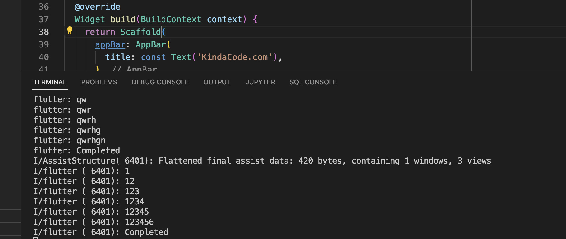
You can also see the characters you’ve entered in the terminal window:
The Code
1. Install the plugin:
flutter pub add pin_code_fields2. The final code:
// main.dart
import 'package:flutter/material.dart';
import 'package:pin_code_fields/pin_code_fields.dart';

void main() {
  runApp(const MyApp());
}

class MyApp extends StatelessWidget {
  const MyApp({Key? key}) : super(key: key);

  @override
  Widget build(BuildContext context) {
    return MaterialApp(
      debugShowCheckedModeBanner: false,
      title: 'KindaCode.com',
      theme: ThemeData(
        primarySwatch: Colors.green,
      ),
      home: const HomePage(),
    );
  }
}

class HomePage extends StatefulWidget {
  const HomePage({Key? key}) : super(key: key);

  @override
  State<HomePage> createState() => _HomePageState();
}

class _HomePageState extends State<HomePage> {
  TextEditingController textEditingController = TextEditingController();
  String currentText = "";

  @override
  Widget build(BuildContext context) {
    return Scaffold(
      appBar: AppBar(
        title: const Text('KindaCode.com'),
      ),
      body: Padding(
        padding: const EdgeInsets.all(30),
        child: Center(
          child: PinCodeTextField(
            length: 6,
            obscureText: false,
            animationType: AnimationType.fade,
            pinTheme: PinTheme(
              shape: PinCodeFieldShape.box,
              borderRadius: BorderRadius.circular(5),
              fieldHeight: 50,
              fieldWidth: 40,
              activeFillColor: Colors.white,
            ),
            animationDuration: const Duration(milliseconds: 300),
            backgroundColor: Colors.blue.shade50,
            enableActiveFill: true,
            controller: textEditingController,
            onCompleted: (v) {
              debugPrint("Completed");
            },
            onChanged: (value) {
              debugPrint(value);
              setState(() {
                currentText = value;
              });
            },
            beforeTextPaste: (text) {
              return true;
            },
            appContext: context,
          ),
        ),
      ),
    );
  }
}
Conclusion
We’ve gone over 2 examples of creating modern and elegant OTP/PIN input fields in Flutter. If you’d like to learn more new and fascinating things about the beloved SDK, take a look at the following articles:
- Using IntrinsicWidth in Flutter: Example & Explanation
- Flutter: Adding a Gradient Border to a Container (2 Examples)
- Flutter: Making Beautiful Chat Bubbles (2 Approaches)
- Flutter: Creating Strikethrough Text (Cross Out Text)
- Flutter: How to Draw a Heart with CustomPaint
- Flutter: DropdownButton Example
You can also check out our Flutter category page or Dart category page for the latest tutorials and examples.


