


This article (which has been recently updated) shows you how to implement a simple Cupertino bottom tab bar in Flutter.
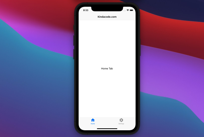
Table of Contents
A Brief Introduction
To create an iOS-styled bottom navigation tab bar in Flutter, these widgets are frequently used together:
- CupertinoTabScaffold: Lays out the tab bar at the bottom and the content between or behind the tab bar.
- CupertinoTabBar: An iOS-style bottom tab bar that displays multiple tabs. The first tab is active by default.
- BottomNavigationBarItem: An interactive button with an icon (required) and a label (optional), resides inside a CupertinoTabBar widget.
An example is worth more than a thousand words. Check the complete example below for more clarity.
The Example
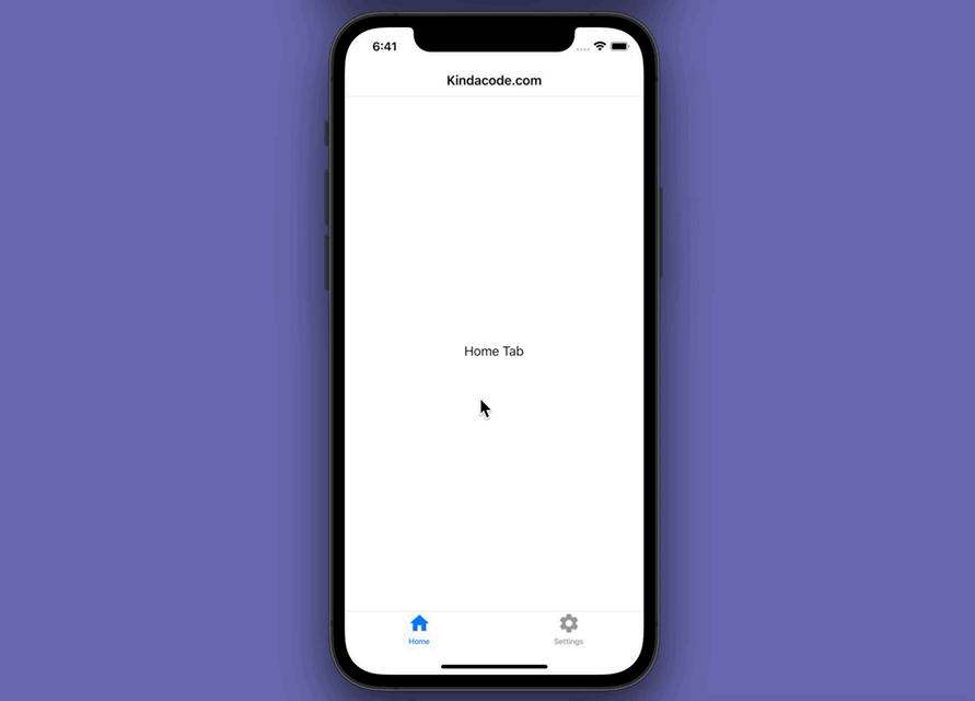
Preview
This sample app contains 2 tabs: The home tab and the settings tab. You can move between them by using the bottom tab bar. Here’s how it works:
The code
1. Firstly, you need to import the Cupertino library:
import 'package:flutter/cupertino.dart';2. The complete code:
import 'package:flutter/cupertino.dart';
import 'package:flutter/material.dart';

void main() {
  runApp(const MyApp());
}

class MyApp extends StatelessWidget {
  const MyApp({Key? key}) : super(key: key);

  @override
  Widget build(BuildContext context) {
    return const CupertinoApp(
      // Remove the debug banner
      debugShowCheckedModeBanner: false,
      title: 'Kindacode.com',
      home: MyHomePage(),
    );
  }
}

// Main Screen
class MyHomePage extends StatefulWidget {
  const MyHomePage({Key? key}) : super(key: key);

  @override
  State<MyHomePage> createState() => _MyHomePageState();
}

class _MyHomePageState extends State<MyHomePage> {
  final List<Widget> _tabs = [
    const HomeTab(), // see the HomeTab class below
    const SettingTab() // see the SettingsTab class below
  ];

  @override
  Widget build(BuildContext context) {
    return CupertinoPageScaffold(
      navigationBar: const CupertinoNavigationBar(
        middle: Text('Kindacode.com'),
      ),
      child: CupertinoTabScaffold(
          tabBar: CupertinoTabBar(
            items: const [
              BottomNavigationBarItem(icon: Icon(Icons.home), label: 'Home'),
              BottomNavigationBarItem(
                  icon: Icon(Icons.settings), label: 'Settings')
            ],
          ),
          tabBuilder: (BuildContext context, index) {
            return _tabs[index];
          }),
    );
  }
}

// Home Tab
class HomeTab extends StatelessWidget {
  const HomeTab({Key? key}) : super(key: key);

  @override
  Widget build(BuildContext context) {
    return const Center(
      child: Text('Home Tab'),
    );
  }
}

// Settings Tab
class SettingTab extends StatelessWidget {
  const SettingTab({Key? key}) : super(key: key);

  @override
  Widget build(BuildContext context) {
    return const Center(
      child: Text('Settings Tab'),
    );
  }
}
Conclusion
We’ve gone through a complete example of implementing a Cupertino Bottom Tab Bar in Flutter. With this knowledge in mind, you can structure your app’s layout more elegantly. If you’d like to explore more iOS-style widgets and other interesting stuff in Flutter, take a look at the following articles:
- Flutter Cupertino Button – Tutorial and Examples
- Flutter CupertinoSegmentedControl Example
- Flutter: Get CupertinoNavigationBar height
- Flutter: Cupertino ContextMenu example
- Working with Cupertino Date Picker in Flutter
- Flutter: Ways to Add a Drop Shadow to a Widget
You can also check out our Flutter category page or Dart category page for the latest tutorials and examples.