


This practical article shows you a couple of different ways to add a drop shadow to a widget in Flutter. The first four approaches are to use self-written code while the last one is to make use of a third-party package (for special scenarios).
Using BoxDecoration.boxShadow
This example creates an amber box with a drop shadow:
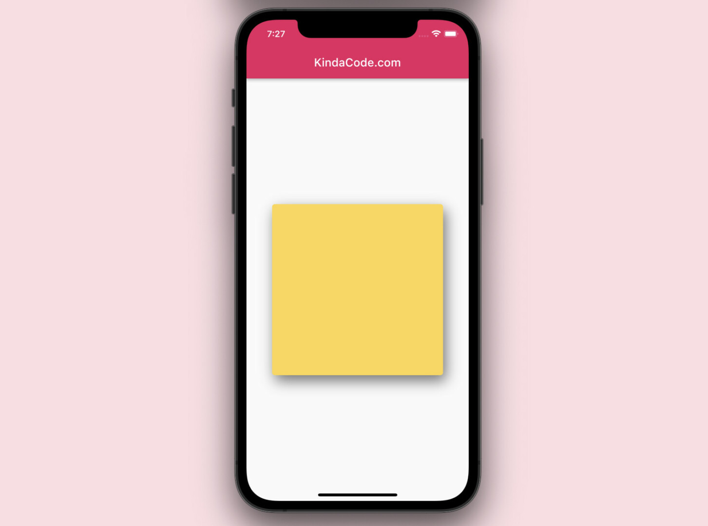
The code:
Scaffold(
        appBar: AppBar(title: const Text('KindaCode.com')),
        body: Center(
          child: Container(
            width: 300,
            height: 300,
            decoration: BoxDecoration(
              color: Colors.amber.shade300,
              borderRadius: BorderRadius.circular(5),
              // implement shadow effect
              boxShadow: const [
                BoxShadow(
                    color: Colors.black54, // shadow color
                    blurRadius: 20, // shadow radius
                    offset: Offset(5, 10), // shadow offset
                    spreadRadius:
                        0.1, // The amount the box should be inflated prior to applying the blur
                    blurStyle: BlurStyle.normal // set blur style
                    ),
              ],
            ),
          ),
));
Using BoxDecoration.boxShadow helps us control various characteristics of the shadow:
- color: Sets shadow color
- blurRadius: Sets shadow radius
- offset: Shadow offset
- spreadRadius: The amount the box should be inflated prior to applying the blur
- blurStyle: Sets blur style (the default value is BlurStyle.normal)
Using Card widget
Wrapping the widget you want to add a drop shadow by a Card widget is a simple and quick solution. You can customize the shadow with the following options:
- elevation: Controls the size of the shadow behind the card
- shadowColor: The color of the shadow
Example:
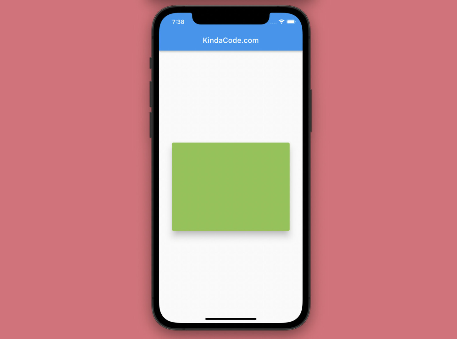
The code:
Scaffold(
        appBar: AppBar(title: const Text('KindaCode.com')),
        body: const Center(
          child: Card(
            elevation: 16, // the size of the shadow
            shadowColor: Colors.black, // shadow color
            color: Colors.lightGreen,
            child: SizedBox(
              width: 320,
              height: 240,
            ),
          ),
));
Using Material widget
Using a Material widget is similar to using a Card widget in adding a drop shadow.
Example:
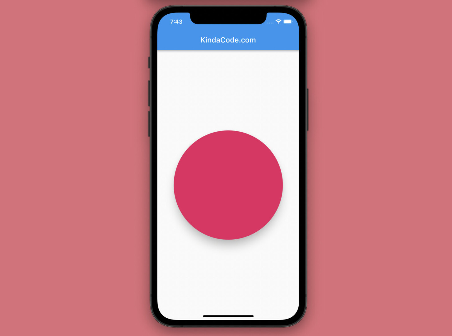
The code:
Scaffold(
        appBar: AppBar(title: const Text('KindaCode.com')),
        body: Center(
            child: Material(
          elevation: 20,
          shadowColor: Colors.black,
          color: Colors.pink,
          shape:
              RoundedRectangleBorder(borderRadius: BorderRadius.circular(150)),
          child: const SizedBox(
            width: 300,
            height: 300,
          ),
)));
Using PhysicalModel widget
Like the Card widget and the Material widget, the PhysicalModel widget can also be used to implement a drop shadow.
Example:
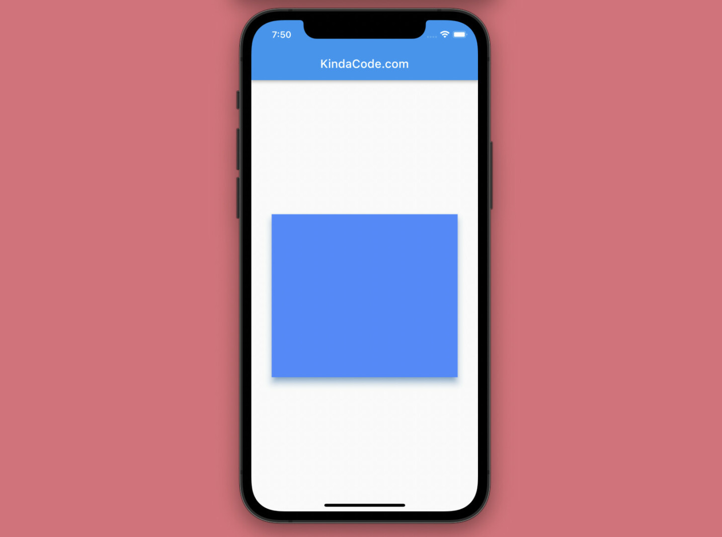
The code:
Scaffold(
        appBar: AppBar(title: const Text('KindaCode.com')),
        body: const Center(
          child: PhysicalModel(
            color: Colors.blueAccent,
            elevation: 10,
            shadowColor: Colors.blue,
            child: SizedBox(
              width: 320,
              height: 280,
            ),
          ),
));
Using a 3rd Package
In the vast majority of scenarios, there’s no need to install third-party plugins for just making shadow effects. However, in some rare situations, creating a special shadow might be tough and challenging. If it is the case, consider using a plugin, such as simple_shadow, shadow, drop_shadow, etc.
This example makes use of the simple_shadow package to add a drop shadow to an icon. Install it by running the following command:
flutter pub add simple_shadowScreenshot:
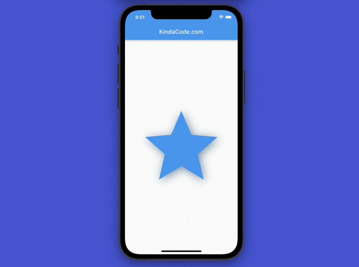
The complete code (including some boilerplate):
// main.dart
import 'package:flutter/material.dart';
import 'package:simple_shadow/simple_shadow.dart';

void main() {
  runApp(const MyApp());
}

class MyApp extends StatelessWidget {
  const MyApp({Key? key}) : super(key: key);

  @override
  Widget build(BuildContext context) {
    return const MaterialApp(
      // Remove the debug banner icon
      debugShowCheckedModeBanner: false,
      title: 'KindaCode.com',
      home: HomeScreen(),
    );
  }
}

class HomeScreen extends StatelessWidget {
  const HomeScreen({Key? key}) : super(key: key);

  @override
  Widget build(BuildContext context) {
    return Scaffold(
        appBar: AppBar(title: const Text('KindaCode.com')),
        body: Center(
          child: SimpleShadow(
              opacity: 0.6, // Default: 0.5
              color: Colors.black54, // Default: Black
              offset: const Offset(5, 5), // Default: Offset(2, 2)
              sigma: 15,
              child: const Icon(
                Icons.star,
                size: 300,
                color: Colors.blue,
              )),
        ));
  }
}
Adding Drop Shadows to Text
Adding a drop shadow to text is simple as adding a drop shadow to an icon (see the preceding example), thanks to the help of the simple_shadow plugin. However, you can see the tricks to add shadow effects to text without any third-party packages in this article: How to Add a Drop Shadow to Text in Flutter.
Final Words
We’ve covered several techniques to create drop shadows in Flutter. This knowledge can help you build more gorgeous and glamorous apps and gain more engagement from users. If you’d like to explore more new and interesting things about modern Flutter development, take a look at the following articles:
- Flutter: Giving a Size to a CircularProgressIndicator
- How to create selectable text in Flutter
- Flutter StreamBuilder examples (null safety)
- Flutter: FilteringTextInputFormatter Examples
- Flutter Autocomplete example
- Using GetX (Get) for State Management in Flutter
You can also take a tour around our Flutter topic page and Dart topic page to see the latest tutorials and examples.