


This article walks you through 4 different examples of using FloatingActionButton (FAB) in Flutter. These examples are arranged in order from basic to advanced, from simple to complex. Without any further ado, let’s get started.
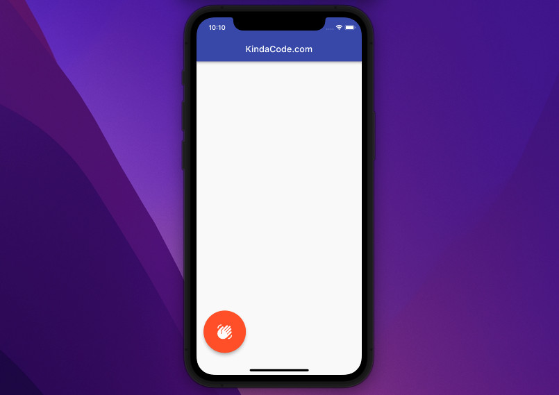
Large Circular FloatingActionButton
You can create a big circular floating action button using the FloatingActionButton.large constructor.
Screenshot:
The code:
Scaffold(
appBar: AppBar(
title: const Text('KindaCode.com'),
backgroundColor: Colors.indigo,
),
floatingActionButton: FloatingActionButton.large(
onPressed: () {},
backgroundColor: Colors.deepOrange,
child: const Icon(Icons.waving_hand),
),
floatingActionButtonLocation: FloatingActionButtonLocation.startFloat,
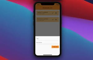
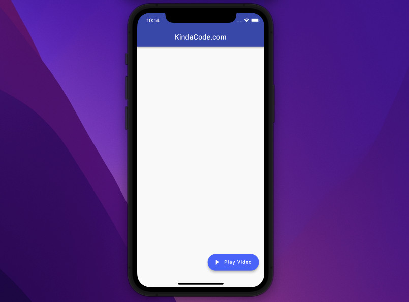
);Pill FloatingActionButton with Text and Icon
You can easily create a pill floating action button with text and an icon by using the FloatingActionButton.extended constructor.
Screenshot:
The code:
Scaffold(
appBar: AppBar(
title: const Text('KindaCode.com'),
backgroundColor: Colors.indigo,
),
floatingActionButton: FloatingActionButton.extended(
onPressed: () {},
icon: const Icon(Icons.play_arrow),
label: const Text('Play Video'),
backgroundColor: Colors.indigoAccent,
),
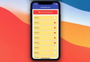
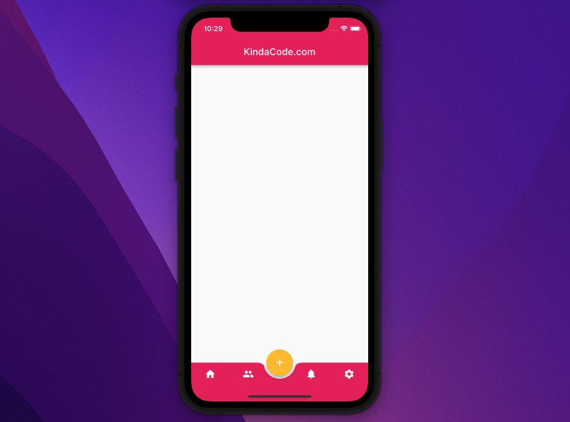
);FloatingActionButton and notched BottomNavigationBar
This example creates a curved bottom navigation bar with a notch (a semi-circle cut) in the middle. Right there, we place a floating action button.
Screenshot:
The code:
Scaffold(
appBar: AppBar(
title: const Text('KindaCode.com'),
backgroundColor: Colors.pink,
),
// The bottom navigation bar
bottomNavigationBar: BottomAppBar(
color: Colors.pink,
// this creates a notch in the center of the bottom bar
shape: const CircularNotchedRectangle(),
notchMargin: 6,
child: Row(
mainAxisAlignment: MainAxisAlignment.spaceAround,
children: [
IconButton(
icon: const Icon(
Icons.home,
color: Colors.white,
),
onPressed: () {},
),
IconButton(
icon: const Icon(
Icons.people,
color: Colors.white,
),
onPressed: () {},
),
const SizedBox(
width: 20,
),
IconButton(
icon: const Icon(
Icons.notifications,
color: Colors.white,
),
onPressed: () {},
),
IconButton(
icon: const Icon(
Icons.settings,
color: Colors.white,
),
onPressed: () {},
),
],
),
),
// implement the floating button
floatingActionButton: FloatingActionButton(
onPressed: () {},
backgroundColor: Colors.amber,
child: const Icon(Icons.add)),
floatingActionButtonLocation: FloatingActionButtonLocation.centerDocked,
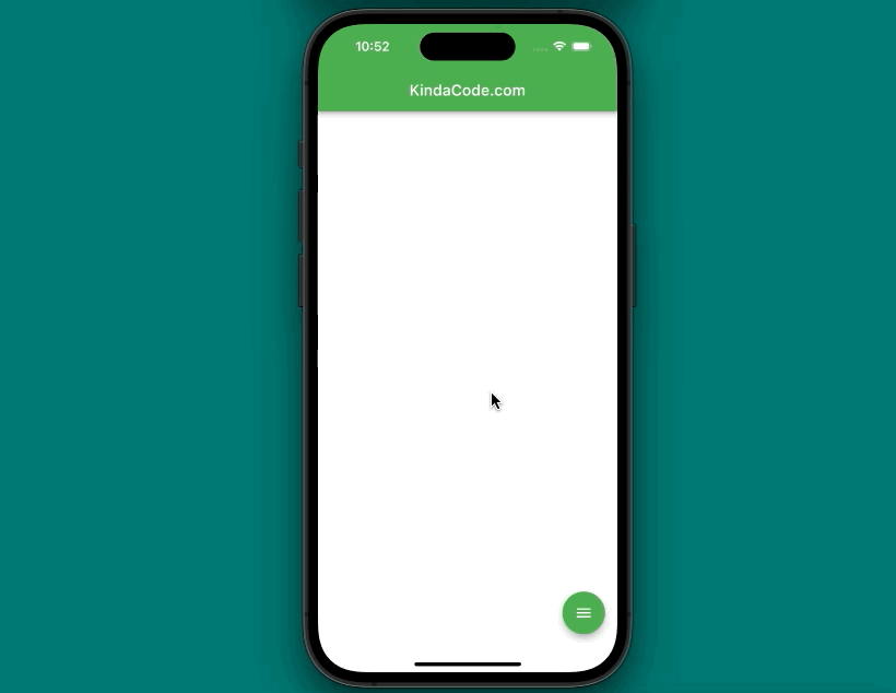
);Speed Dial Animated FloatingActionButton
This example is a little bit long and complicated, so please bear with us. The app we will make contains a floating acting button (let’s call it primary FAB or main FAB). When this one gets pressed for the first time, the other three floating action buttons will show up (let’s call them child FABs). When the main FAB is pressed another time, the child FABs will become invisible. One extra thing is that the icon of the main FAB is animated.
Words might be confusing. Let’s see how it works in action:
The full code (with explanations):
// main.dart
import 'package:flutter/material.dart';

void main() {
  runApp(const MyApp());
}

class MyApp extends StatelessWidget {
  const MyApp({Key? key}) : super(key: key);
  @override
  Widget build(BuildContext context) {
    return MaterialApp(
        // Remove the debug banner
        debugShowCheckedModeBanner: false,
        title: 'KindaCode.com',
        theme: ThemeData(
          primarySwatch: Colors.green,
        ),
        home: const HomePage());
  }
}

class HomePage extends StatefulWidget {
  const HomePage({Key? key}) : super(key: key);

  @override
  State<HomePage> createState() => _HomePageState();
}

class _HomePageState extends State<HomePage>
    with SingleTickerProviderStateMixin {
  // Animation controller
  late AnimationController _animationController;

  // This is used to animate the icon of the main FAB
  late Animation<double> _buttonAnimatedIcon;

  // This is used for the child FABs
  late Animation<double> _translateButton;

  // This variable determnies whether the child FABs are visible or not
  bool _isExpanded = false;

  @override
  initState() {
    _animationController = AnimationController(
        vsync: this, duration: const Duration(milliseconds: 600))
      ..addListener(() {
        setState(() {});
      });

    _buttonAnimatedIcon =
        Tween<double>(begin: 0.0, end: 1.0).animate(_animationController);

    _translateButton = Tween<double>(
      begin: 100,
      end: -20,
    ).animate(CurvedAnimation(
      parent: _animationController,
      curve: Curves.easeInOut,
    ));
    super.initState();
  }

  // dispose the animation controller
  @override
  dispose() {
    _animationController.dispose();
    super.dispose();
  }

  // This function is used to expand/collapse the children floating buttons
  // It will be called when the primary FAB (with menu icon) is pressed
  _toggle() {
    if (_isExpanded) {
      _animationController.reverse();
    } else {
      _animationController.forward();
    }

    _isExpanded = !_isExpanded;
  }

  @override
  Widget build(BuildContext context) {
    return Scaffold(
      appBar: AppBar(title: const Text('KindaCode.com')),
      floatingActionButton: Column(
        mainAxisAlignment: MainAxisAlignment.end,
        children: [
          Transform(
            transform: Matrix4.translationValues(
              0.0,
              _translateButton.value * 4,
              0.0,
            ),
            child: FloatingActionButton(
              backgroundColor: Colors.blue,
              onPressed: () {/* Do something */},
              child: const Icon(
                Icons.email,
              ),
            ),
          ),
          Transform(
            transform: Matrix4.translationValues(
              0,
              _translateButton.value * 3,
              0,
            ),
            child: FloatingActionButton(
              backgroundColor: Colors.red,
              onPressed: () {/* Do something */},
              child: const Icon(
                Icons.call,
              ),
            ),
          ),
          Transform(
            transform: Matrix4.translationValues(
              0,
              _translateButton.value * 2,
              0,
            ),
            child: FloatingActionButton(
              backgroundColor: Colors.amber,
              onPressed: () {/* Do something */},
              child: const Icon(Icons.message),
            ),
          ),
          // This is the primary FAB
          FloatingActionButton(
            onPressed: _toggle,
            child: AnimatedIcon(
              icon: AnimatedIcons.menu_close,
              progress: _buttonAnimatedIcon,
            ),
          ),
        ],
      ),
    );
  }
}
Wrapping Up
We’ve gone over a couple of floating action button examples. As of now, you have more options to implement this kind of button in your app. If you’d like to explore more new and amazing things about modern Flutter development, take a look at the following articles:
- Flutter: Creating Custom Back Buttons
- Flutter: Text with Read More / Read Less Buttons
- Using Chip widget in Flutter: Tutorial & Examples
- Flutter: Making Beautiful Chat Bubbles (2 Approaches)
- Using GetX (Get) for State Management in Flutter
- Flutter & SQLite: CRUD Example
You can also take a tour around our Flutter topic page and Dart topic page to see the latest tutorials and examples.