


This article shows you how to implement text with a read more / read less button in Flutter without using any third-party plugins.
What Is The Point?
When displaying long text in your app, you might want to show only the first few words and hide the rest of the content to save space. This is not only commonly seen on mobile devices (with small screens) but also on the web. A typical design for this use case is to add Read More / Read Less buttons.
In the beginning, the user can only see a few lines of text. When the Read More button is tapped, the full text will be exposed. The Read Less button is used to collapse the expanded content so that the screen will be neat as before.
Example
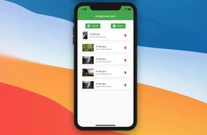
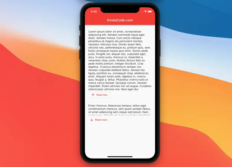
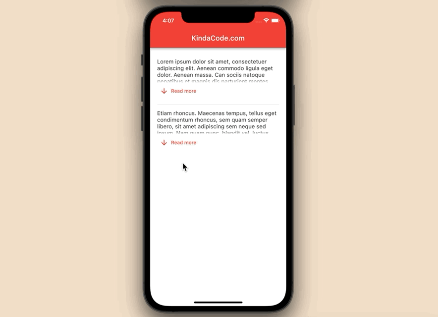
App Preview
The process of expanding and collapsing text will be accompanied by animation to help increase the user experience. We’ll build a custom widget named TextWrapper (that is reusable) from scratch.
Demo:
Creating The TextWrapper Widget
This custom widget displays a string and is expandable/collapsable. You can reuse it as many times as you want:
// Create a expandable/ collapsable text widget
class TextWrapper extends StatefulWidget {
  const TextWrapper({Key? key, required this.text}) : super(key: key);

  final String text;

  @override
  State<TextWrapper> createState() => _TextWrapperState();
}

class _TextWrapperState extends State<TextWrapper>
    with TickerProviderStateMixin {
  bool isExpanded = false;
  @override
  Widget build(BuildContext context) {
    return Column(crossAxisAlignment: CrossAxisAlignment.start, children: [
      AnimatedSize(
          duration: const Duration(milliseconds: 300),
          child: ConstrainedBox(
              constraints: isExpanded
                  ? const BoxConstraints()
                  : const BoxConstraints(maxHeight: 70),
              child: Text(
                widget.text,
                style: const TextStyle(fontSize: 16),
                softWrap: true,
                overflow: TextOverflow.fade,
              ))),
      isExpanded
          ? OutlinedButton.icon(
              icon: const Icon(Icons.arrow_upward),
              label: const Text('Read less'),
              onPressed: () => setState(() => isExpanded = false))
          : TextButton.icon(
              icon: const Icon(Icons.arrow_downward),
              label: const Text('Read more'),
              onPressed: () => setState(() => isExpanded = true))
    ]);
  }
}
The Complete Code
Here’s the full source code in main.dart that produces the demo app you’ve seen in the previous section:
// main.dart
import 'package:flutter/material.dart';

void main() {
  runApp(const MyApp());
}

class MyApp extends StatelessWidget {
  const MyApp({Key? key}) : super(key: key);

  @override
  Widget build(BuildContext context) {
    return MaterialApp(
      debugShowCheckedModeBanner: false,
      title: 'KindaCode.com',
      theme: ThemeData(
        primarySwatch: Colors.red,
      ),
      home: const HomePage(),
    );
  }
}

class HomePage extends StatefulWidget {
  const HomePage({Key? key}) : super(key: key);

  @override
  State<HomePage> createState() => _HomePageState();
}

class _HomePageState extends State<HomePage> {
  @override
  Widget build(BuildContext context) {
    return Scaffold(
      appBar: AppBar(
        title: const Text('KindaCode.com'),
      ),
      body: Padding(
        padding: const EdgeInsets.symmetric(vertical: 30, horizontal: 20),
        child: SingleChildScrollView(
          child: Column(
            children: const [
              TextWrapper(
                  text:
                      "Lorem ipsum dolor sit amet, consectetuer adipiscing elit. Aenean commodo ligula eget dolor. Aenean massa. Can sociis natoque penatibus et magnis dis parturient montes, nascetur ridiculus mus. Donec quam felis, ultricies nec, pellentesque eu, pretium quis, sem. Nulla consequat massa quis enim. Donec pede justo, fringilla vel, aliquet nec, vulputate eget, arcu. In enim justo, rhoncus ut, imperdiet a, venenatis vitae, justo. Nullam dictum felis eu pede mollis pretium. Integer tincidunt. Cras dapibus. Vivamus elementum semper nisi. Aenean vulputate eleifend tellus. Aenean leo ligula, porttitor eu, consequat vitae, eleifend ac, enim. Aliquam lorem ante, dapibus in, viverra quis, feugiat a, tellus. Phasellus viverra nulla ut metus varius laoreet. Quisque rutrum. Aenean imperdiet. Etiam ultricies nisi vel augue. Curabitur ullamcorper ultricies nisi. Nam eget dui."),
              Divider(
                height: 30,
              ),
              TextWrapper(
                  text:
                      "Etiam rhoncus. Maecenas tempus, tellus eget condimentum rhoncus, sem quam semper libero, sit amet adipiscing sem neque sed ipsum. Nam quam nunc, blandit vel, luctus pulvinar, hendrerit id, lorem. Maecenas nec odio et ante tincidunt tempus. Donec vitae sapien ut libero venenatis faucibus. Nullam quis ante. Etiam sit amet orci eget eros faucibus tincidunt. Duis leo. Sed fringilla mauris sit amet nibh. Donec sodales sagittis magna. Sed consequat, leo eget bibendum sodales, augue velit cursus nunc.")
            ],
          ),
        ),
      ),
    );
  }
}

// Create a expandable/ collapsable text widget
class TextWrapper extends StatefulWidget {
  const TextWrapper({Key? key, required this.text}) : super(key: key);

  final String text;

  @override
  State<TextWrapper> createState() => _TextWrapperState();
}

class _TextWrapperState extends State<TextWrapper>
    with TickerProviderStateMixin {
  bool isExpanded = false;
  @override
  Widget build(BuildContext context) {
    return Column(crossAxisAlignment: CrossAxisAlignment.start, children: [
      AnimatedSize(
          duration: const Duration(milliseconds: 300),
          child: ConstrainedBox(
              constraints: isExpanded
                  ? const BoxConstraints()
                  : const BoxConstraints(maxHeight: 70),
              child: Text(
                widget.text,
                style: const TextStyle(fontSize: 16),
                softWrap: true,
                overflow: TextOverflow.fade,
              ))),
      isExpanded
          ? OutlinedButton.icon(
              icon: const Icon(Icons.arrow_upward),
              label: const Text('Read less'),
              onPressed: () => setState(() => isExpanded = false))
          : TextButton.icon(
              icon: const Icon(Icons.arrow_downward),
              label: const Text('Read more'),
              onPressed: () => setState(() => isExpanded = true))
    ]);
  }
}
Conclusion
You’ve learned how to create text with read more / read less buttons in Flutter. This knowledge will help you build more professional and attractive user interfaces. If you’d like to explore more new and exciting stuff about Flutter, take a look at the following articles:
- Flutter: Making a Dropdown Multiselect with Checkboxes
- Using Stepper widget in Flutter: Tutorial & Example
- Using Provider for State Management in Flutter
- Flutter & SQLite: CRUD Example
- Flutter AnimatedList – Tutorial and Examples
- Flutter: Making Beautiful Chat Bubbles (2 Approaches)
You can also check out our Flutter category page or Dart category page for the latest tutorials and examples.


