


Table of Contents
Introduction
There might be cases where the default soft keyboard on iOS or Android doesn’t fit your need, and it is very frustrating or almost impossible to archive your goal with that thing. Trying to tweak or deep customize the default soft keyboard is not a good idea.
This article shows you how to implement your own custom num pad (number keyboard) in Flutter. We will make it from scratch without using any third-party plugins. The code we have to write will be a little bit long but contain no hard stuff.
The Complete Example
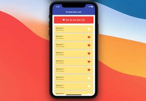
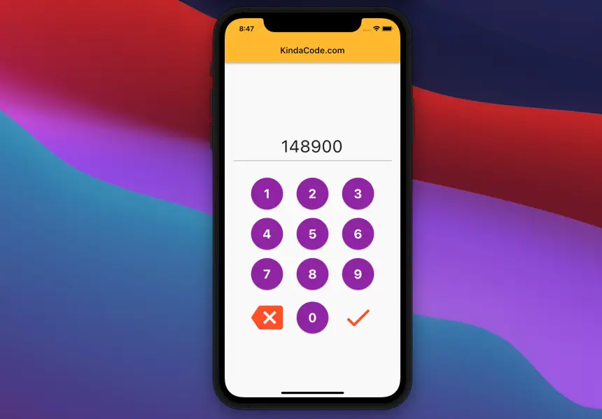
App Preview
The NumPad that we are going to make has 9 round buttons to enter the numbers from 0 to 9. Besides, there are 2 icon buttons: the first button is for deleting the last digit, and the other one is used to submit the received numbers. When the submit button is pressed, a dialog with the result will show up.
Here’s how it works:
The Code
1. Init a new Flutter project by running:
flutter create custom_numpad_exampleIn the lib directory, add a new file named num_pad.dart. This file will hold our reusable and customizable NumPad widget. The file structure inside the lib folder now looks like this:
.
├── main.dart
└── num_pad.dart
2. . Add the following to the num_pad.dart file:
import 'package:flutter/material.dart';

// KeyPad widget
// This widget is reusable and its buttons are customizable (color, size)
class NumPad extends StatelessWidget {
  final double buttonSize;
  final Color buttonColor;
  final Color iconColor;
  final TextEditingController controller;
  final Function delete;
  final Function onSubmit;

  const NumPad({
    Key? key,
    this.buttonSize = 70,
    this.buttonColor = Colors.indigo,
    this.iconColor = Colors.amber,
    required this.delete,
    required this.onSubmit,
    required this.controller,
  }) : super(key: key);

  @override
  Widget build(BuildContext context) {
    return Container(
      margin: const EdgeInsets.only(left: 30, right: 30),
      child: Column(
        children: [
          const SizedBox(height: 20),
          Row(
            mainAxisAlignment: MainAxisAlignment.spaceEvenly,
            // implement the number keys (from 0 to 9) with the NumberButton widget
            // the NumberButton widget is defined in the bottom of this file
            children: [
              NumberButton(
                number: 1,
                size: buttonSize,
                color: buttonColor,
                controller: controller,
              ),
              NumberButton(
                number: 2,
                size: buttonSize,
                color: buttonColor,
                controller: controller,
              ),
              NumberButton(
                number: 3,
                size: buttonSize,
                color: buttonColor,
                controller: controller,
              ),
            ],
          ),
          const SizedBox(height: 20),
          Row(
            mainAxisAlignment: MainAxisAlignment.spaceEvenly,
            children: [
              NumberButton(
                number: 4,
                size: buttonSize,
                color: buttonColor,
                controller: controller,
              ),
              NumberButton(
                number: 5,
                size: buttonSize,
                color: buttonColor,
                controller: controller,
              ),
              NumberButton(
                number: 6,
                size: buttonSize,
                color: buttonColor,
                controller: controller,
              ),
            ],
          ),
          const SizedBox(height: 20),
          Row(
            mainAxisAlignment: MainAxisAlignment.spaceEvenly,
            children: [
              NumberButton(
                number: 7,
                size: buttonSize,
                color: buttonColor,
                controller: controller,
              ),
              NumberButton(
                number: 8,
                size: buttonSize,
                color: buttonColor,
                controller: controller,
              ),
              NumberButton(
                number: 9,
                size: buttonSize,
                color: buttonColor,
                controller: controller,
              ),
            ],
          ),
          const SizedBox(height: 20),
          Row(
            mainAxisAlignment: MainAxisAlignment.spaceEvenly,
            children: [
              // this button is used to delete the last number
              IconButton(
                onPressed: () => delete(),
                icon: Icon(
                  Icons.backspace,
                  color: iconColor,
                ),
                iconSize: buttonSize,
              ),
              NumberButton(
                number: 0,
                size: buttonSize,
                color: buttonColor,
                controller: controller,
              ),
              // this button is used to submit the entered value
              IconButton(
                onPressed: () => onSubmit(),
                icon: Icon(
                  Icons.done_rounded,
                  color: iconColor,
                ),
                iconSize: buttonSize,
              ),
            ],
          ),
        ],
      ),
    );
  }
}

// define NumberButton widget
// its shape is round
class NumberButton extends StatelessWidget {
  final int number;
  final double size;
  final Color color;
  final TextEditingController controller;

  const NumberButton({
    Key? key,
    required this.number,
    required this.size,
    required this.color,
    required this.controller,
  }) : super(key: key);

  @override
  Widget build(BuildContext context) {
    return SizedBox(
      width: size,
      height: size,
      child: ElevatedButton(
        style: ElevatedButton.styleFrom(
          backgroundColor: color,
          shape: RoundedRectangleBorder(
            borderRadius: BorderRadius.circular(size / 2),
          ),
        ),
        onPressed: () {
          controller.text += number.toString();
        },
        child: Center(
          child: Text(
            number.toString(),
            style: const TextStyle(
                fontWeight: FontWeight.bold, color: Colors.white, fontSize: 30),
          ),
        ),
      ),
    );
  }
}
3. Last but not least, create an instance of our NumPad class in main.dart and brings it to work:
// main.dart
import 'package:flutter/material.dart';

// import our custom number keyboard
import './num_pad.dart';

void main() {
  runApp(const MyApp());
}

class MyApp extends StatelessWidget {
  const MyApp({Key? key}) : super(key: key);

  @override
  Widget build(BuildContext context) {
    return MaterialApp(
      debugShowCheckedModeBanner: false,
      title: 'KindaCode.com',
      theme: ThemeData(primarySwatch: Colors.amber),
      home: const HomePage(),
    );
  }
}

class HomePage extends StatefulWidget {
  const HomePage({Key? key}) : super(key: key);

  @override
  State<HomePage> createState() => _HomePageState();
}

class _HomePageState extends State<HomePage> {
  // text controller
  final TextEditingController _myController = TextEditingController();

  @override
  Widget build(BuildContext context) {
    return Scaffold(
      appBar: AppBar(
        title: const Text('KindaCode.com'),
      ),
      body: Column(
        mainAxisAlignment: MainAxisAlignment.center,
        children: [
          // display the entered numbers
          Padding(
            padding: const EdgeInsets.all(20),
            child: SizedBox(
              height: 70,
              child: Center(
                  child: TextField(
                controller: _myController,
                textAlign: TextAlign.center,
                showCursor: false,
                style: const TextStyle(fontSize: 40),
                // Disable the default soft keybaord
                keyboardType: TextInputType.none,
              )),
            ),
          ),
          // implement the custom NumPad
          NumPad(
            buttonSize: 75,
            buttonColor: Colors.purple,
            iconColor: Colors.deepOrange,
            controller: _myController,
            delete: () {
              _myController.text = _myController.text
                  .substring(0, _myController.text.length - 1);
            },
            // do something with the input numbers
            onSubmit: () {
              debugPrint('Your code: ${_myController.text}');
              showDialog(
                  context: context,
                  builder: (_) => AlertDialog(
                        content: Text(
                          "You code is ${_myController.text}",
                          style: const TextStyle(fontSize: 30),
                        ),
                      ));
            },
          ),
        ],
      ),
    );
  }
}
Conclusion
Together we’ve built a custom Numpad in Flutter. You can save the num_pad.dart file and modify it as needed to reuse it in your future projects. Keep the ball rolling and continue learning more new things about Flutter by taking a look at the following articles:
- Flutter: Creating OTP/PIN Input Fields (2 approaches)
- Flutter & Hive Database: CRUD Example
- Using Provider for State Management in Flutter
- Flutter: Making Beautiful Chat Bubbles (2 Approaches)
- Flutter: Dismiss Keyboard when Tap Outside Text Field
- Flutter: Moving TextFormField focus with soft keyboard
- 3 Ways to Cancel a Future in Flutter and Dart
You can also take a tour around our Flutter topic page and Dart topic page to see the latest tutorials and examples.


