

In Flutter, you can customize the color, thickness, and style (actually, there are only 2 stypes for underline: solid and none) of a TextFIeld’s underline by using the parameters from the InputDecoration class listed below:
- enabledBorder
- focusedBorder
- errorBorder
- focusedErrorBorder
- disabledBorder
The example below will give you a more intuitive look.
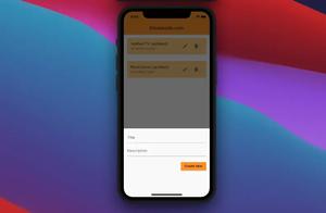
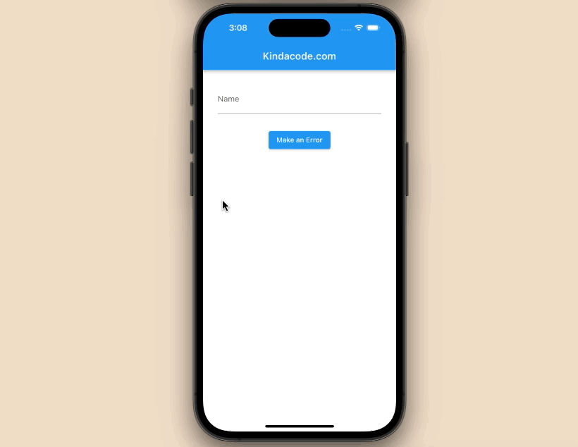
Example Preview
The app we are going to make has a text field and a button. In the beginning, the underline is grey and thin. When the text field gets focused, the underline will become purple and its thickness will grow.
The purpose of the button is to create a fake error. When the button is pressed:
- The underline’s color will be red if it’s still focused (we use focusedErrorBorder for this)
- The underline’s color will be yellow if it loses focus (we use errorBorder for this)
A quick demo is worth more than a thousand words:
The code
Customizing an individual TextField
The code below applies the settings for a single TextField:
// main.dart
import 'package:flutter/material.dart';

void main() {
  runApp(const MyApp());
}

class MyApp extends StatelessWidget {
  const MyApp({Key? key}) : super(key: key);

  @override
  Widget build(BuildContext context) {
    return const MaterialApp(
      // Remove the debug banner
      debugShowCheckedModeBanner: false,
      title: 'Kindacode.com',
      home: HomePage(),
    );
  }
}

class HomePage extends StatefulWidget {
  const HomePage({Key? key}) : super(key: key);

  @override
  State<HomePage> createState() => _HomePageState();
}

class _HomePageState extends State<HomePage> {
  String? _errorText;

  @override
  Widget build(BuildContext context) {
    return Scaffold(
      appBar: AppBar(
        title: const Text('Kindacode.com'),
      ),
      body: Padding(
        padding: const EdgeInsets.all(30),
        child: Column(
          children: [
            TextField(
              decoration: InputDecoration(
                labelText: 'Name',
                hintText: 'Enter your name',
                errorText: _errorText,
                // Enabled Border
                enabledBorder: const UnderlineInputBorder(
                  borderSide: BorderSide(color: Colors.grey),
                ),
                // Focused Border
                focusedBorder: const UnderlineInputBorder(
                  borderSide: BorderSide(color: Colors.purple, width: 5),
                ),
                // Error Border
                errorBorder: const UnderlineInputBorder(
                  borderSide: BorderSide(color: Colors.yellow, width: 5),
                ),
                // Focused Error Border
                focusedErrorBorder: const UnderlineInputBorder(
                  borderSide: BorderSide(color: Colors.red, width: 5),
                ),
              ),
            ),
            const SizedBox(
              height: 30,
            ),
            // The purpose of this button is to create a mocking error
            ElevatedButton(
                onPressed: () {
                  setState(() {
                    _errorText = 'Something went wrong!';
                  });
                },
                child: const Text('Make an Error'))
          ],
        ),
      ),
    );
  }
}
Using inputDecorationTheme
You can also use inputDecorationTheme to apply your settings for the entire app, like so:
// main.dart
import 'package:flutter/material.dart';

void main() {
  runApp(const MyApp());
}

class MyApp extends StatelessWidget {
  const MyApp({Key? key}) : super(key: key);

  @override
  Widget build(BuildContext context) {
    return MaterialApp(
      // Remove the debug banner
      debugShowCheckedModeBanner: false,
      title: 'Kindacode.com',
      theme: ThemeData(
          inputDecorationTheme: const InputDecorationTheme(
        enabledBorder: UnderlineInputBorder(
          borderSide: BorderSide(color: Colors.grey),
        ),
        focusedBorder: UnderlineInputBorder(
          borderSide: BorderSide(color: Colors.purple, width: 5),
        ),
        errorBorder: UnderlineInputBorder(
          borderSide: BorderSide(color: Colors.yellow, width: 5),
        ),
        focusedErrorBorder: UnderlineInputBorder(
          borderSide: BorderSide(color: Colors.red, width: 5),
        ),
      )),
      home: const HomePage(),
    );
  }
}

class HomePage extends StatefulWidget {
  const HomePage({Key? key}) : super(key: key);

  @override
  State<HomePage> createState() => _HomePageState();
}

class _HomePageState extends State<HomePage> {
  String? _errorText;

  @override
  Widget build(BuildContext context) {
    return Scaffold(
      appBar: AppBar(
        title: const Text('Kindacode.com'),
      ),
      body: Padding(
        padding: const EdgeInsets.all(30),
        child: Column(
          children: [
            TextField(
              decoration: InputDecoration(
                labelText: 'Name',
                hintText: 'Enter your name',
                errorText: _errorText,
              ),
            ),
            const SizedBox(
              height: 30,
            ),
            ElevatedButton(
                onPressed: () {
                  setState(() {
                    _errorText = 'Something went wrong!';
                  });
                },
                child: const Text('Make an Error'))
          ],
        ),
      ),
    );
  }
}
Conclusion
The customizations mentioned in this article are applicable to both TextField and TextFormField. Hope they match your needs. Keep moving and continue learning by taking a look at the following articles:
- Flutter: Add a Character Counter to TextField
- How to create a Filter/Search ListView in Flutter
- Flutter form validation example
- Working with dynamic Checkboxes in Flutter
- Flutter + Firebase Storage: Upload, Retrieve, and Delete files
You can also check out our Flutter topic page or Dart topic page for the latest tutorials and examples.