


This article is about the Slider widget in Flutter. We will explore the fundamentals of this widget and walk through a complete example of using it in practice.
Table of Contents
A Brief Overview
The Slider widget creates a material design slider that is used to select a single value from a range of values (if you want to make an iOS-style slider, see Flutter CupertinoSlider). You can implement it with the following constructor:
Slider({
  Key? key,
  required double value,
  required ValueChanged<double>? onChanged,
  ValueChanged<double>? onChangeStart,
  ValueChanged<double>? onChangeEnd,
  double min = 0.0,
  double max = 1.0,
  int? divisions,
  String? label,
  Color? activeColor,
  Color? inactiveColor,
  Color? thumbColor,
  MouseCursor? mouseCursor,
  SemanticFormatterCallback? semanticFormatterCallback,
  FocusNode? focusNode,
  bool autofocus = false
})
If you prefer an adaptive slider, use this one:
Slider.adaptive({
  Key? key,
  required double value,
  required ValueChanged<double>? onChanged,
  ValueChanged<double>? onChangeStart,
  ValueChanged<double>? onChangeEnd,
  double min = 0.0,
  double max = 1.0,
  int? divisions,
  String? label,
  MouseCursor? mouseCursor,
  Color? activeColor,
  Color? inactiveColor,
  Color? thumbColor,
  SemanticFormatterCallback? semanticFormatterCallback,
  FocusNode? focusNode,
  bool autofocus = false
})
In general, we often care about value, onChanged, min, max, and label the most.
The Example
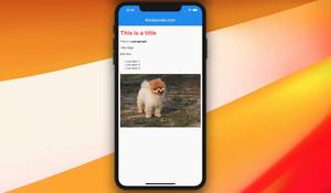
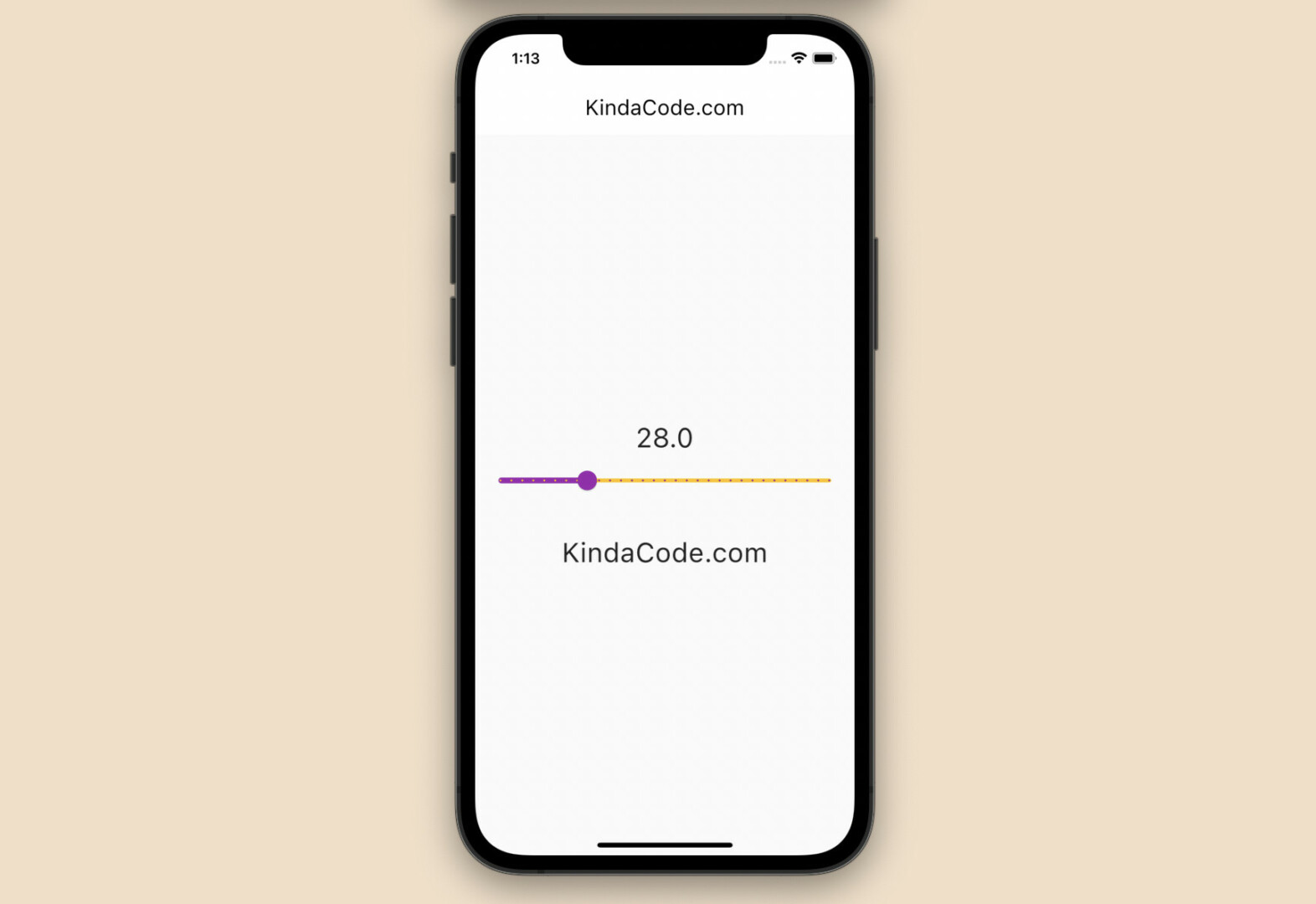
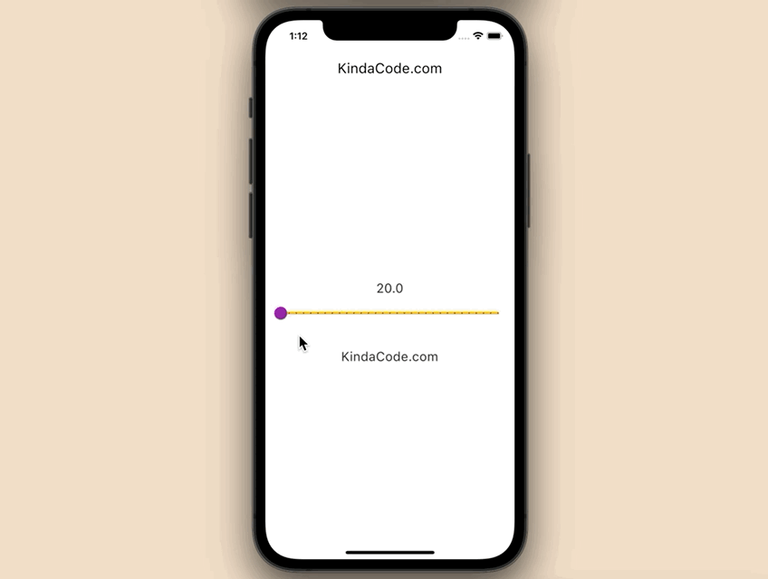
App Preview
The app we are going to build contains a slider and a text widget in the center of the screen. You can use the slider to change the font size of the text. Here’s how it works:
The Code
The complete code in main.dart:
// main.dart
import 'package:flutter/material.dart';

void main() {
  runApp(const MyApp());
}

class MyApp extends StatelessWidget {
  const MyApp({Key? key}) : super(key: key);

  @override
  Widget build(BuildContext context) {
    return MaterialApp(
      debugShowCheckedModeBanner: false,
      title: 'KindaCode.com',
      theme: ThemeData(
        // neable Material 3
        useMaterial3: true,
        primarySwatch: Colors.green,
      ),
      home: const HomePage(),
    );
  }
}

class HomePage extends StatefulWidget {
  const HomePage({Key? key}) : super(key: key);

  @override
  State<HomePage> createState() => _HomePageState();
}

class _HomePageState extends State<HomePage> {
  // The font size of the text
  // This can be changed by the slider
  double _fontSize = 20;

  @override
  Widget build(BuildContext context) {
    return Scaffold(
      appBar: AppBar(
        title: const Text('KindaCode.com'),
      ),
      body: Column(
        mainAxisAlignment: MainAxisAlignment.center,
        children: [
          Text(
            _fontSize.toString(),
            style: TextStyle(fontSize: _fontSize),
          ),
          Slider(
              value: _fontSize,
              min: 20,
              max: 50,
              divisions: 30,
              label: _fontSize.toString(),
              activeColor: Colors.purple,
              inactiveColor: Colors.amber,
              onChanged: (value) {
                setState(() {
                  _fontSize = value;
                });
              }),
          const SizedBox(
            height: 30,
          ),
          Text(
            'KindaCode.com',
            style: TextStyle(fontSize: _fontSize),
          )
        ],
      ),
    );
  }
}
Conclusion
You’ve learned how to create a material slider that allows your users to select a value from a range. If you’d like to explore more new and exciting things about Flutter and mobile development, take a look at the following articles:
- Flutter: Firing multiple Futures at the same time with FutureGroup
- Flutter & Dart: 3 Ways to Generate Random Strings
- Flutter: How to Draw a Heart with CustomPaint
- Flutter: Stream.periodic example
- 2 Ways to Create Flipping Card Animation in Flutter
- Flutter: DropdownButton Example
You can also check out our Flutter category page or Dart category page for the latest tutorials and examples.


