

This article shows you how to create a button with a loading indicator inside. You can write code from scratch or make use of a third-party plugin to get the job done.
Using self-written code
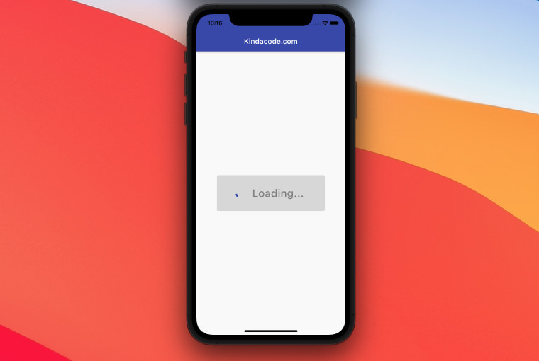
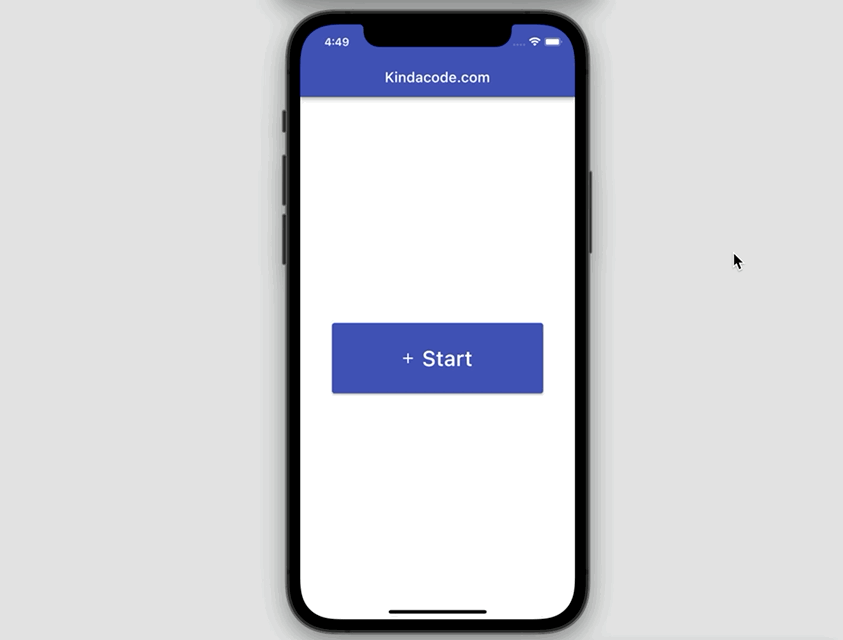
Example Preview
The tiny app we are going to build has a button in the center of the screen. When the button is pressed, it will be disabled and a progress indicator will show up. It also happens that the word “Start” will be replaced by “Loading”. This process will last for 3 seconds.
The Code
Full source code in main.dart with explanations:
// KindaCode.com
// main.dart
import 'package:flutter/material.dart';

void main() {
  runApp(const MyApp());
}

class MyApp extends StatelessWidget {
  const MyApp({Key? key}) : super(key: key);

  @override
  Widget build(BuildContext context) {
    return MaterialApp(
        // Remove the debug banner
        debugShowCheckedModeBanner: false,
        title: 'Kindacode.com',
        theme: ThemeData(
          primarySwatch: Colors.indigo,
        ),
        home: const HomePage());
  }
}

class HomePage extends StatefulWidget {
  const HomePage({Key? key}) : super(key: key);

  @override
  State<HomePage> createState() => _HomePageState();
}

class _HomePageState extends State<HomePage> {
  // The indicator will show up when _isLoading = true.
  // The button will be unpressable, too.
  bool _isLoading = false;

  // This function will be triggered when the button is pressed
  void _startLoading() async {
    setState(() {
      _isLoading = true;
    });

    // Wait for 3 seconds
    // You can replace this with your own task like fetching data, proccessing images, etc
    await Future.delayed(const Duration(seconds: 3));

    setState(() {
      _isLoading = false;
    });
  }

  @override
  Widget build(BuildContext context) {
    return Scaffold(
      appBar: AppBar(
        title: const Text('Kindacode.com'),
      ),
      body: Center(
        child: ElevatedButton.icon(
          icon: _isLoading
              ? const CircularProgressIndicator()
              : const Icon(Icons.add),
          label: Text(
            _isLoading ? 'Loading...' : 'Start',
            style: const TextStyle(fontSize: 30),
          ),
          onPressed: _isLoading ? null : _startLoading,
          style: ElevatedButton.styleFrom(fixedSize: const Size(300, 100)),
        ),
      ),
    );
  }
}
Using a 3rd plugin
There are several packages that can help us do the same thing as the example above. Even though making a loading button doesn’t require a lot of code, many developers prefer to use out-of-the-box solutions. Here are some good choices:
- round_loading_button (500+ likes)
- progress_state_button (330+ likes)
Conclusion
We’ve examined a complete example of implementing an elevated button with a loading indicator inside. If you’d like to explore more new and interesting stuff in Flutter, take a look at the following articles:
- Flutter: FilteringTextInputFormatter Examples
- Flutter: Floating Action Button examples (basic & advanced)
- Flutter: Caching Network Images for Big Performance gains
- Flutter: ValueListenableBuilder Example
- Flutter: 2 Ways to Make a Dark/Light Mode Toggle
- Using GetX (Get) for State Management in Flutter
You can also take a tour around our Flutter topic page and Dart topic page to see the latest tutorials and examples.


