


In Flutter, the CircularProgressIndicator widget, as its name implies, helps you implement a circle progress indicator that lets the user know that something is loading. This widget doesn’t ship options to set its size like width, height, radius, etc. In fact, the size of a CircularProgressIndicator depends on its parent. So, we can adjust the size of a CircularProgressIndicator by simply using a Container or a SizedBox widget.
Note: It would be best if you give the Container or SizedBox a width equal to the height. If the width and height are different, the CircularProgressIndicator will become an ellipse. If you place a CircularProgressIndicator in a Center widget or a Container widget with alignment, the size of CircularProgress will be as minimal as possible regardless of its parent’s size.
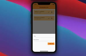
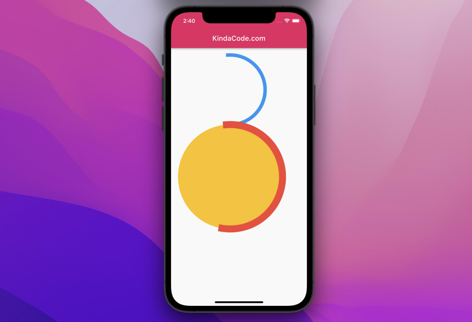
Example Preview:
The Code:
Scaffold(
      appBar: AppBar(title: const Text('KindaCode.com')),
      body: Padding(
        padding: const EdgeInsets.all(20),
        child: Column(
          children: [
            const SizedBox(
              width: 200,
              height: 200,
              child: CircularProgressIndicator(
                color: Colors.blue,
                strokeWidth: 10,
              ),
            ),
            Container(
              width: 300,
              height: 300,
              decoration: const BoxDecoration(
                  shape: BoxShape.circle, color: Colors.amber),
              child: const CircularProgressIndicator(
                color: Colors.red,
                strokeWidth: 20,
              ),
            )
          ],
        ),
      ),
);
Further reading:
- How to Create Rounded ListTile in Flutter
- Dart & Flutter: Convert a Duration to HH:mm:ss format
- Flutter: Creating Transparent/Translucent App Bars
- Viewing PDF files in Flutter
- Flutter and Firestore Database: CRUD example
- How to implement a loading dialog in Flutter
You can also take a tour around our Flutter topic page and Dart topic page to see the latest tutorials and examples.


