

This succinct and straight-to-the-point article shows you how to create accordions (collapsible content) with only Tailwind CSS (without any Javascript).
Table of Contents
Overview
In the world of web development, an accordion can be expanded or collapsed to show or hide long content. It consists of a header (or summary section) that displays a brief title and a body that contains detailed information. A user can click on the header to toggle between hiding and showing the body.
By using two HTML tags <summary> and <details> in combination with Tailwind CSS, we can make interactive and vivid accordions from scratch. With the open modifier, we can conditionally add styles when a <details> element is in the open state.
If you get bored with this instruction, see the practical example below.
Example
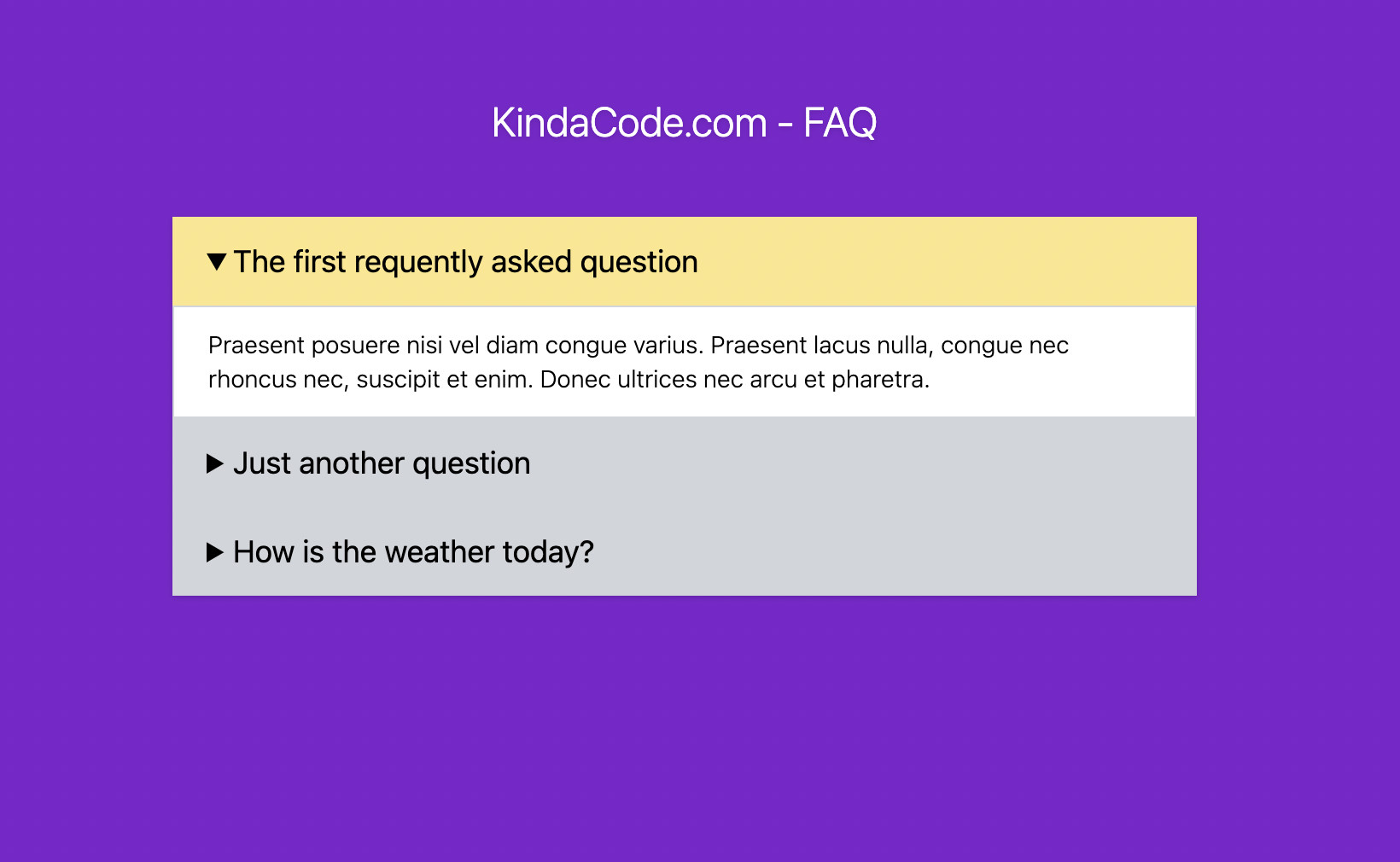
Preview
This example creates a FAQ (frequently asked questions) section, which can be found on mode websites today.
The Code
<body class="bg-purple-700">
    <div class="mx-auto my-20 w-[600px] drop-shadow rounded-md">
        <h1 class="text-2xl font-italic font-light text-center text-white mb-10">KindaCode.com - FAQ</h1>

        <!-- The First FAQ -->
        <details class="bg-gray-300 open:bg-amber-200 duration-300">
            <summary class="bg-inherit px-5 py-3 text-lg cursor-pointer">The first requently asked question</summary>
            <div class="bg-white px-5 py-3 border border-gray-300 text-sm font-light">
                <p>Praesent posuere nisi vel diam congue varius. Praesent lacus nulla, congue nec rhoncus nec,
                    suscipit et enim. Donec ultrices nec arcu et pharetra.</p>
            </div>
        </details>

        <!-- The Second FAQ -->
        <details class="bg-gray-300 open:bg-amber-200 duration-300">
            <summary class="bg-inherit px-5 py-3 text-lg cursor-pointer">Just another question</summary>
            <div class="bg-white px-5 py-3 border border-gray-300 text-sm font-light">
                <p>Just some dummy content. Just some dummy content. Just some dummy content. Just some dummy content
                    Just some dummy content. Just some dummy content</p>
            </div>
        </details>

        <!-- The Third FAQ -->
        <details class="bg-gray-300 open:bg-amber-200 duration-300">
            <summary class="bg-inherit px-5 py-3 text-lg cursor-pointer">How is the weather today?</summary>
            <div class="bg-white px-5 py-3 border border-gray-300 text-sm font-light">
                <ul>
                    <li>List Item 1</li>
                    <li>List Item 2</li>
                </ul>
            </div>
        </details>

    </div>
</body>
Conclusion
You’ve learned how to create expansible/collapsible content with Tailwind CSS. This technique is useful when you want to present a large amount of information but still want to save space. If you’d like to explore more new and interesting stuff about frontend development, take a look at the following articles:
- Form Validation with Tailwind CSS (without Javascript)
- Styling a Login Page with Tailwind CSS
- Min-Width, Max-Width, Min-Height, and Max-Height in Tailwind CSS
- Tailwind CSS: Creating Shimmer Loading Placeholder (Skeleton)
- Tailwind CSS: Create a Fixed/Sticky Footer Menu
- Tailwind CSS: How to Create Parallax Scrolling Effect
You can also check out our CSS category page for the latest tutorials and examples.