


This article walks you through a couple of different examples of styling the placeholder text of an input/textarea field by using the ::placeholder pseudo-element in CSS.
Table of Contents
Example 1
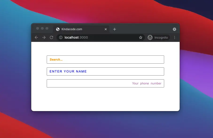
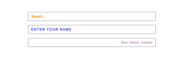
In most browsers, placeholder text is light grey by default. In Firefox, the default opacity of the placeholder is less than 1. In this example, we will customize many properties of the placeholder text, such as color, font style, font weight, alignment, etc.
HTML code:
<!DOCTYPE html>
<html lang="en">
  <head>
    <meta charset="UTF-8" />
    <meta http-equiv="X-UA-Compatible" content="IE=edge" />
    <meta name="viewport" content="width=device-width, initial-scale=1.0" />
    <link rel="stylesheet" href="style.css" />
    <title>Kindacode.com</title>
  </head>
  <body>
    <div class="container">
      <input type="search" class="input1" placeholder="Search..." />
      <input type="text" class="input2" placeholder="Enter your name" />
      <input type="tel"  class="input3" placeholder="Your phone number" />
    </div>
  </body>
</html>
CSS code:
.container {
  margin: 50px auto;
  width: 500px;
}

.input1, .input2, .input3 {
 margin: 8px 0;
 width: 500px;
 padding: 8px 10px;
 box-sizing: border-box;
}

/* Styling the placeholder text */
.input1::placeholder {
  color: orange;
  font-style: italic;
  font-weight: bold;
}
.input2::placeholder {
  color: blue;
  text-transform: uppercase;
  letter-spacing: 2px;
}
.input3::placeholder {
 color: purple;
 opacity: 0.5;
 word-spacing: 4px;
 text-align: right;
}
Result
Note: Even though ::placeholder works on all major modern browsers, it isn’t supported by old ones like Internet Explorer.
Example 2
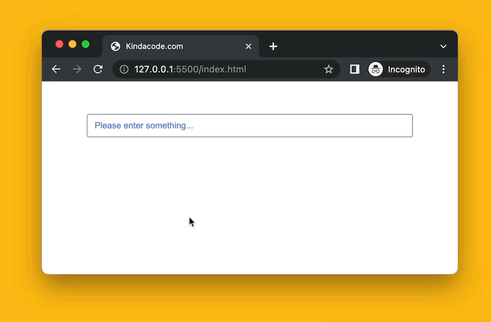
In this example, the style of the placeholder text depends on the state of the input. Initially, the placeholder text will be royal blue. When the input is hovered, the placeholder text will be orange-red and uppercase. When the input is focused, the placeholder text becomes invisible.
Preview:
HTML code:
<!DOCTYPE html>
<html lang="en">
  <head>
    <meta charset="UTF-8" />
    <meta http-equiv="X-UA-Compatible" content="IE=edge" />
    <meta name="viewport" content="width=device-width, initial-scale=1.0" />
    <title>Kindacode.com</title>
    <link rel="stylesheet" href="style.css" />
  </head>
  <body>
    <div class="container">
      <input type="search" class="input" placeholder="Please enter something..." />
    </div>
  </body>
</html>
CSS code:
.container {
  margin: 50px auto;
  width: 500px;
}

.input {
 width: 500px;
 padding: 8px 10px;
}

.input::placeholder {
  color: royalblue;
  opacity: 0.9;
}

.input:hover::placeholder {
  color: orangered;
  text-transform: uppercase;
}

.input:focus::placeholder {
  opacity: 0;
}
Example 3
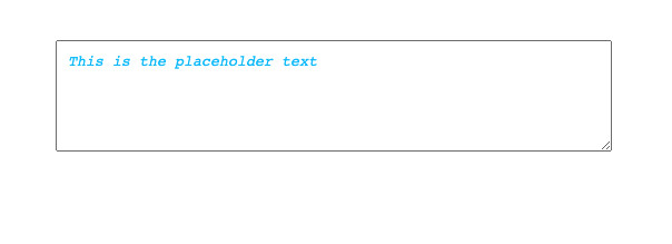
This example styles the placeholder text of a textarea element.
The full code (HTML is mixed with CSS):
<!DOCTYPE html>
<html lang="en">
  <head>
    <meta charset="UTF-8" />
    <meta http-equiv="X-UA-Compatible" content="IE=edge" />
    <meta name="viewport" content="width=device-width, initial-scale=1.0" />
    <title>Kindacode.com</title>

    <style>
     .container {
       margin: 50px auto;
       width: 500px;
     }

     textarea {
       width: 500px;
       height: 100px;
       box-sizing: border-box;
       padding: 10px;
     }

     textarea::placeholder {
       color: deepskyblue;
       font-style: italic;
     }

    </style>

  </head>
  <body>
    <div class="container">
      <textarea placeholder="This is the placeholder text"></textarea>
    </div>
  </body>
</html>
Result:
Conclusion
We’ve gone over a few examples of styling the placeholder text of an input or textarea element. If you would like to learn more about HTML/CSS and other frontend stuff, take a look at the following articles:
- CSS: Make a search field with a magnifying glass icon inside
- CSS: Adjust the Gap between Text and Underline
- CSS @keyframes Examples
- Most popular React Component UI Libraries
- CSS Flexbox: Make an Element Fill the Remaining Space
You can also check out our CSS category page for the latest tutorials and examples.