
This succinct, practical article shows you how to create responsive and adaptive user interfaces in Tailwind CSS.
Table of Contents
Overview
You can style responsive elements by using the following mobile-first breakpoint prefix system:
| Breakpoint Prefix | Minimum width |
|---|---|
| sm | 640px |
| md | 768px |
| lg | 1024px |
| xl | 1280px |
| 2xl | 1536px |
With a breakpoint prefix stays at the beginning, a utility will only make impact from a certain viewport size. For example: md:bg-red-500 only creates a red background when the viewport width is equal or greater than 768px.
When styling a component for mobile, you need to use the unprefixed version of a utility, not the sm prefix.
For more clarity, please see the complete example below.
Example
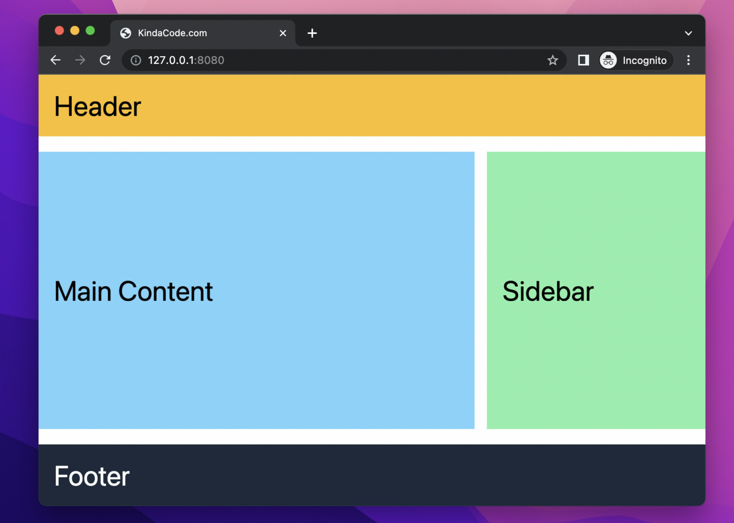
Preview
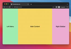
This example will create a typical web layout consisting of header, main content, sidebar, and footer. When the screen is small, the main content and sidebar will be in one column. When the screen is 768px or larger, they will be next to each other horizontally. In addition, the font size also changes at breakpoint 768px.
The Code
<body>
    <header class="bg-amber-400 p-5">
        <h1 class="text-2xl md:text-4xl">Header</h1>
    </header>

    <div class="bg-white my-5 w-full flex flex-col space-y-4 md:flex-row md:space-x-4 md:space-y-0">
        <main class="bg-sky-300 md:w-2/3 lg:w-3/4 px-5 py-40">
            <h1 class="text-2xl md:text-4xl">Main Content</h1>
        </main>
        <aside class="bg-green-300 md:w-1/3 lg:w-1/4 px-5 py-40">
            <h1 class="text-2xl md:text-4xl">Sidebar</h1>
        </aside>
    </div>

    <footer class="bg-slate-800 mt-auto p-5">
        <h1 class="text-2xl md:text-4xl text-white">Footer</h1>
    </footer>
</body>
Conclusion
You’ve learned how to build responsive user interfaces with the breakpoint system of Tailwind CSS and applied that knowledge in a practical example. If you’d like to explore more new and interesting stuff about modern frontend development, take a look at the following articles:
- Tailwind CSS: How to Create Parallax Scrolling Effect
- Tailwind CSS: Creating Shimmer Loading Placeholder (Skeleton)
- Tailwind CSS: Create a Search Field with an Icon Inside
- Tailwind CSS: Create a User Card with Circle Avatar
- How to Create a Fixed Sidebar with Tailwind CSS
- How to Create Frosted Glass Effect in Tailwind CSS
You can also check out our CSS category page for the latest tutorials and examples.