

A fixed/sticky footer will always be present and visible to the user no matter where they are on the page. In Tailwind CSS, you can implement a fixed footer navigation menu by combining the fixed utility class with the bottom-0 (set bottom position to 0) and left-0 (set left position to 0) utility classes.
Below is a complete example that demonstrates this approach.
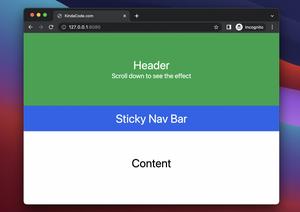
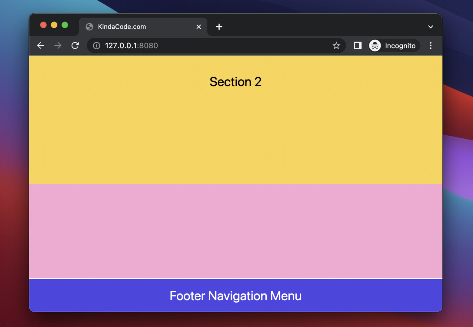
Example preview:
Note: If you’re using Safari, this demo video might not work nicely or not start at all. Please use Chrome, Edge, Firefox, or another web browser instead.
The full code:
<!doctype html>
<html>

<head>
    <meta charset="UTF-8">
    <meta name="viewport" content="width=device-width, initial-scale=1.0">
    <script src="https://cdn.tailwindcss.com"></script>
    <title>KindaCode.com</title>
</head>

<body>
    <div>
        <header class="w-full h-16 bg-red-700 text-white flex justify-center items-center">
            Header
        </header>
        <main>
            <div class="w-full h-96 bg-sky-300 flex justify-center items-center text-2xl">Section 1</div>
            <div class="w-full h-96 bg-amber-300 flex justify-center items-center text-2xl">Section 2</div>
            <div class="w-full h-96 bg-pink-300 flex justify-center items-center text-2xl">Section 3</div>
        </main>
        <footer class="w-full h-16 bg-indigo-600 border-t-2 border-white
            fixed left-0 bottom-0
            flex justify-center items-center
            text-white text-2xl
            ">
            Footer Navigation Menu
        </footer>
    </div>
</body>

</html>
That’s if. Further reading:
- Tailwind CSS: How to Create a Sticky/Affix NavBar
- How to Create a Fixed Sidebar with Tailwind CSS
- Tailwind CSS: Style an Element Based on Its Sibling’s State
- Tailwind CSS: How to Create Parallax Scrolling Effect
- How to Zoom on Hover with Tailwind CSS (the easiest approach)
- How to Create Striped Tables with Tailwind CSS
You can also check out our CSS category page for the latest tutorials and examples.