

This article walks you through a couple of different examples of using @keyframes to create animation in CSS.
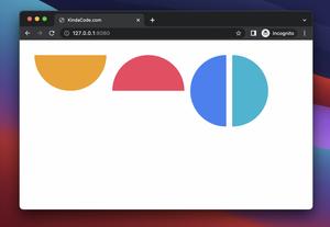
The Moving Box
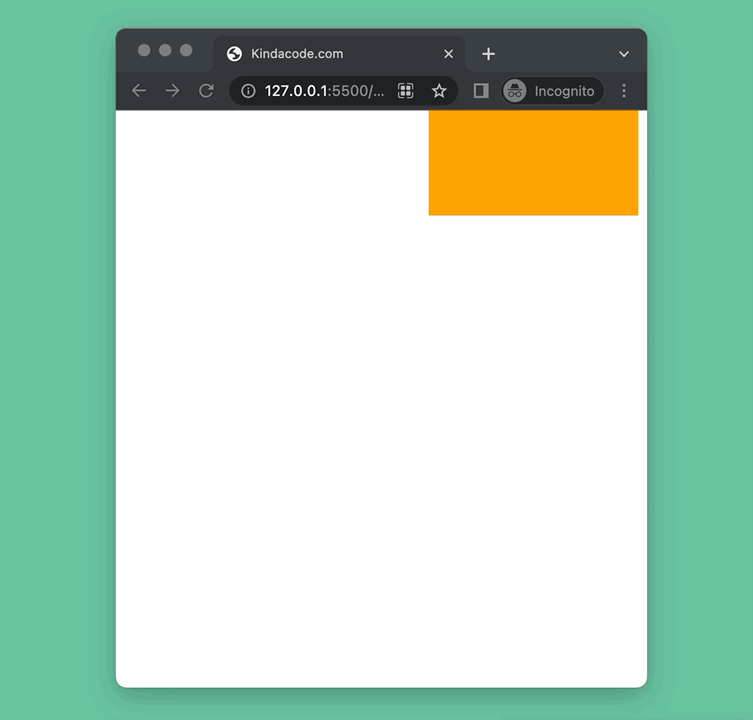
This example will create a box that moves in a rectangular orbit. Besides the change in position, the size and color of the box also change.
Preview:
The code:
<!DOCTYPE html>
<html lang="en">
<head>
<meta charset="UTF-8" />
<meta http-equiv="X-UA-Compatible" content="IE=edge" />
<meta name="viewport" content="width=device-width, initial-scale=1.0" />
<title>Kindacode.com</title>
<style>
.box {
width: 100px;
height: 100px;
background: red;
position: absolute;
animation: move 5s infinite;
}
@keyframes move {
0% {
top: 0px;
left: 0px;
background: red;
width: 100px;
height: 100px;
}
25% {
top: 0px;
left: 300px;
background: orange;
width: 200px;
height: 100px;
}
50% {
top: 300px;
left: 300px;
background: yellow;
width: 100px;
height: 200px;
}
75% {
top: 300px;
left: 0px;
background: green;
width: 200px;
height: 200px;
}
100% {
top: 0px;
left: 0px;
background: red;
width: 100px;
height: 100px;
}
}
</style>
</head>
<body>
<div class="box"></div>
</body>
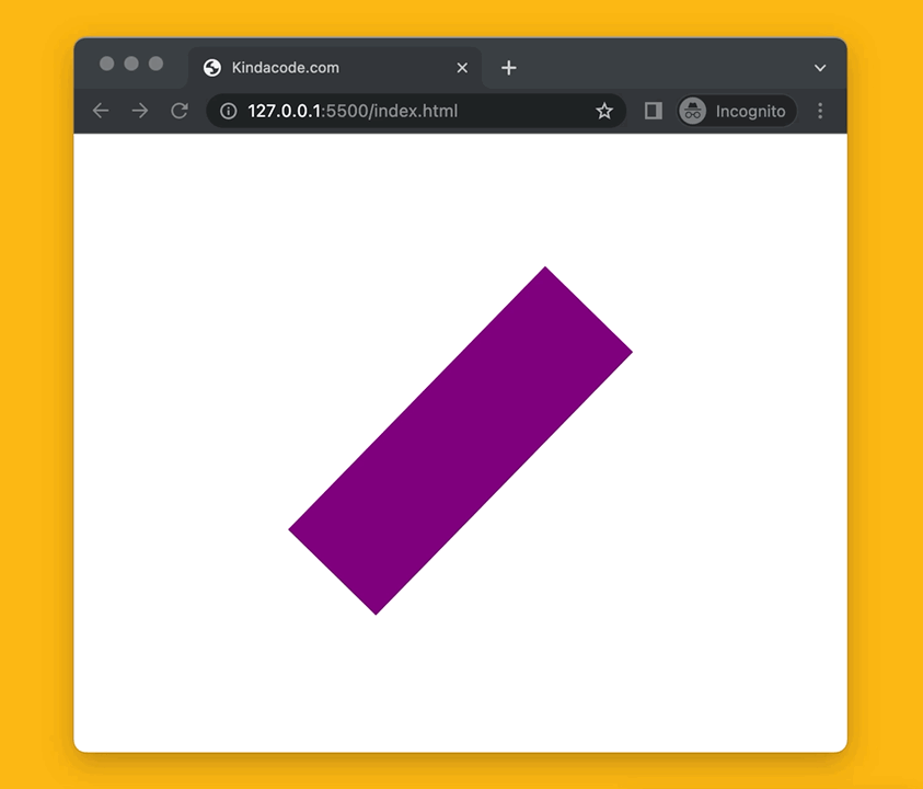
</html>Spinning Animation
Preview:
The code:
<!DOCTYPE html>
<html lang="en">
  <head>
    <meta charset="UTF-8" />
    <meta http-equiv="X-UA-Compatible" content="IE=edge" />
    <meta name="viewport" content="width=device-width, initial-scale=1.0" />
    <title>Kindacode.com</title>
    <style>
      .box {
        margin: 100px auto;
        width: 100px;
        height: 300px;
        background: purple;
        animation: spin 2s infinite;
      }

      @keyframes spin {
        from {
          transform: rotate(0deg);
        }
        to {
          transform: rotate(360deg);
        }
      }
    </style>
  </head>
  <body>
    <div class="box"></div>
  </body>
</html>
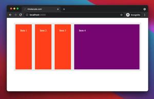
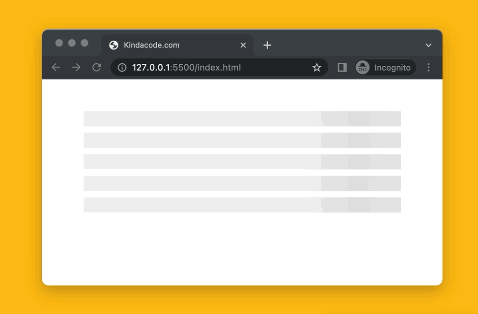
Loading Placeholder (Skeleton/Shimmer)
A content loading placeholder is used to take the place when the content is being loaded. You can see them appear on many famous platforms such as Facebook, Youtube, Netflix, Reddit, Quora, etc.
Preview:
The code:
<!DOCTYPE html>
<html lang="en">
  <head>
    <meta charset="UTF-8" />
    <meta http-equiv="X-UA-Compatible" content="IE=edge" />
    <meta name="viewport" content="width=device-width, initial-scale=1.0" />
    <title>Kindacode.com</title>

    <style>
      @keyframes loading {
        0% {
          background-position: -500px 0;
        }
        100% {
          background-position: 500px 0;
        }
      }

      .content {
        margin: 50px auto;
        max-width: 500px;
      }

      .placeholder {
        margin-bottom: 10px;

        animation-duration: 1.25s;
        animation-fill-mode: forwards;
        animation-iteration-count: infinite;
        animation-name: loading;
        animation-timing-function: linear;

        background: linear-gradient(
          to right,
          #eeeeee 10%,
          #dddddd 18%,
          #eeeeee 33%
        );
        background-size: 1000px 104px;
        height: 24px;
        position: relative;
      }
    </style>

  </head>
  <body>
    <div class="content">
      <div class="placeholder"></div>
      <div class="placeholder"></div>
      <div class="placeholder"></div>
      <div class="placeholder"></div>
      <div class="placeholder"></div>
    </div>
  </body>
</html>
Conclusion
We’ve gone over a few examples of using @keyframes to create animation in CSS. If you’d like to learn more new and interesting stuff about frontend development, take a look at the following articles:
- CSS: Make a search field with a magnifying glass icon inside
- CSS Circle Button Examples
- Javascript: 5 ways to create a new array from an old array
- Javascript: Get current date time as 20xx/00/00 00:00:00 format
- 5 best open-source WYSIWYG editors for React
You can also check out our CSS category page for the latest tutorials and examples.