


A sticky navbar (or an affix navbar) is a navbar that fixates to the top of the page when you scroll past it. This practical article walks you through a complete example of creating a navbar like so with Bootstrap 5.
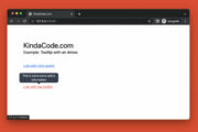
Example Preview
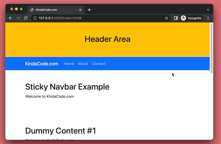
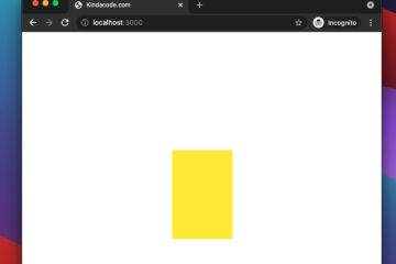
The demo webpage we’re going to make contains a header section, a blue navbar, and some dummy content. When the header is visible, the navbar moves like other elements when you scroll down. However, as soon as the header is off-screen, the navbar is fixed on the viewport’s top.
A GIF is worth more than thousands of words:
The Code
The main point here is to add the sticky-top class to the navbar to make it sticky. Below is the complete code (with explanations) for the example:
<!DOCTYPE html>
<head>
<meta charset="UTF-8">
<meta http-equiv="X-UA-Compatible" content="IE=edge">
<meta name="viewport" content="width=device-width, initial-scale=1.0">
<link href="https://cdn.jsdelivr.net/npm/[email protected]/dist/css/bootstrap.min.css" rel="stylesheet"
crossorigin="anonymous">
<title>KindaCode.com</title>
</head>
<body>
<!-- Header section -->
<header class="header py-5 bg-warning">
<div class="container">
<h1 class="text-center">Header Area</h1>
</div>
</header>
<!-- Implement the Navbar -->
<nav class="navbar navbar-expand-sm sticky-top navbar-dark bg-primary">
<div class="container">
<!-- Replace this with your own logo -->
<a class="navbar-brand" href="https://www.kindacode.com">KindaCode.com</a>
<!-- Toggler/collapsibe Button for small screens -->
<button class="navbar-toggler" type="button" data-bs-toggle="collapse" data-bs-target="#myList"
aria-controls="myList" aria-expanded="false" aria-label="Toggle navigation">
<span class="navbar-toggler-icon"></span>
</button>
<!-- List of links -->
<div class="collapse navbar-collapse" id="myList">
<ul class="navbar-nav">
<li class="nav-item active">
<a class="nav-link" href="#">Home</a>
</li>
<li class="nav-item">
<a class="nav-link" href="#">About</a>
</li>
<li class="nav-item">
<a class="nav-link" href="#">Contact</a>
</li>
</ul>
</div>
</div>
</nav>
<!-- Just some dummy content -->
<div class="container">
<div class="py-5">
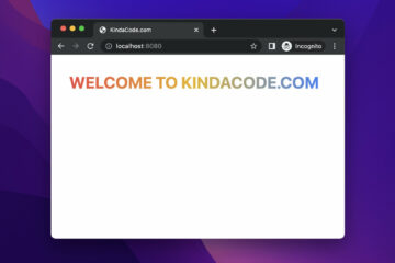
<h1>Sticky Navbar Example</h1>
<p>Welcome to KindaCode.com</p>
</div>
<div class="py-5">
<h1>Dummy Content #1</h1>
<p>Welcome to KindaCode.com</p>
</div>
<div class="py-5">
<h1>Dummy Content #2</h1>
<p>Welcome to KindaCode.com</p>
</div>
<div class="py-5">
<h1>Dummy Content #3</h1>
<p>Welcome to KindaCode.com</p>
</div>
<div class="py-5">
<h1>Dummy Content #4</h1>
<p>Welcome to KindaCode.com</p>
</div>
</div>
<!-- Bootstrap Javascript bundle -->
<script src="https://cdn.jsdelivr.net/npm/[email protected]/dist/js/bootstrap.bundle.min.js"
crossorigin="anonymous"></script>
</body>
</html>That’s it. Further reading:
- Bootstrap 5: Vertically Center an Element inside a Div
- How to Use Bootstrap 5 and Bootstrap Icons in React
- Bootstrap 5: How to Create Icon Buttons with Text
- Bootstrap 5: Card Examples
- CSS: Adjust the Gap between Text and Underline
You can also check out our CSS category page for the latest tutorials and examples.


nice