


A tooltip is a simple text popup tip that will be shown when the user’s mouse hovers over an element and is hidden when the mouse leaves. This succinct article walks you through a complete example that shows you how to create tooltips with Tailwind CSS. No Javascript is required.
Table of Contents
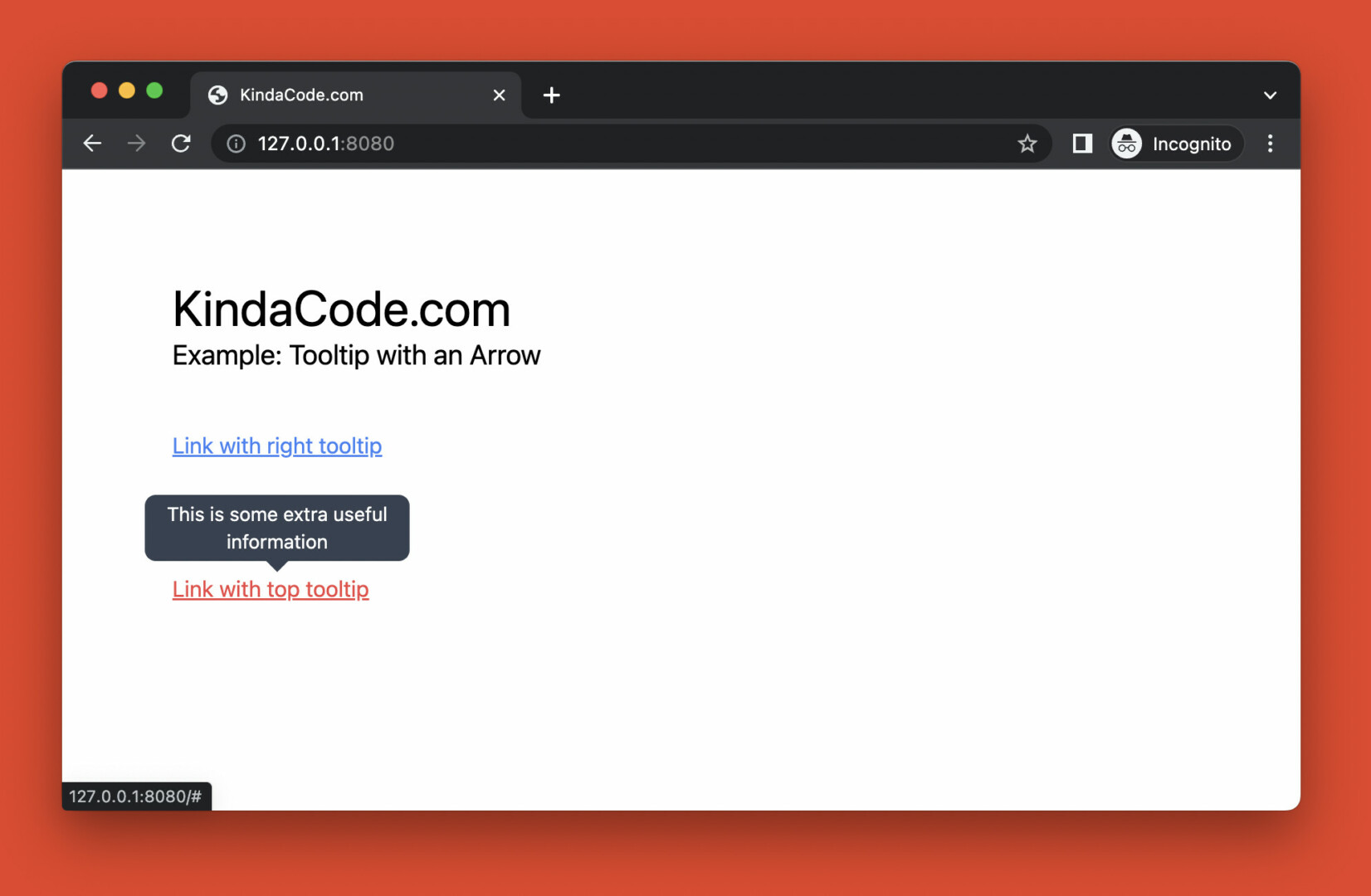
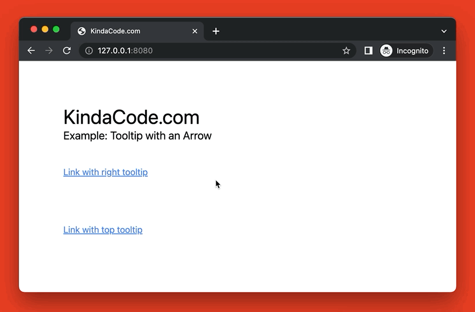
Preview
This example displays 2 links. When the user’s mouse hovers over the first one, a tooltip with a left arrow will show up on the right side. When the user’s mouse hovers over the second link, a tooltip with a down arrow will appear on the top side.
Here’s how the work:
The Code
Below is the code that produces the example above:
<body class="p-20">
    <h1 class="text-4xl">KindaCode.com</h1>
    <h3 class="text-xl">Example: Tooltip with an Arrow</h3>

    <!-- The right tooltip -->
    <div>
        <a href="#" class="mt-10 group relative inline-block text-blue-500 underline hover:text-red-500 duration-300">
            Link with right tooltip
            <!-- Tooltip text here -->
            <span
                class="absolute hidden group-hover:flex -top-2 -right-3 translate-x-full w-48 px-2 py-1 bg-gray-700 rounded-lg text-center text-white text-sm before:content-[''] before:absolute before:top-1/2  before:right-[100%] before:-translate-y-1/2 before:border-8 before:border-y-transparent before:border-l-transparent before:border-r-gray-700">This
                is some extra useful information</span>
        </a>
    </div>

    <!-- The top tooltip -->
    <div class="mt-20">
        <a href="#" class="group relative inline-block text-blue-500 underline hover:text-red-500 duration-300">
            Link with top tooltip
            <!-- Tooltip text here -->
            <span
                class="absolute hidden group-hover:flex -left-5 -top-2 -translate-y-full w-48 px-2 py-1 bg-gray-700 rounded-lg text-center text-white text-sm after:content-[''] after:absolute after:left-1/2 after:top-[100%] after:-translate-x-1/2 after:border-8 after:border-x-transparent after:border-b-transparent after:border-t-gray-700">This
                is some extra useful information</span>
        </a>
    </div>

</body>
Explanation
All the tooltips are hidden by default (thanks to the hidden utility). When a link gets hovered, the associated tooltip will show up. Here’s the underlying mechanism:
- The group class was added to the <a> element
- The group-hover modifier was used in the <span> element that nested in the <a> element
To create the down arrow and the left arrow, we use the before and after pseudo-elements. They have no content but thick borders. All of the side borders are transparent except the right one (the left arrow) and the top one (the down arrow).
Here’s the utilities classes were used to create the left arrow in the first tooltip:
before:content-[''] before:absolute before:top-1/2 before:right-[100%] before:-translate-y-1/2 before:border-8 before:border-y-transparent before:border-l-transparent before:border-r-gray-700And here’re what was used to make the down arrow:
after:content-[''] after:absolute after:left-1/2 after:top-[100%] after:-translate-x-1/2 after:border-8 after:border-x-transparent after:border-b-transparent after:border-t-gray-700If you are still confused about the arrow trick, see this article: How to Create Triangles with Tailwind CSS (4 Examples).
Conclusion
You’ve learned how to create tooltips with Tailwind CSS. Try to modify the code, change some utility classes, adjust some values, remove some things, and add some things to see what happens or make the results fit your needs.
If you’d like to explore more new and interesting stuff about modern frontend technologies, take a look at the following articles:
- Tailwind CSS: Creating a Read More/Read Less Button
- Tailwind CSS: Create Image Hover Overlay Effects
- Tailwind CSS: How to Create a Back To Top Button
- How to Create Toggleable Tabs with Tailwind CSS
- Tailwind CSS: Create an Image Carousel/Slideshow
- How to Create a Hero Image with Tailwind CSS
You can also check out our CSS category page for the latest tutorials and examples.