

This practical article shows you how to create a toggle switch by using Tailwind CSS. No Javascript or any other libraries are required. Let’s see the code and discover the trick behind the scene.
Table of Contents
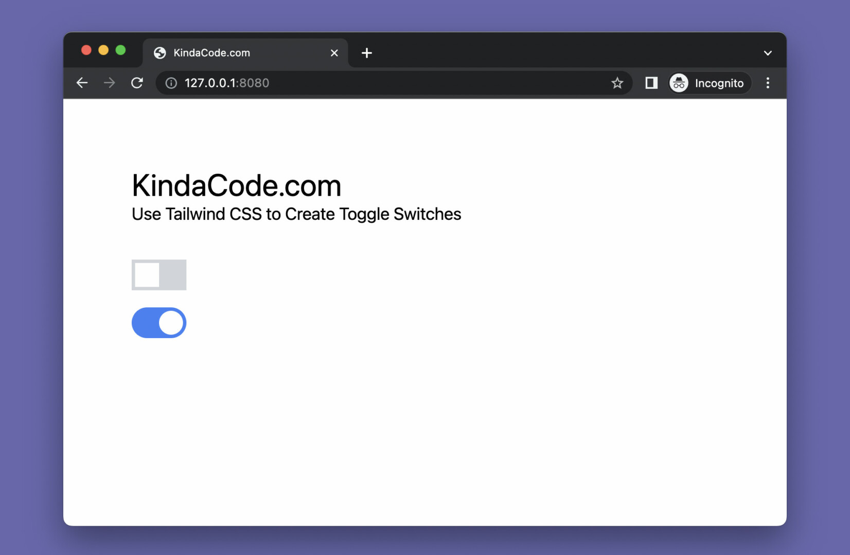
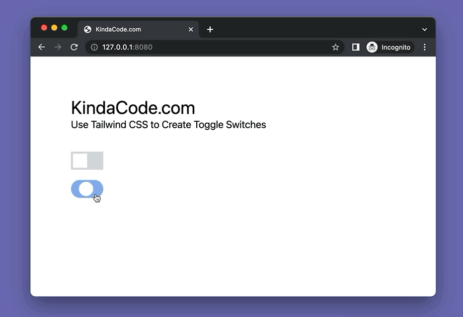
Example Preview
We’re going to implement 2 toggle switches. The first one is in a rectangular shape while the second one is in a rounded shape. When a switch is off, its background is light gray. When it is one, the background is blue.
Here’s how they work in action:
The Code
Here’s the full source code that produces the webpage you see in the demo:
<!doctype html>
<html>

<head>
    <meta charset="UTF-8">
    <meta name="viewport" content="width=device-width, initial-scale=1.0">
    <meta http-equiv="X-UA-Compatible" content="ie=edge">
    <script src="https://cdn.tailwindcss.com"></script>
    <title>KindaCode.com</title>
</head>

<body class="p-20">
    <h1 class="text-4xl">KindaCode.com</h1>
    <h3 class="mb-10 text-xl">Use Tailwind CSS to Create Toggle Switches</h3>

    <!-- Rectangular switch -->
    <div>
        <label class="relative inline-block w-16 h-9">
            <input type="checkbox" class="peer opacity-0 w-0 h-0">
            <span class="absolute cursor-pointer top-0 left-0 right-0 bottom-0 bg-gray-300 duration-300 before:content-[''] before:absolute before:w-7 before:h-7 before:bottom-1 before:left-1
                before:bg-white before:duration-300 peer-checked:before:translate-x-7 peer-checked:bg-blue-500"></span>
        </label>
    </div>

    <!-- Rounded switch -->
    <div class="mt-5">
        <label class="relative inline-block w-16 h-9 rounded-full">
            <input type="checkbox" class="peer opacity-0 w-0 h-0">
            <span class="absolute cursor-pointer top-0 left-0 right-0 bottom-0 bg-gray-300 rounded-full duration-300 before:content-[''] before:absolute before:w-7 before:h-7 before:bottom-1 before:left-1 before:rounded-full
                before:bg-white before:duration-300 peer-checked:before:translate-x-7 peer-checked:bg-blue-500"></span>
        </label>
    </div>

</body>

</html>
Explanation
The main point to creating a toggle switch is a label element and an invisible checkbox with zero width (w-0), zero height (h-0), and zero opacity (thanks to the opacity-0 utility class) as well.
If the checkbox is unchecked it means the toggle switch is off. And vice versa, when the checkbox is checked, the toggle switch’s state is on.
We create the track by using a span element. We create the thumb (the white controller) by using the before pseudo-element. To change the background color of the span element based on the state of the checkbox, we add the peer class to the checkbox and use the peer-checked modifier with the bg-blue-500 utility for the span.
Conclusion
You’ve learned how to create toggle switches by using only Tailwind CSS. The code you need to write isn’t too long and the underlying logic isn’t too complicated. You can modify the code, adjust some values, add some things, and remove some things to make the result fit your needs.
If you’d like to explore more new and interesting stuff about modern web frontend technologies, take a look at the following articles:
- Tailwind CSS: Creating a Read More/Read Less Button
- Tailwind CSS: How to Create a Mega Menu
- Tailwind CSS: How to Create a Full-Screen Overlay Menu
- Tailwind CSS: Use a Checkbox to Show/Hide an Element
- Tailwind CSS: Custom Checkboxes and Radio Buttons
- How to Style the HR Element with Tailwind CSS
You can also check out our CSS category page for the latest tutorials and examples.