

The steps below show you how to create a cut-out text effect with Tailwind CSS.
1. Prepare HTML markup:
<div>
   <h1>KindaCode.com</h1>
</div>
2. Set an image background for the div element. We can do this by using inline styles or creating a class in an external CSS file. For simplicity’s sake, we’ll go with the first option:
<div style="background: url(https://www.kindacode.com/wp-content/uploads/2022/05/sample-background.jpeg)"
        class="m-20">
        <h1>KindaCode.com</h1>
</div>
We use the m-20 utility to add some margin.
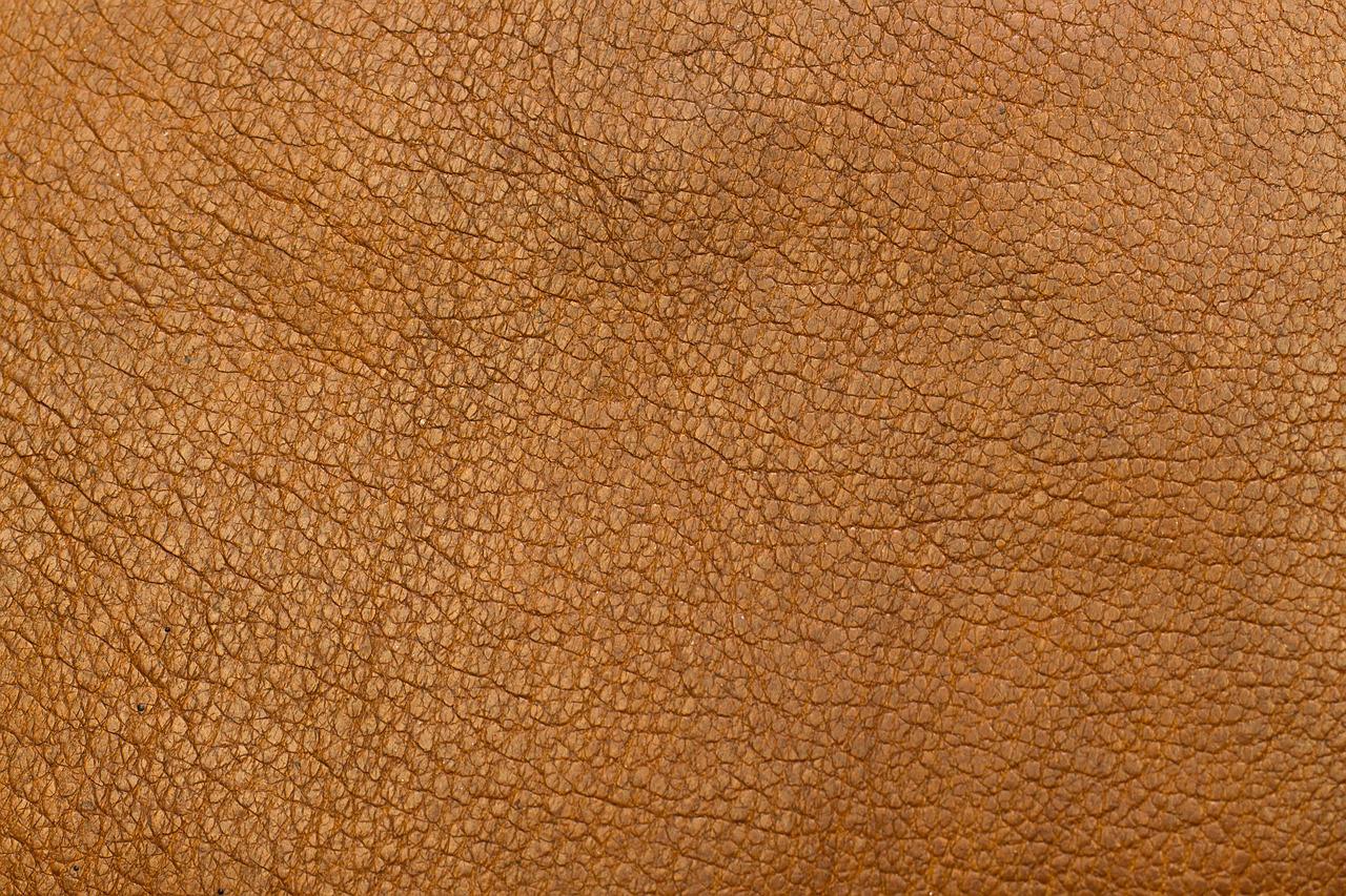
Here’s the image:
3. Now we make the cut-out text effect just by using mix-blend-lighten and bg-white utilities:
<div style="background: url(https://www.kindacode.com/wp-content/uploads/2022/05/sample-background.jpeg)"
        class="m-20">
        <h1 class="text-center text-7xl font-extrabold mix-blend-lighten bg-white uppercase">
            KindaCode.com</h1>
</div>
The text-center, text-7xl, and font-extrabold utilities make the text look clearer.
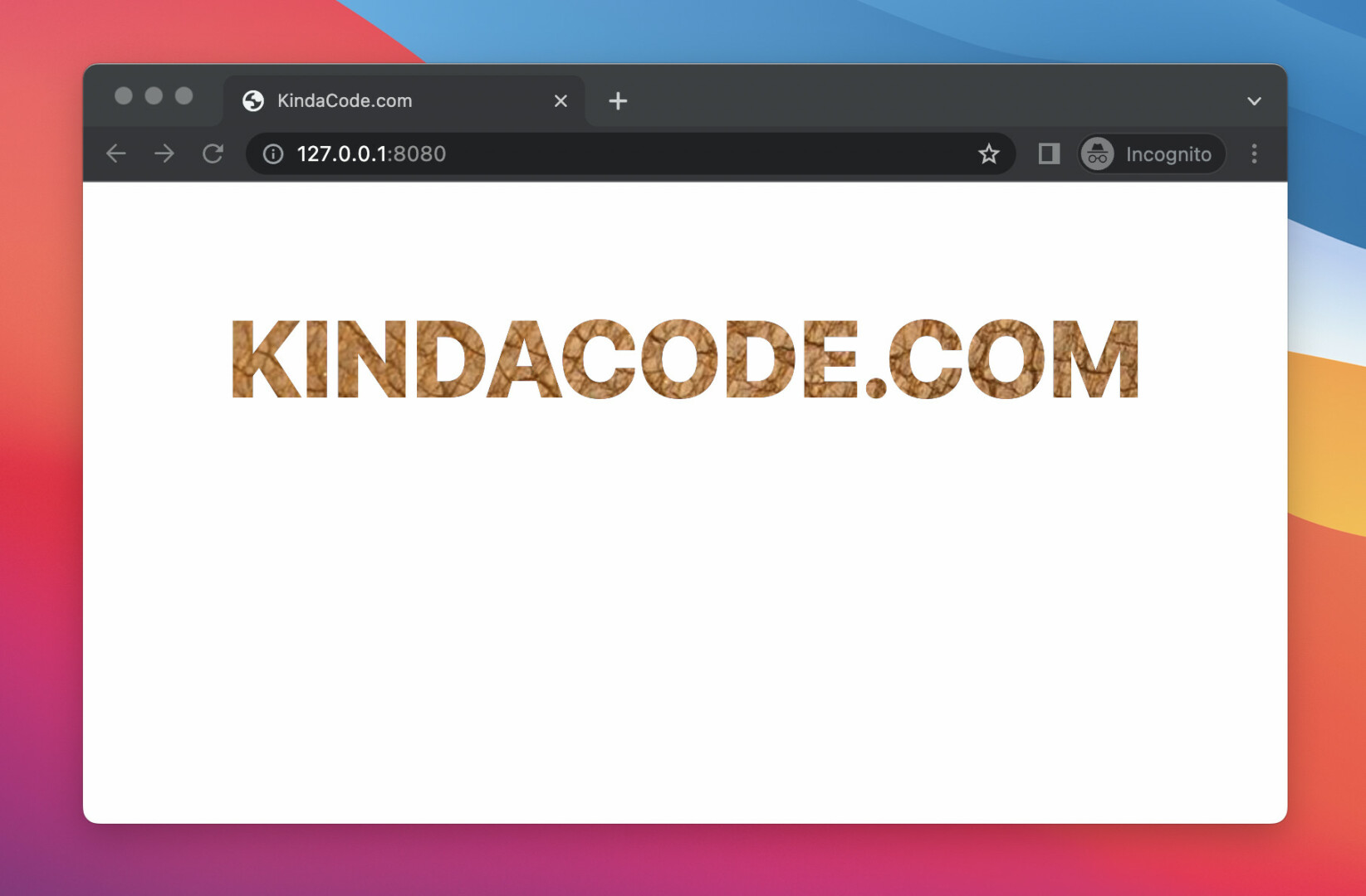
The final result:
The full source code:
<!doctype html>
<html>

<head>
    <meta charset="UTF-8">
    <meta name="viewport" content="width=device-width, initial-scale=1.0">
    <script src="https://cdn.tailwindcss.com"></script>
    <title>KindaCode.com</title>
</head>

<body>
    <div style="background: url(https://www.kindacode.com/wp-content/uploads/2022/05/sample-background.jpeg)"
        class="m-20">
        <h1 class="text-center text-7xl font-extrabold mix-blend-lighten bg-white uppercase">
            KindaCode.com</h1>
    </div>
</body>

</html>
Further reading:
- How to Zoom on Hover with Tailwind CSS (the easiest approach)
- Tailwind CSS: Make a Div 100% Height & Width of the Viewport
- Tailwind CSS: How to Create Gradient Text
- How to Create Circle Buttons with Tailwind CSS
- Displaying Toast Messages with Tailwind CSS
- Tailwind CSS: Create a Responsive Top Navigation Menu
You can also check out our CSS category page for the latest tutorials and examples.