

This succinct, practical article walks you through a complete example of creating a responsive top navigation menu with Tailwind CSS and a little vanilla Javascript (just a few lines of Javascript code). Without any further ado, let’s get started.
Table of Contents
Example
Preview
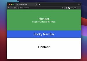
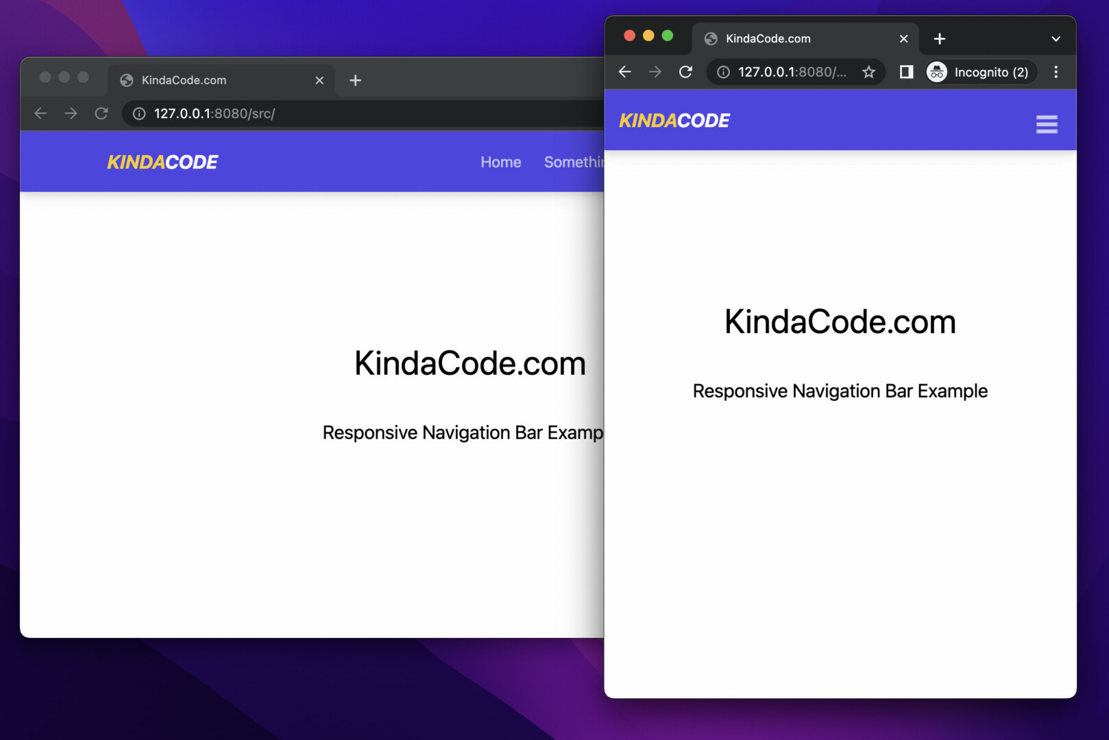
The small project we’re going to build has a top bar and some dummy content. The top nav contains a site logo and a menu with links.
- If the screen width is equal to or more than 768px (the md breakpoint), the menu will be displayed on the right side and the links are on a row.
- If the screen width is smaller than 768px, the menu will be hidden but a hamburger icon will appear. You can use this hamburger icon to open the menu. On mobile, the menu background is dark gray. It can be closed with an X button.
Words might be confusing and hard to follow. Here’s how it works in action:
The Code
The full source code of the example (with explanations in comments):
<!doctype html>
<html>
<head>
<meta charset="UTF-8">
<meta name="viewport" content="width=device-width, initial-scale=1.0">
<meta http-equiv="X-UA-Compatible" content="ie=edge">
<script src="https://cdn.tailwindcss.com"></script>
<title>KindaCode.com</title>
</head>
<body>
<header class="w-full h-16 bg-indigo-600 drop-shadow-lg">
<div class="container px-4 md:px-0 h-full mx-auto flex justify-between items-center">
<!-- Logo Here -->
<a class="text-yellow-400 text-xl font-bold italic" href="https://www.kindacode.com">KINDA<span
class="text-white">CODE</span></a>
<!-- Menu links here -->
<ul id="menu" class="hidden fixed top-0 right-0 px-10 py-16 bg-gray-800 z-50
md:relative md:flex md:p-0 md:bg-transparent md:flex-row md:space-x-6">
<li class="md:hidden z-90 fixed top-4 right-6">
<a href="javascript:void(0)" class="text-right text-white text-4xl"
onclick="toggleMenu()">×</a>
</li>
<li>
<a class="text-white opacity-70 hover:opacity-100 duration-300" href="#">Home</a>
</li>
<li>
<a class="text-white opacity-70 hover:opacity-100 duration-300" href="#">Something</a>
</li>
<li>
<a class="text-white opacity-70 hover:opacity-100 duration-300" href="#">Forums</a>
</li>
<li>
<a class="text-white opacity-70 hover:opacity-100 duration-300" href="#">About</a>
</li>
<li>
<a class="text-white opacity-70 hover:opacity-100 duration-300" href="#">Contact</a>
</li>
</ul>
<!-- This is used to open the menu on mobile devices -->
<div class="flex items-center md:hidden">
<button class="text-white text-4xl font-bold opacity-70 hover:opacity-100 duration-300"
onclick="toggleMenu()">
☰
</button>
</div>
</header>
<main>
<h1 class="mt-40 text-4xl text-center">KindaCode.com</h1>
<h2 class="mt-10 text-xl text-center">Responsive Navigation Bar Example</h2>
</main>
<!-- Javascript Code -->
<script>
var menu = document.getElementById('menu');
function toggleMenu() {
menu.classList.toggle('hidden');
menu.classList.toggle('w-full');
menu.classList.toggle('h-screen');
}
</script>
</body>
</html>Conclusion
You’ve examined an end-to-end example of making a responsive header menu with Tailwind CSS and vanilla Javascript. You can modify the code, add something, remove something, and change something to make it suit your needs.
If you’d like to explore more new and interesting stuff about modern web development, take a look at the following articles:
- Tailwind CSS: How to Create a Stepper
- How to Create Pill Buttons with Tailwind CSS
- Using :not() selector in Tailwind CSS
- How to Style a Pagination with Tailwind CSS
- Tailwind CSS: Create a Fixed/Sticky Footer Menu
- Tailwind CSS: Create an Animated & Closable Side Menu
You can also check out our CSS category page for the latest tutorials and examples.