
This succinct and straight-to-the-point article shows you how to create a modal dialog with Tailwind CSS and vanilla Javascript (just a few lines of JS code).
Overview
In general, when we show a dialog, we also display an overlay layer. This overlay will stay behind the dialog but cover the rest of the page. We’ll give it the position fixed and the width and height of the full screen (w-screen and h-screen utility classes, respectively).
A typical dialog usually has a title, a body, and a button that allows the user to close the dialog. To center the dialog both vertically and horizontally, we add these utilities: top-1/2, left-1/2, -translate-x-1/2, -translate-y-1/2.
For more clarity, see the complete example below.
Example
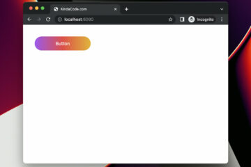
Preview
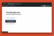
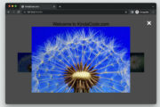
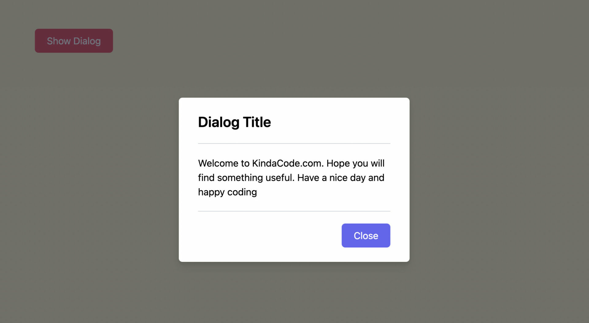
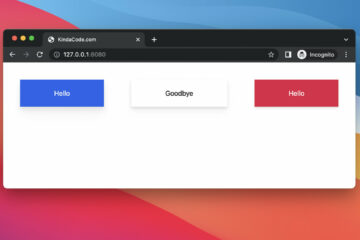
The sample webpage we’re going to make has a button. When a user clicks this button, the overlay and the dialog will show up. The overlay has a dark gray background color with a certain transparency. This helps the user to focus on the dialog only. In the bottom right corner of the dialog, there is a button that can be used to close the dialog as well as hide the overlay.
Here’s how it works:
The Code
The full code with explanations:
<!doctype html>
<html>

<head>
    <meta charset="UTF-8">
    <meta name="viewport" content="width=device-width, initial-scale=1.0">
    <meta http-equiv="X-UA-Compatible" content="ie=edge">
    <script src="https://cdn.tailwindcss.com"></script>
    <title>KindaCode.com</title>
</head>

<body class="p-20 bg-amber-100">

    <!-- This button is used to open the dialog -->
    <button id="open" class="px-5 py-2 bg-rose-500 hover:bg-rose-700 text-white cursor-pointer rounded-md">
        Show Dialog
    </button>

    <!-- Overlay element -->
    <div id="overlay" class="fixed hidden z-40 w-screen h-screen inset-0 bg-gray-900 bg-opacity-60"></div>

    <!-- The dialog -->
    <div id="dialog"
        class="hidden fixed z-50 top-1/2 left-1/2 -translate-x-1/2 -translate-y-1/2 w-96 bg-white rounded-md px-8 py-6 space-y-5 drop-shadow-lg">
        <h1 class="text-2xl font-semibold">Dialog Title</h1>
        <div class="py-5 border-t border-b border-gray-300">
            <p>Welcome to KindaCode.com. Hope you will find something useful. Have a nice day and happy coding</p>
        </div>
        <div class="flex justify-end">
            <!-- This button is used to close the dialog -->
            <button id="close" class="px-5 py-2 bg-indigo-500 hover:bg-indigo-700 text-white cursor-pointer rounded-md">
                Close</button>
        </div>
    </div>

    <!-- Javascript code -->
    <script>
        var openButton = document.getElementById('open');
        var dialog = document.getElementById('dialog');
        var closeButton = document.getElementById('close');
        var overlay = document.getElementById('overlay');

        // show the overlay and the dialog
        openButton.addEventListener('click', function () {
            dialog.classList.remove('hidden');
            overlay.classList.remove('hidden');
        });

        // hide the overlay and the dialog
        closeButton.addEventListener('click', function () {
            dialog.classList.add('hidden');
            overlay.classList.add('hidden');
        });
    </script>
</body>

</html>
Conclusion
You’ve learned how to implement a modal dialog with Tailwind CSS and pure Javascript. If you’d like to explore more new and fascinating things about modern frontend development, take a look at the following articles:
- Tailwind CSS: Custom Checkboxes and Radio Buttons
- Tailwind CSS: Light/Dark theme based on system settings
- Form Validation with Tailwind CSS (without Javascript)
- Tailwind CSS: How to create accordions (collapsible content)
- Styling a Login Page with Tailwind CSS
- Tailwind CSS: How to use calc() function
You can also check out our CSS category page for the latest tutorials and examples.


is there a reason why the dialog is outside overlay?
Exactly what I needed, thank you!