
Tailwind CSS provides grid utilities that are handy for creating responsive layouts with rows and columns. This tutorial article walks you through a couple of examples of using Tailwind’s grid system in action.
A Brief Overview
Here are the main points:
- The parent container must go with the grid class
- To specify n equal-sized columns in the grid, use the grid-cols-{n} utility
- To specify n equal-sized rows in the grid, use the grid-rows-{n} utility
- To create implicitly-created grid columns, use one of these utilities: auto-cols-auto, auto-cols-min, auto-cols-max, auto-cols-fr
- To create grid auto rows, use one of these utilities: auto-rows-auto, auto-rows-min, auto-rows-max, auto-rows-fr
- To add spaces between both rows and columns, use the gap-{size} utilities. To add spaces horizontally or vertically, use the gap-x-{size} or gap-y-{size} utility, respectively
Words might be rambling and not easy to understand, especially for people who are not familiar to CSS. See the examples below for more clarity.
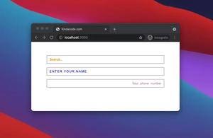
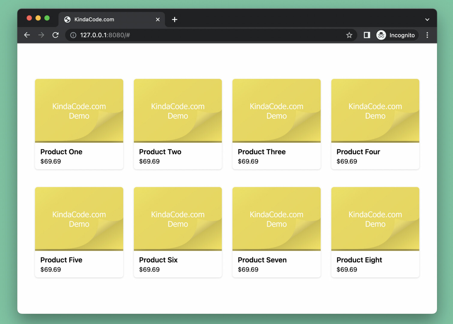
Responsive Product Grid
Preview
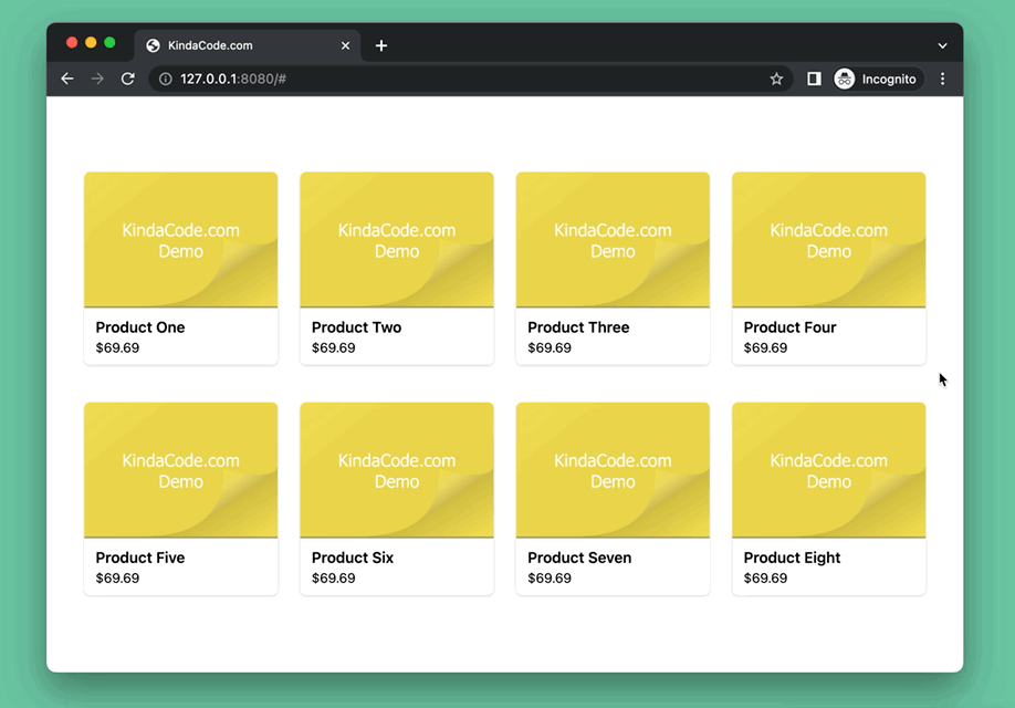
This example creates a responsive product grid that you can see on the vast majority of e-commerce websites nowadays. The number of columns depends on the screen size:
- If the screen width is less than 640px, the layout only renders a single column
- If the screen width is equal to or greater than 640px (the sm breakpoint), 2 columns are shown
- If the screen width is equal to or greater than 768px (the md breakpoint), 4 columns are shown
Here’s how it works:
The Code
The code seems a little long but most of it is just dummy product cards:
<body class="px-10 py-20">
    <!-- grid container -->
    <div class="grid grid-cols-1 sm:grid-cols-2 md:grid-cols-4 gap-x-6 gap-y-10">
        <!-- product card -->
        <a href="https://www.kindacode.com"
            class="flex flex-col bg-white drop-shadow hover:drop-shadow-lg hover:opacity-70 rounded-md">
            <img src=" https://www.kindacode.com/wp-content/uploads/2022/07/kindacode-example.png" alt="Fiction Product"
                class="h-36 object-cover rounded-tl-md rounded-tr-md">

            <div class="px-3 py-2">
                <h1 class="font-semibold">Product One</h1>
                <p class="text-sm">$69.69</p>
            </div>
        </a>

        <!-- product card -->
        <a href="https://www.kindacode.com"
            class="flex flex-col bg-white drop-shadow hover:drop-shadow-lg hover:opacity-70 rounded-md">
            <img src=" https://www.kindacode.com/wp-content/uploads/2022/07/kindacode-example.png" alt="Fiction Product"
                class="h-36 object-cover rounded-tl-md rounded-tr-md">

            <div class="px-3 py-2">
                <h1 class="font-semibold">Product Two</h1>
                <p class="text-sm">$69.69</p>
            </div>
        </a>

        <!-- product card -->
        <a href="https://www.kindacode.com"
            class="flex flex-col bg-white drop-shadow hover:drop-shadow-lg hover:opacity-70 rounded-md">
            <img src=" https://www.kindacode.com/wp-content/uploads/2022/07/kindacode-example.png" alt="Fiction Product"
                class="h-36 object-cover rounded-tl-md rounded-tr-md">

            <div class="px-3 py-2">
                <h1 class="font-semibold">Product Three</h1>
                <p class="text-sm">$69.69</p>
            </div>
        </a>

        <!-- product card -->
        <a href="https://www.kindacode.com"
            class="flex flex-col bg-white drop-shadow hover:drop-shadow-lg hover:opacity-70 rounded-md">
            <img src=" https://www.kindacode.com/wp-content/uploads/2022/07/kindacode-example.png" alt="Fiction Product"
                class="h-36 object-cover rounded-tl-md rounded-tr-md">

            <div class="px-3 py-2">
                <h1 class="font-semibold">Product Four</h1>
                <p class="text-sm">$69.69</p>
            </div>
        </a>

        <!-- product card -->
        <a href="https://www.kindacode.com"
            class="flex flex-col bg-white drop-shadow hover:drop-shadow-lg hover:opacity-70 rounded-md">
            <img src=" https://www.kindacode.com/wp-content/uploads/2022/07/kindacode-example.png" alt="Fiction Product"
                class="h-36 object-cover rounded-tl-md rounded-tr-md">

            <div class="px-3 py-2">
                <h1 class="font-semibold">Product Five</h1>
                <p class="text-sm">$69.69</p>
            </div>
        </a>

        <!-- product card -->
        <a href="https://www.kindacode.com"
            class="flex flex-col bg-white drop-shadow hover:drop-shadow-lg hover:opacity-70 rounded-md">
            <img src=" https://www.kindacode.com/wp-content/uploads/2022/07/kindacode-example.png" alt="Fiction Product"
                class="h-36 object-cover rounded-tl-md rounded-tr-md">

            <div class="px-3 py-2">
                <h1 class="font-semibold">Product Six</h1>
                <p class="text-sm">$69.69</p>
            </div>
        </a>

        <!-- product card -->
        <a href="https://www.kindacode.com"
            class="flex flex-col bg-white drop-shadow hover:drop-shadow-lg hover:opacity-70 rounded-md">
            <img src=" https://www.kindacode.com/wp-content/uploads/2022/07/kindacode-example.png" alt="Fiction Product"
                class="h-36 object-cover rounded-tl-md rounded-tr-md">

            <div class="px-3 py-2">
                <h1 class="font-semibold">Product Seven</h1>
                <p class="text-sm">$69.69</p>
            </div>
        </a>

        <!-- product card -->
        <a href="https://www.kindacode.com"
            class="flex flex-col bg-white drop-shadow hover:drop-shadow-lg hover:opacity-70 rounded-md">
            <img src=" https://www.kindacode.com/wp-content/uploads/2022/07/kindacode-example.png" alt="Fiction Product"
                class="h-36 object-cover rounded-tl-md rounded-tr-md">

            <div class="px-3 py-2">
                <h1 class="font-semibold">Product Eight</h1>
                <p class="text-sm">$69.69</p>
            </div>
        </a>

    </div>
</body>
Responsive Website Layout
Preview
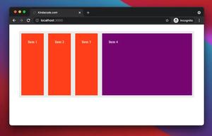
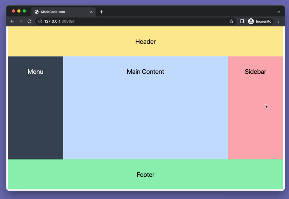
This example creates a common responsive website layout that you can witness on the internet over and over again. We’ll use the col-span-{n} utilities to size columns.
The webpage we’re going to make is constituted of 5 sectors: header, menu, main content, sidebar, and footer. When the screen size is less than 768px (the md breakpoint), it’s all in a single column. When the screen size is greater than or equal to 768px, the menu along with the main content and sidebar are in a horizontal row. Their size in the ratio is 1:3:1.
The Code
The complete source code that produces the demo above:
<!doctype html>
<html>

<head>
    <meta charset="UTF-8">
    <meta name="viewport" content="width=device-width, initial-scale=1.0">
    <meta http-equiv="X-UA-Compatible" content="ie=edge">
    <script src="https://cdn.tailwindcss.com"></script>
    <title>KindaCode.com</title>
</head>

<body>
    <!-- The grid parent -->
    <div class="mx-auto container grid grid-cols-5">
        <!-- Header section -->
        <header class="col-span-5 p-10 bg-amber-200">
            <h1 class="text-center text-2xl">Header</h1>
        </header>

        <!-- Left menu -->
        <aside class="col-span-5 md:col-span-1 p-10 bg-gray-700">
            <h1 class="text-center text-2xl text-white">Menu</h1>
        </aside>

        <!-- Main content -->
        <main class="col-span-5 md:col-span-3 h-96 p-10 bg-blue-200">
            <h1 class="text-center text-2xl">Main Content</h1>
        </main>

        <!-- Right sidebar -->
        <aside class="col-span-5 md:col-span-1 p-10 bg-rose-300">
            <h1 class="text-center text-2xl">Sidebar</h1>
        </aside>

        <!-- Footter -->
        <footer class="col-span-5 p-10 bg-green-300">
            <h1 class="text-center text-2xl">Footer</h1>
        </footer>
    </div>
</body>

</html>
Conclusion
We’ve gone over several examples of building grid layouts with Tailwind CSS. Try to modify the code, change some elements, add some utilities, remove some utilities, and observe what happens. Practice makes perfect.
If you’d like to explore more new and interesting stuff in the modern frontend development world, take a look at the following articles:
- Tailwind CSS: How to Create Tooltips
- Tailwind CSS: Create Toggle Switches without Javascript
- Tailwind CSS: Red Notification Badge with a Count
- Tailwind CSS: Creating a Read More/Read Less Button
- Tailwind CSS: How to Create an Off-Canvas Side Menu
- How to Create Toggleable Tabs with Tailwind CSS
You can also check out our CSS category page for the latest tutorials and examples.