


In Tailwind CSS, you can style custom checkboxes and radio buttons by using an official plugin named @tailwindcss/forms ((it is reliable and well maintained by the same team behind Tailwind CSS).
Installing
Install @tailwindcss/forms by executing the following command in the root directory of your project:
npm i @tailwindcss/formsOpen your tailwind.config.js file and add the plugin like so:
plugins: [
    // add this line
    require('@tailwindcss/forms')
],
If you want to get things ready quickly for learning or development purposes, just insert the following scripts to the <head></head> section of your HTML file:
<script src="https://cdn.tailwindcss.com"></script>
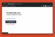
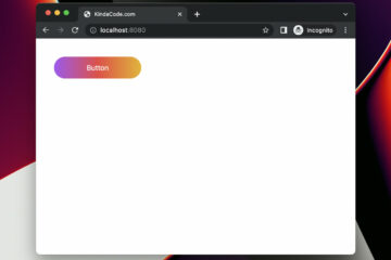
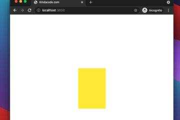
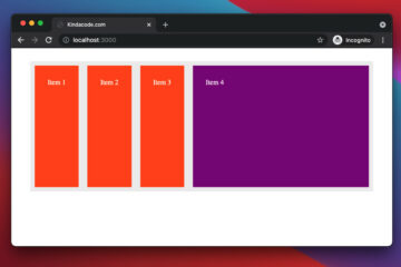
<script src="https://cdn.tailwindcss.com?plugins=forms"></script>Custom Checkboxes Example
Screenshot:
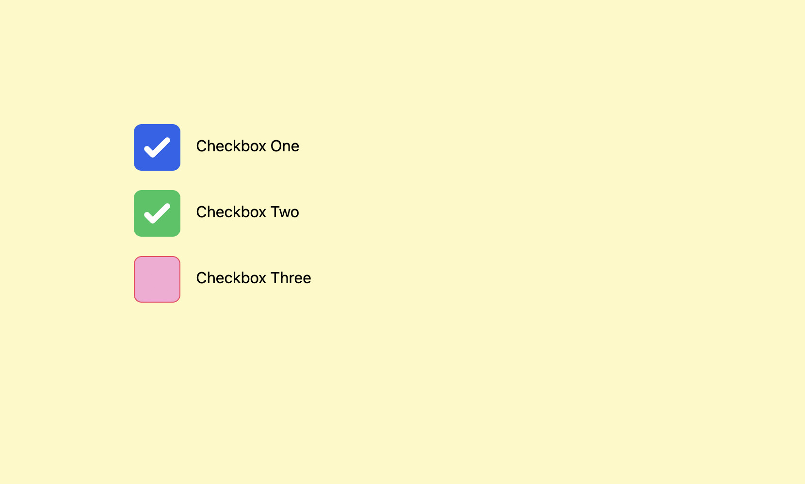
The code:
<body class="p-40 bg-yellow-100">
<form class="space-y-5">
<div>
<input type="checkbox" checked name="checkbox-one" id="checkbox-one" class="bg-gray-200 hover:bg-gray-300 cursor-pointer
w-12 h-12 border-3 border-amber-500 focus:outline-none rounded-lg" />
<label for="checkbox-one" class="ml-3">Checkbox One</label>
</div>
<div>
<input type="checkbox" checked name="checkbox-two" id="checkbox-two" class="bg-amber-200 hover:bg-amber-400 cursor-pointer
w-12 h-12 border-3 border-rose-500 rounded-lg checked:bg-green-500" />
<label for="checkbox-one" class="ml-3">Checkbox Two</label>
</div>
<div>
<input type="checkbox" name="checkbox-three" id="checkbox-three" class="bg-pink-300 hover:bg-pink-400 cursor-pointer
w-12 h-12 border-3 border-rose-500 rounded-lg checked:bg-rose-600" />
<label for="checkbox-one" class="ml-3">Checkbox Three</label>
</div>
</form>
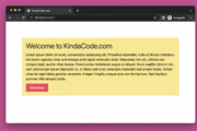
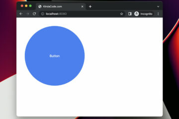
</body>Custom Radio Buttons Example
Screenshot:
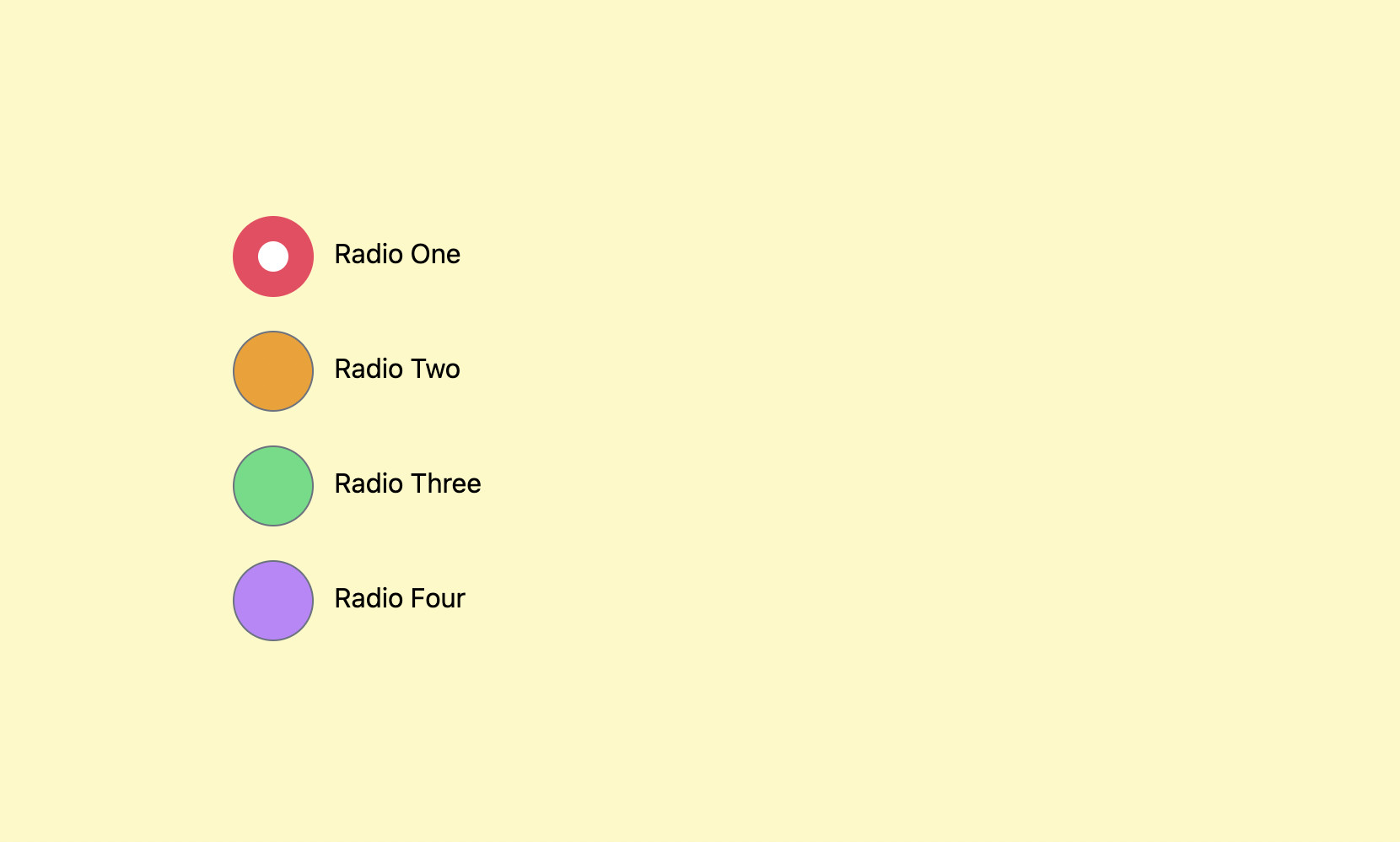
The code:
<body class="p-40 bg-yellow-100">
    <form class="space-y-5">
        <idv>
            <input type="radio" checked="checked" name="radio" id="radio-one"
                class="w-12 h-12 bg-pink-300 checked:bg-rose-500 cursor-pointer" />
            <label for="radio-one" class="ml-2">Radio One</label>
        </idv>

        <div>
            <input type="radio" name="radio" id="radio-two"
                class="w-12 h-12 bg-amber-500 hover:bg-amber-700 checked:bg-rose-500 cursor-pointer" />
            <label for="radio-two" class="ml-2">Radio Two</label>
        </div>

        <div>
            <input type="radio" name="radio" id="radio-three"
                class="w-12 h-12 bg-green-400 hover:bg-yellow-700 checked:bg-rose-500 cursor-pointer" />
            <label for="radio-three" class="ml-2">Radio Three</label>
        </div>

        <div>
            <input type="radio" name="radio" id="radio-four"
                class="w-12 h-12 bg-purple-400 hover:bg-purple-700 checked:bg-rose-500 cursor-pointer" />
            <label for="radio-four" class="ml-2">Radio Four</label>
        </div>
    </form>
</body>
Conclusion
You’ve learned how to make custom checkboxes and radio buttons the fastest and easiest way by making use of the official plugin @tailwindcss/forms. If you’d like to explore more new and interesting stuff about frontend development, take a look at the following articles:
- Styling selected text with Tailwind CSS
- Tailwind CSS: Light/Dark theme based on system settings
- Tailwind CSS: How to create accordions (collapsible content)
- Form Validation with Tailwind CSS (without Javascript)
- Tailwind CSS: Create a Fixed/Sticky Footer Menu
- Tailwind CSS: How to Create a Sticky/Affix NavBar
You can also check out our CSS category page for the latest tutorials and examples.


Thanks