


Buttons are an indispensable part of mobile applications. In Flutter, buttons are rectangular in shape by default. However, in some cases, you may want your buttons to be circular to accentuate and blend in with the surrounding layout best.
This article shows you a few elegant ways to create circular buttons (also called round buttons) in Flutter. Without any further ado, let’s get started.
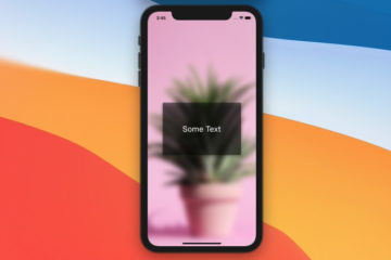
Using ElevatedButton (recommended)
The point here is to give the elevated button an equal width and height, then set its shape to CircleBorder().
Preview:
The code:
ElevatedButton(
onPressed: () {},
style: ElevatedButton.styleFrom(
fixedSize: const Size(200, 200),
shape: const CircleBorder(),
),
child: const Text(
'Button',
style: TextStyle(fontSize: 24),
),
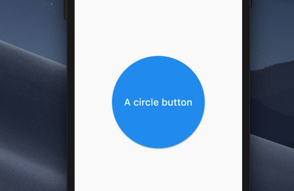
),Using MaterialButton
The code:
MaterialButton(
        color: Colors.blue,
        shape: const CircleBorder(),
        onPressed: () {},
        child: const Padding(
          padding: EdgeInsets.all(100),
          child: Text(
            'A circle button',
            style: TextStyle(color: Colors.white, fontSize: 24),
          ),
        ),
)
Output:
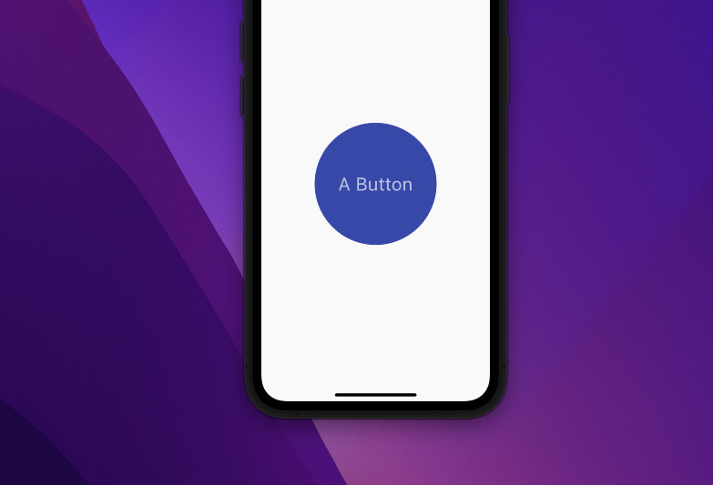
Using GestureDetector + CircleAvatar
Example:
GestureDetector(
            onTap: () {
              debugPrint('Button tapped');
            },
            child: const CircleAvatar(
              radius: 100,
              backgroundColor: Colors.indigo,
              child: Text(
                'A Button',
                style: TextStyle(fontSize: 30),
              ),
            )
),
Screenshot:
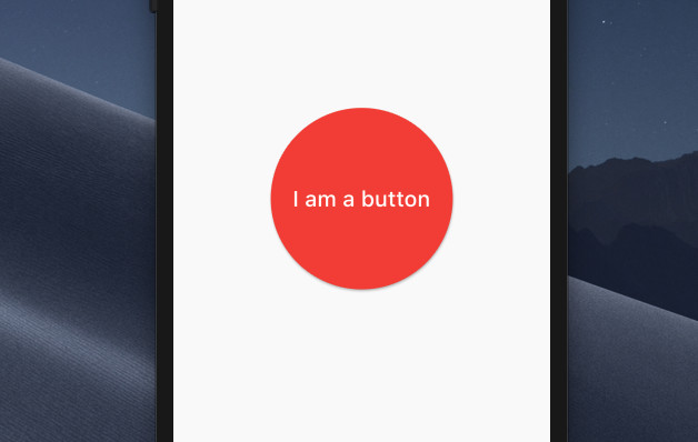
Using ElevatedButton + Container
In the old days, the ElevatedButton widget didn’t provide an option for sizing it (the ElevatedButton.styleFrom method has no parameter named fixedSize). That’s why this approach was useful in the past. Nowadays, it seems more complex than necessary. However, I think it is still worth trying.
The code:
ElevatedButton(
        style: ElevatedButton.styleFrom(
            shape: const CircleBorder(), backgroundColor: Colors.red),
        child: Container(
          width: 200,
          height: 200,
          alignment: Alignment.center,
          decoration: const BoxDecoration(shape: BoxShape.circle),
          child: const Text(
            'I am a button',
            style: TextStyle(fontSize: 24),
          ),
        ),
        onPressed: () {},
)
Output:
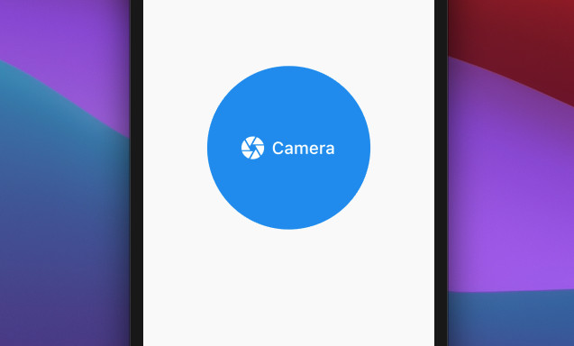
Using ClipRRect + SizedBox + ElevatedButton
Another interesting technique for implementing a circle button in Flutter.
The code:
ClipRRect(
          borderRadius: BorderRadius.circular(120),
          child: SizedBox(
            width: 240,
            height: 240,
            child: ElevatedButton.icon(
              icon: const Icon(
                Icons.camera,
                size: 40,
              ),
              label: const Text(
                'Camera',
                style: TextStyle(fontSize: 25),
              ),
              onPressed: () {},
            ),
          ),
),
Output:
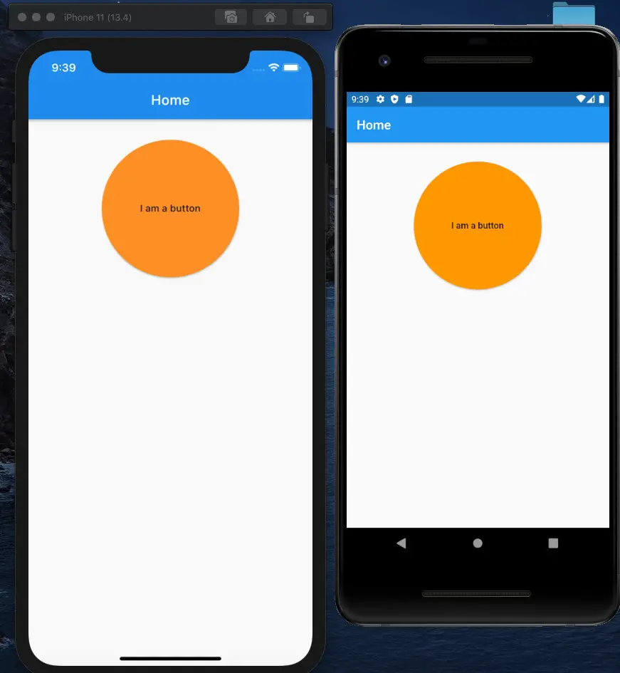
An Old Method for RaisedButton (Legacy)
The RaisedButton widget is deprecated, and only appears in old code bases. If you’re working with a new Flutter project, use ElevatedButton instead.
Wrap a RaisedButton widget inside a square Container and use the BorderRadius class.
Sample code:
import 'package:flutter/material.dart';
void main() => runApp(const MyApp());

class MyApp extends StatelessWidget {
  const MyApp({Key? key}) : super(key: key);

  @override
  Widget build(BuildContext context) {
    return MaterialApp(
        // Removing the debug banner when running on simulators
        debugShowCheckedModeBanner: false,
        title: 'An Aweasome App',
        home: Scaffold(
          appBar: AppBar(
            title: const Text('Home'),
          ),
          body: Center(
            child: Column(
              children: <Widget>[
                // just an empty SizedBox to add some spacing
                const SizedBox(
                  height: 30,
                ),

                SizedBox(
                    // set width equal to height to make a square
                    width: 200,
                    height: 200,
                    child: RaisedButton(
                      color: Colors.orange,
                      shape: RoundedRectangleBorder(
                          // set the value to a very big number like 100, 1000...
                          borderRadius: BorderRadius.circular(100)),
                      child: const Text('I am a button'),
                      onPressed: () {},
                    ))
              ],
            ),
          ),
        ));
  }
}
Output:
Conclusion
We went over several approaches to implementing circular buttons in Flutter. If you would like to learn more about button stuff, take a look at the following articles: Working with ElevatedButton in Flutter – Ways To Create Circle Icon Buttons in Flutter – Flutter Cupertino Button – Flutter: Create a Button with a Loading Indicator Inside.
Flutter is charming, and there are many other things to learn:
- Flutter: Making Beautiful Chat Bubbles (2 Approaches)
- Using Chip widget in Flutter: Tutorial & Examples
- Flutter: SliverGrid example
- Flutter: Creating OTP/PIN Input Fields (2 approaches)
You can also check out our Flutter category page or Dart category page for more tutorials and examples.


ElevatedButton is new to me