
This practical article walks you through 3 complete examples of showing toast messages in React. In the first one, we will create our own toasts without using any third-party libraries. This will help you to customize and control everything to your liking and strengthen your programming skills. In the next examples, we will deploy toasts quickly with the help of 2 well-known packages, react-toastify, and react-hot-toast. The benefit of using a library is that it helps us to get things done quickly without writing a lot of code.
Create Your Own Toasts from Scratch
This example creates the most viable toast with the useState hook and pure CSS.
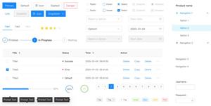
Example Preview
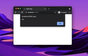
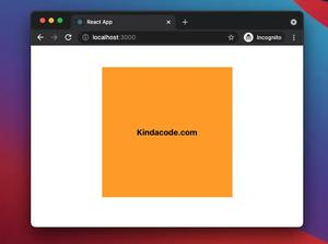
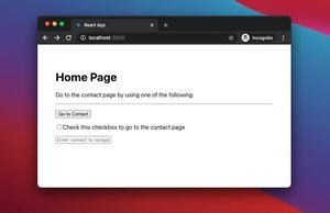
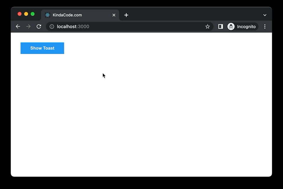
The app we’re going to make has a blue button. When this button is pressed, a simple toast will appear in the bottom right corner of the screen. It will stay there for 3 seconds and then will automatically go away.
The Code
1. The full source code in App.js with explanations:
// KindaCode.com
// src/App.js
import { useState } from 'react';
import './App.css';

function App() {
  const [isShown, setIsShown] = useState(false);

  // This function is called when the blue button gets clicked
  const showToast = () => {
    setIsShown(true);

    // automatically hide the toast after 5 seconds
    // your can set a shorter/longer time if you want
    setTimeout(() => {
      setIsShown(false);
    }, 3000);
  };

  return (
    <>
      <div className='container'>
        {/* This button is used to show the toast */}
        <button className='button' onClick={showToast}>
          Show Toast
        </button>

        {/* Implement our toast here */}
        {isShown && (
          <div className='my-toast'>
            <span className='my-toast__icon'>i</span>
            <span>This is a simple toast</span>
          </div>
        )}
      </div>
    </>
  );
}

export default App;
2. App.css:
.container {
  padding: 30px;
}

.button {
  padding: 10px 30px;
  background: #2196f3;
  color: #fff;
  font-weight: bold;
  border: none;
  cursor: pointer;
}

.button:hover {
  background: #0b7dda;
}

.my-toast {
  position: fixed;
  bottom: 30px;
  right: 30px;
  z-index: 9999;
  display: inline-flex;
  padding: 10px 20px;
  background: #eee;
  box-shadow: 0 2px 4px rgba(0, 0, 0, 0.2);
  border-radius: 15px;
}

.my-toast__icon {
  display: flex;
  justify-content: center;
  align-items: center;
  width: 20px;
  height: 20px;
  margin-right: 10px;
  background: #2196f3;
  color: #fff;
  border-radius: 50%;
}
Using react-hot-toast
Install
Add package react-hot-toast to your project by running the following command:
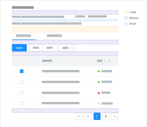
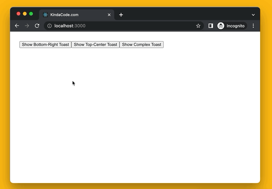
npm i react-hot-toastExample Preview
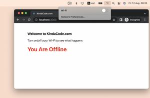
This tiny React app shows toasts in various positions with different styles.
The Code
// KindaCode.com
// src/App.js
import toast, { Toaster } from 'react-hot-toast';

function App() {
  return (
    <div style={{ padding: 30 }}>
      {/* Display a toast in the bottom right corner */}
      <button
        onClick={() => {
          toast('Welcome to KindaCode.com', {
            position: 'bottom-right',
            style: {
              background: '#2196f3',
              color: '#fff',
            },
            duration: 2000,
          });
        }}
      >
        Show Bottom-Right Toast
      </button>

      {/* Show a toast in top center */}
      <button
        onClick={() => {
          toast('Just a dummy message', {
            position: 'top-center',
            style: {
              background: '#ffc107',
            },
            duration: 2000,
          });
        }}
      >
        Show Top-Center Toast
      </button>

      {/* Show a complex toast with title & description */}
      <button
        onClick={() => {
          toast(
            <div>
              <h2>Toast Title</h2>
              <p>
                Toast description. Just some dummy text. Just some dummy text.
                Just some dummy text.
              </p>
            </div>,
            {
              position: 'bottom-left',
              style: {
                background: '#ff1744',
                color: '#fff',
              },
              duration: 2000,
            }
          );
        }}
      >
        Show Complex Toast
      </button>
      <Toaster />
    </div>
  );
}

export default App;
Using react-toastify
Install
react-toastify is a very popular package with more than 1 million weekly downloads. You can install it by performing the command below:
npm i react-toastifyAnd then import its components and CSS into your code:
import { ToastContainer, toast } from 'react-toastify';
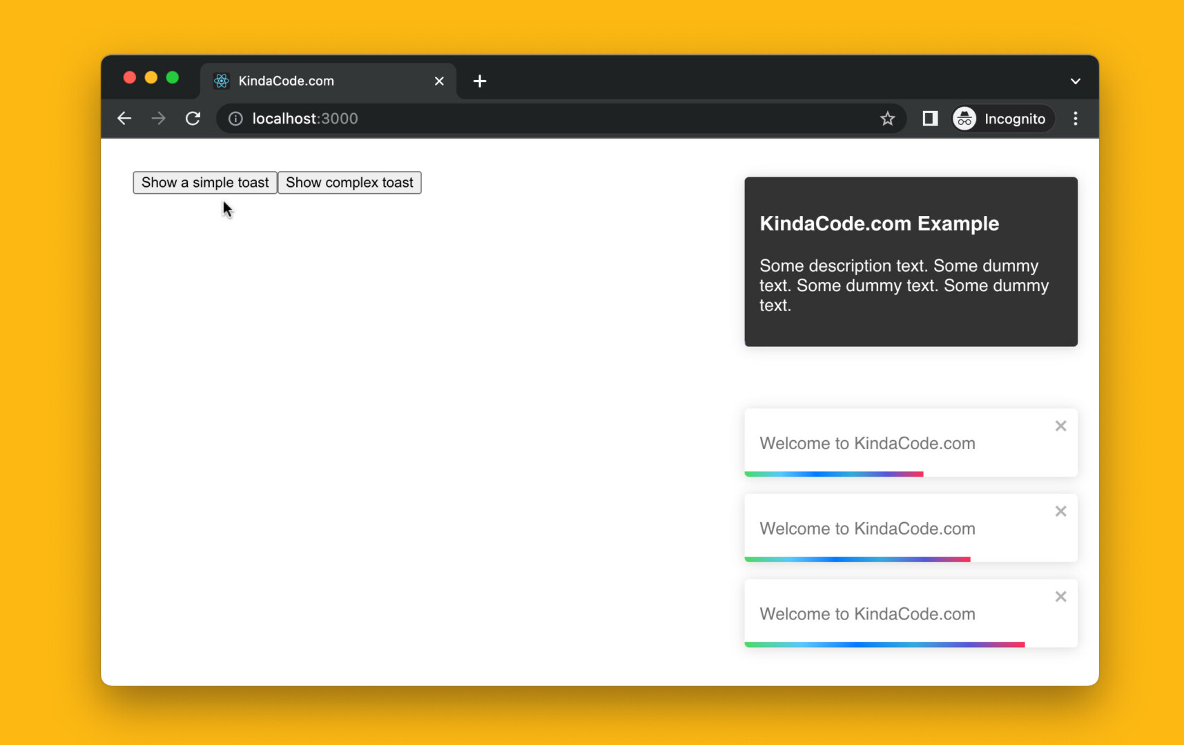
import 'react-toastify/dist/ReactToastify.css';Example Preview
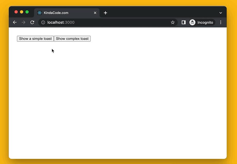
The Code
// KindaCode.com
// src/App.js
import { ToastContainer, toast } from 'react-toastify';
import 'react-toastify/dist/ReactToastify.css';

function App() {
  return (
    <div style={{ padding: 30 }}>
      {/* Show a simple toast in the bottom right corner */}
      <button
        onClick={() =>
          toast('Welcome to KindaCode.com', {
            position: 'bottom-right',
            autoClose: 5000,
          })
        }
      >
        Show a simple toast
      </button>

      {/* Show a complex toast with title & description text */}
      <button
        onClick={() =>
          toast(
            <div>
              <h3>KindaCode.com Example</h3>
              <p>
                Some description text. Some dummy text. Some dummy text. Some
                dummy text.
              </p>
            </div>,
            {
              position: 'top-right',
              autoClose: 3000,
              style: {
                background: '#333',
                color: '#fff',
              },
              closeButton: false,
            }
          )
        }
      >
        Show complex toast
      </button>

      <ToastContainer />
    </div>
  );
}

export default App;
Conclusion
We’ve walked through 3 full examples of implementing toasts in React. Choose the approach that suits your needs and go further with it. Continue learning more new and captivating things in the modern React world by taking a look at the following articles:
- React: Programmatically Add/Remove CSS Classes
- React: Show a Loading Dialog (without any libraries)
- React + TypeScript: Making a Custom Context Menu
- React + TypeScript: Multiple Dynamic Checkboxes
- React + TypeScript: Image onLoad & onError Events
- How to render HTML content in React Native
You can also check our React category page and React Native category page for the latest tutorials and examples.