

This practical shows you how to implement a loading modal dialog in React. We’ll build everything from the ground up and not use any third-party libraries. In addition, we’ll only use modern features like hooks and functional components. Class-based components and other things like that won’t appear.
Table of Contents
Overview
A loading dialog serves two main purposes:
- Let the user know that one of our apps is temporarily busy and something is being worked on
- Prevent the user from interacting with other page elements, such as editing forms, pressing buttons, etc, while the processing has not finished
The loading dialogs will be very useful in many common scenarios like making HTTP requests, payment processing, file handling, authentication, etc. A loading dialog should NOT be closed manually by the user. It should only go away automatically when the asynchronous operation finishes.
Words might sound boring and confusing. Let’s examine the concrete example below to obtain a better understanding.
Full Example
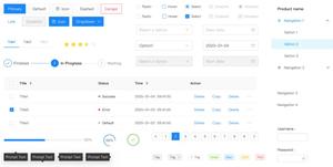
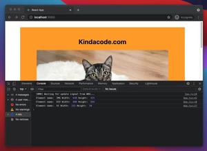
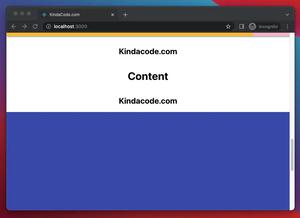
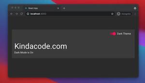
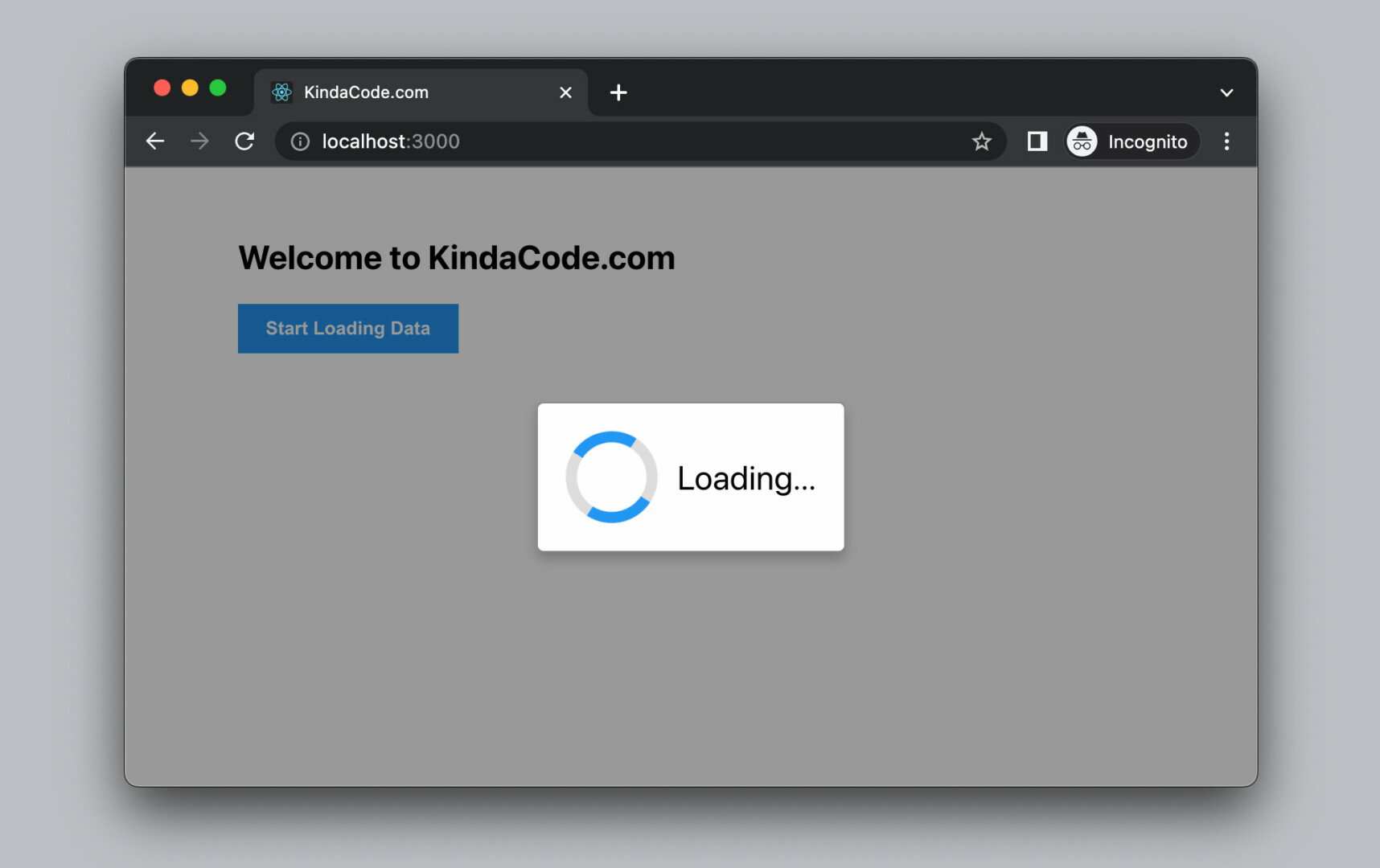
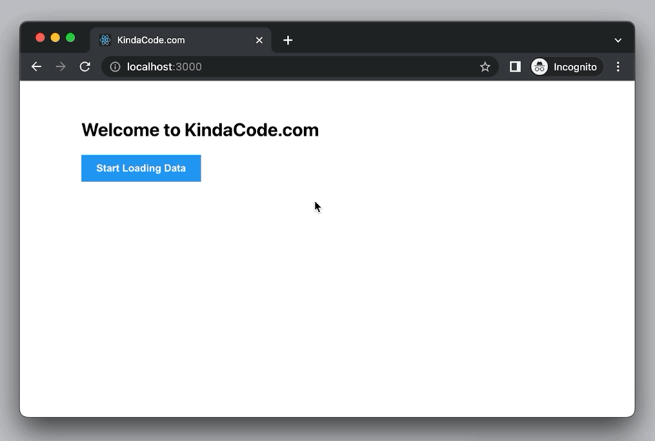
App Preview
The simple React project we’re going to build has a blue button. When this button is clicked, a mocking asynchronous job that intimates fetching data from a network API will be fired and our loading dialog will show up. This will take a few seconds to finish. When it is done, the loading dialog will evaporate, and some text (impersonates fetched data) will be displayed right below the button.
Here’s how it works in action:
Not that the circle progress indicator will be made with only pure CSS. No icons or GIFs are needed.
The Code
1. Create a new React project by executing the following command:
npx create-react-app kindacode-exampleThe name doesn’t matter. Choose another one if you like. From now on, we only care about two files in the src folder: App.js and App.css.
2. The complete code in src/App.js with explanations:
// KindaCode.com
// Loading Dialog Example
import { useState } from 'react';
import './App.css';

// Our main component
function App() {
  // whether or not to show the loading dialog
  const [isLoading, setIsLoading] = useState(false);

  // data to display
  const [loadedData, setLoadedData] = useState();

  // define a fake async function that mimics a network request
  const fakeRequest = () => {
    return new Promise((resolve) => {
      setTimeout(() => {
        resolve(
          'Successfully fetched data from a non-existent API of KindaCode.com'
        );
      }, 2000);
    });
  };

  // this function will be called when the button get clicked
  const buttonHandler = async () => {
    // show the loading dialog
    setIsLoading(true);

    // do the fake request and wait for it to finish
    const result = await fakeRequest();
    setLoadedData(result);

    // auto hide the loading dialog when the asynchronous operation is done
    setIsLoading(false);
  };

  return (
    <>
      {/* This is the modal that is hidden by default */}
      <div style={{ display: isLoading ? 'flex' : 'none' }} className='modal'>
        <div className='modal-content'>
          <div className='loader'></div>
          <div className='modal-text'>Loading...</div>
        </div>
      </div>

      {/* main content */}
      <div className='container'>
        <h2>Welcome to KindaCode.com</h2>
        {/* This button is used to start the loading process */}
        <button className='button' onClick={buttonHandler}>
          Start Loading Data
        </button>
        <br />

        {/* Display loaded data if available */}
        {loadedData && <p>{loadedData}</p>}
      </div>
    </>
  );
}

export default App;
3. Remove all of the default code in your src/App.css then add the following:
.container {
  width: 80%;
  margin: 50px auto;
}

.button {
  background: #2196f3;
  padding: 10px 20px;
  border: none;
  cursor: pointer;
  color: #fff;
  font-weight: bold;
}

.button:hover {
  background: #0b7dda;
}

/* Style the modal */
.modal {
  position: fixed; /* Stay in place */
  z-index: 1; /* Sit on top */
  left: 0;
  top: 0;
  width: 100%; /* Full width */
  height: 100%; /* Full height */
  background-color: rgba(0, 0, 0, 0.4); /* Semi-transparent black background */
  display: flex;
  justify-content: center;
  align-items: center;
}

/* Modal Content */
.modal-content {
  margin: auto;
  padding: 20px;
  border: 1px solid #888;
  border-radius: 5px;
  display: flex;
  align-items: center;
  box-shadow: 0 5px 8px 0 rgba(0, 0, 0, 0.2);
  background-color: #fefefe;
}

.modal-text {
  margin-left: 14px;
  font-size: 24px;
}

/* Create the circle loader with pure CSS */
.loader {
  width: 50px;
  height: 50px;
  border: 8px solid #ddd;
  border-top: 8px solid #2196f3;
  border-bottom: 8px solid #2196f3;
  border-radius: 50%;
  -webkit-animation: spin 2s linear infinite;
  animation: spin 2s linear infinite;
}

@-webkit-keyframes spin {
  0% {
    -webkit-transform: rotate(0deg);
  }
  100% {
    -webkit-transform: rotate(360deg);
  }
}

@keyframes spin {
  0% {
    transform: rotate(0deg);
  }
  100% {
    transform: rotate(360deg);
  }
}
4. Get the project up and running:
npm startAnd finally, go to http://localhost:3000 to view the result.
Conclusion
We’ve walked through an end-to-end example of showing a modal dialog with a circle loading indicator. You can modify the code, make some changes, and see what happens. If you’d like to learn more new and fascinating stuff in modern React to build your own prodigious project in the future, take a look at the following articles:
- React: How to Create a Reorderable List from Scratch
- React: 5+ Ways to Store Data Locally in Web Browsers
- React: How to Detect a Click Outside/Inside a Component
- Working with the useId() hook in React
- React Router: useParams & useSearchParams Hooks
- React + TypeScript: Handling onScroll event
You can also check our React category page and React Native category page for the latest tutorials and examples.