
Ant Design is one of the most popular open-source UI libraries for React with a lot of enterprise-level components. This article walks you through 4 examples of using Ant Design buttons in a React application.
Installation
1. Install the required package
npm install antdInstall the icon package (optional):
npm install @ant-design/icons2. Import the Button component into your React code
import { Button } from 'antd';Examples
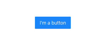
A normal primary button
<Button type="primary" size="large" >
        I'm a button
</Button>
Output:
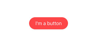
Rounded-corner button (pill button)
<Button type="danger" size="large" shape="round" >
        I'm a button
</Button>
Output:
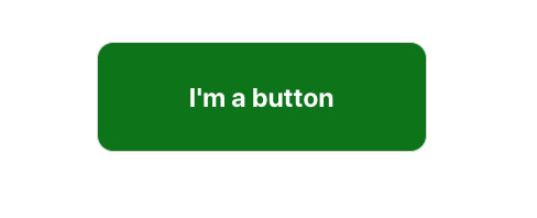
Custom style button
<Button
        style={{
          backgroundColor: "green",
          width: 300,
          height: 100,
          color: "white",
          fontSize: 24,
          fontWeight: "bold",
          borderRadius: 15,
        }}
      >
        I'm a button
</Button>
Output:
Icon button
Import the icon you need:
import { SearchOutlined } from '@ant-design/icons';And use it with the Button component:
<Button type="primary" size="large" shape="round"
        onClick={() => {}} >
        Search
        <SearchOutlined />
</Button>
Output:

Conclusion
We’ve created some beautiful and professional buttons in React with the Button component from Ant Design. This thing helps us save a lot of time when developing projects. If you’d like to explore more new and interesting stuff about modern React development, take a look at the following articles:
- React: Make a simple line chart with Ant Design
- React: Making a side Drawer with Ant Design
- React & TypeScript: Using useRef hook example
- React + TypeScript: Re-render a Component on Window Resize
- React + TypeScript: Create an Autosize Textarea from scratch
- React + TypeScript: Making a Custom Context Menu
You can also check our React category page and React Native category page for the latest tutorials and examples.