

This article walks you through an end-to-end example of implementing a simple side drawer navigation in React by using the Ant Design library.
Table of Contents
The Example
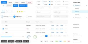
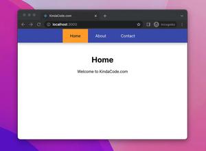
Preview
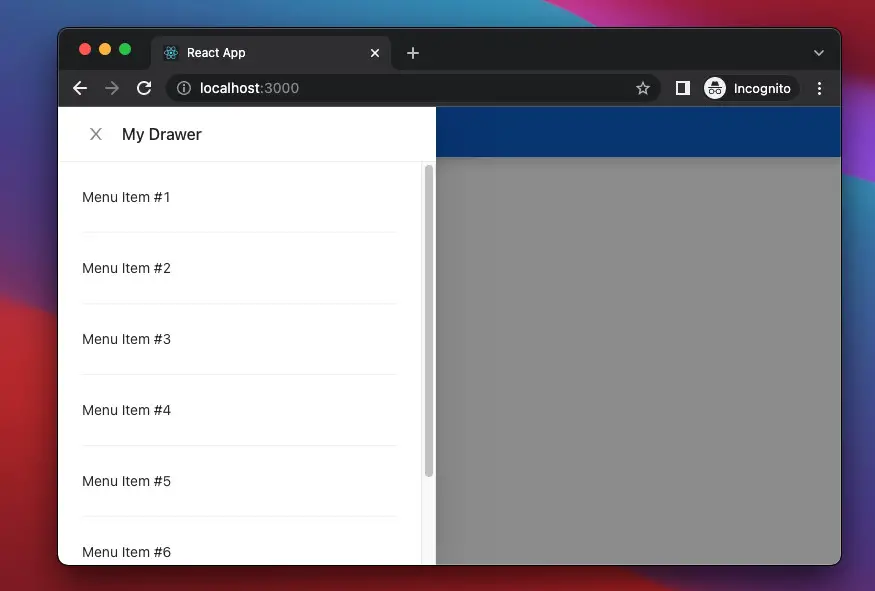
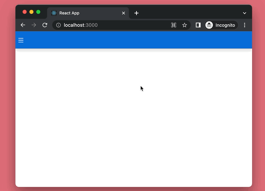
The web app we are going to build has a blue app bar with a hamburger icon button. When this button is clicked, the drawer will show up. The user can close the drawer by hitting anywhere outside the drawer or the X button. Here’s how it works:
The code
1. Initialise a new React project:
npx create-react-app kindacode-example2. Run the following command to install Ant Design and its icon kit:
npm install antd @ant-design/icons3. Import Ant Design components into your Javascript code:
import { Drawer, Button, Divider } from 'antd';
import { MenuOutlined } from '@ant-design/icons';
The complete code with explanations:
import React, { useState } from 'react';

import { Drawer, Button, Divider } from 'antd';
import { MenuOutlined } from '@ant-design/icons';

const App = () => {
  // The drawer is invisible by default
  const [isVisible, setIsVisible] = useState(false);

  // trigger this function to open the drawer
  const showDrawer = () => {
    setIsVisible(true);
  };

  // close the drawer
  const closeDrawer = () => {
    setIsVisible(false);
  };

  return (
    <>
      <nav style={styles.nav}>
        <Button shape="circle" style={styles.button} onClick={showDrawer}>
          <MenuOutlined />
        </Button>
      </nav>
      <Drawer
        visible={isVisible}
        onClose={closeDrawer}
        placement="left"
        title="My Drawer"
      >
        <p>Menu Item #1</p>
        <Divider />
        <p>Menu Item #2</p>
        <Divider />
        <p>Menu Item #3</p>
        <Divider />
        <p>Menu Item #4</p>
        <Divider />
        <p>Menu Item #5</p>
        <Divider />
        <p>Menu Item #6</p>
        <Divider />
        <p>Menu Item #7</p>
      </Drawer>
    </>
  );
};

// Styling
const styles = {
  nav: {
    height: 50,
    background: '#096dd9',
    boxShadow: '0 5px 10px rgba(0, 0, 0, 0.15)',
    display: 'flex',
    alignItems: 'center',
  },
  button: {
    background: 'transparent',
    border: 'none',
    outline: 'none',
    color: 'white',
    fontSize: 16,
  },
};

export default App;
Alternative Solution: How to Create an Animated Side Navigation from Scratch in React
Conclusion
We’ve created a real-world side drawer navigation with the help of Ant Design. If you want to make this thing from scratch, it will consume a lot of time and effect.
To learn more new and exciting things about modern React, take a look at the following articles:
- React Router Dom: Implement a Not Found (404) Route
- React: Make a simple line chart with Ant Design
- Using Ant Design Buttons in React
- React + TypeScript: Handling onScroll event
- React + TypeScript: onMouseOver & onMouseOut events
- React + TypeScript: Re-render a Component on Window Resize
You can also check our React category page and React Native category page for the latest tutorials and examples.