Introduction
In daily life, we see many objects with gridlines, such as whiteboards, and notebooks. In mobile applications, software, and websites related to design or photo editing, we also see the appearance of gridlines. In Flutter, we can create gridlines by using a built-in widget named GridPaper. The grid will be drawn over GridPaper’s child.
The example below demonstrates how to dynamically show or hide gridlines in a Flutter application.
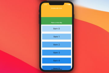
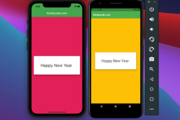
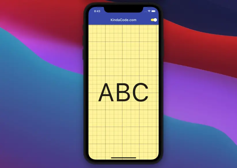
Example Preview
The app we are going to build contains a switch and a yellow container with text inside. The switch is used to control the visibility of gridlines.
To make gridlines become invisible, we set their color to Colors.transparent.
The Code
The complete source code in main.dart with detailed explanations:
// main.dart
import 'package:flutter/material.dart';

void main() {
  runApp(const MyApp());
}

class MyApp extends StatelessWidget {
  const MyApp({Key? key}) : super(key: key);

  @override
  Widget build(BuildContext context) {
    return MaterialApp(
      debugShowCheckedModeBanner: false,
      title: 'KindaCode.com',
      theme: ThemeData(
        primarySwatch: Colors.indigo,
      ),
      home: const HomePage(),
    );
  }
}

class HomePage extends StatefulWidget {
  const HomePage({Key? key}) : super(key: key);

  @override
  State<HomePage> createState() => _HomePageState();
}

class _HomePageState extends State<HomePage> {
  // This variable determines whether the grid paper is shown or not
  bool _isSHown = true;

  @override
  Widget build(BuildContext context) {
    return Scaffold(
      appBar: AppBar(
        title: const Text('KindaCode.com'),
        actions: [
          Switch(
              activeColor: Colors.white,
              activeTrackColor: Colors.yellow,
              value: _isSHown,
              onChanged: (_) {
                setState(() {
                  _isSHown = !_isSHown;
                });
              })
        ],
      ),
      body: GridPaper(
        // Set the color of the lines
        color: _isSHown ? Colors.black54 : Colors.transparent,
        // The number of major divisions within each primary grid cell
        divisions: 2,
        // The number of minor divisions within each major division, including the major division itself
        subdivisions: 2,
        // GridPaper's child
        child: Container(
          width: double.infinity,
          height: double.infinity,
          color: Colors.yellow.shade200,
          child: const Center(
            child: Text(
              'ABC',
              style: TextStyle(fontSize: 150),
            ),
          ),
        ),
      ),
    );
  }
}
You can find more information about the constructor, and properties of the GridPaper widget in the official docs.
Conclusion
We’ve gone through a simple but meaningful example of implementing the GridPaper widget. If you’d like to explore more new and interesting stuff in Flutter, take a look at the following articles:
- Creating Masonry Layout in Flutter with Staggered Grid View
- Flutter: GridTile examples
- Flutter: Safety nesting ListView, GridView inside a Column
- Flutter & Hive Database: CRUD Example
- Flutter: Making Beautiful Chat Bubbles (2 Approaches)
You can also check out our Flutter category page or Dart category page for the latest tutorials and examples.