

This succinct, practical article shows you how to implement and customize range sliders in React. Everything will be made from scratch without using any third-party libraries. I won’t waste your time and bore you with little-meaning words; let’s start exploring the important things.
Note: We’ll write the code with Javascript and then TypeScript. You can skip the Javascript part if you are only interested in TypeScript and skip the TypeScript part if you don’t use it in your work.
Overview
A range slider is a control element that lets the user select a single value from a continuous range of values. It can be created by using <input type=”range”>. The default range is from 0 to 100; however, you can set other minimum and maximum values as necessary.
When using range sliders in JSX and React, you should care about the following props:
- value: he currently selected value for the slider
- onChange: Calls a function during a drag when the user is selecting a new value for the slider by dragging the thumb
- min: The minimum value the user can select (the default value is 0)
- max: The maximum value the user can select (the default value is 100)
- step: Specifies the legal number intervals
- className: CSS classes for styling the slider
<input
        type='range'
        onChange={/* your event handler function here */}
        min={1}
        max={400}
        step={1}
        value={/* your state variable here */}
        className='custom-slider'>
</input>
For more clarity, please see the complete example below.
Full Example
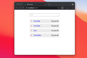
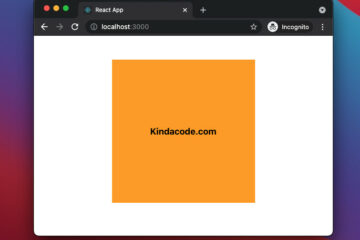
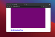
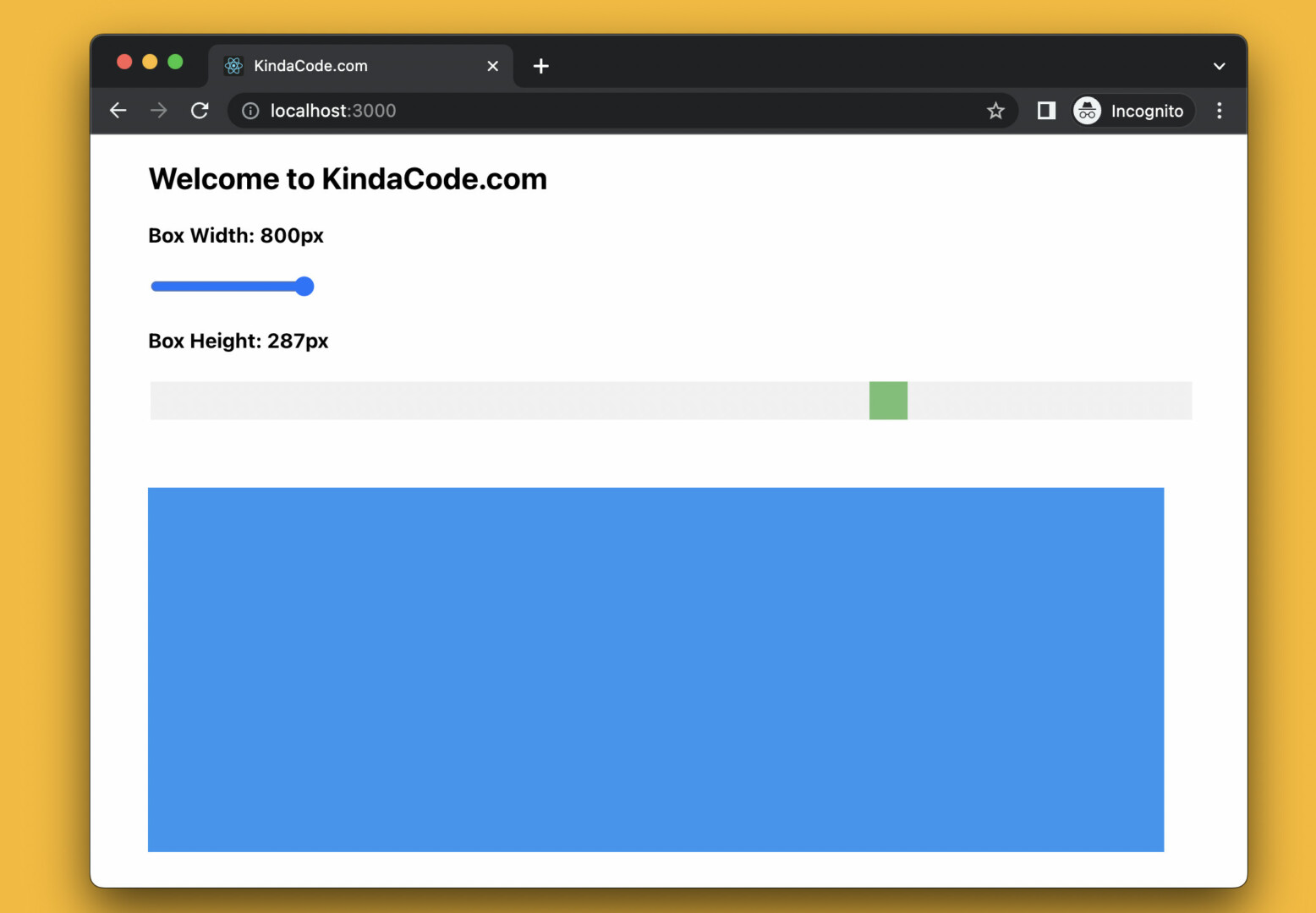
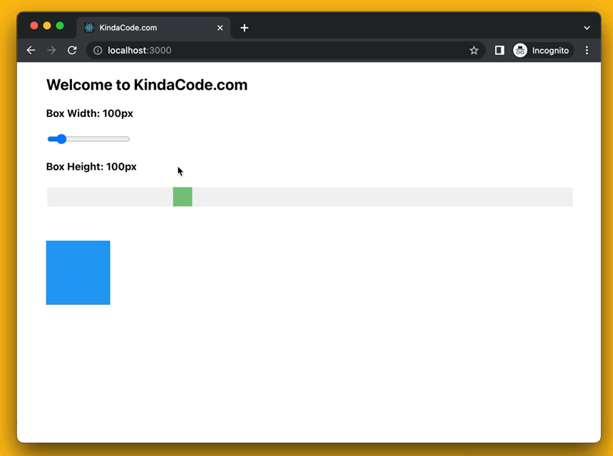
App Preview
The demo we’re going to build uses 2 range sliders to adjust the width and the height of a blue box in real time. These 2 sliders have different looks. The first one has the default appearance, while the second one is deeply styled with CSS.
This animated GIF screenshot will give you the ease of understanding and intuitiveness:
The Code
1. Initialize a new React project:
npx create-react-app kindacode-range-slidersYou can choose any name that makes sense to you.
2. Remove all of the default code in your src/App.js and add the following:
// KindaCode.com
// src/App.js
import { useState } from 'react';
import './App.css';

function App() {
  // the width of the box
  const [width, setWidth] = useState(100);

  // the height of the box
  const [height, setHeight] = useState(100);

  // This function is called when the first range slider changes
  const changeWidth = (event) => {
    setWidth(event.target.value);
  };

  // This function is called when the second range slider changes
  const changeHeight = (event) => {
    setHeight(event.target.value);
  };

  return (
    <div className='container'>
      <h2>Welcome to KindaCode.com</h2>

      {/* A range slider with default appearance */}
      <h4>Box Width: {width}px</h4>
      <input
        type='range'
        onChange={changeWidth}
        min={1}
        max={800}
        step={1}
        value={width}
      ></input>

      {/* Custom range slider */}
      <h4>Box Height: {height}px</h4>
      <input
        type='range'
        onChange={changeHeight}
        min={1}
        max={400}
        step={1}
        value={height}
        className='custom-slider'
      ></input>

      {/* Render the box */}
      <div
        style={{ width: `${width}px`, height: `${height}px` }}
        className='box'
      ></div>
    </div>
  );
}

export default App;
3. Don’t forget about CSS. It’s extremely important in this example. Open your src/App.css file and replace the auto-generated code with this:
/* KindaCode.com */
/* src/App.css */
.container {
  width: 90%;
  margin: 20px auto;
}

/* Style the custom slider */
.custom-slider {
  width: 100%;
  height: 30px;
  background: #eee;
  opacity: 0.8;
  outline: none;
  transition: 0.3s;
  -webkit-appearance: none;
}

.custom-slider:hover {
  opacity: 1;
}

.custom-slider::-webkit-slider-thumb {
  appearance: none;
  -webkit-appearance: none;
  width: 30px;
  height: 30px;
  background: #4caf50;
  cursor: pointer;
}

.custom-slider::-moz-range-thumb {
  width: 30px;
  height: 30px;
  background: #4caf50;
  cursor: pointer;
}

/* Style the box */
.box {
  margin-top: 50px;
  background: #2196f3;
}
Using Range Sliders with TypeScript
It’s important to know that the type for the onChange event of a range slider is React.ChangeEvent<HTMLInputElement>. Another point is that event.target.value will give you a string, and you have to convert it to a number using the parseInt() or parseFloat() functions. You can find all of these things in step 2.
The steps:
1. Create a new TypeScript-based React project:
npx create-react-app kindacode-ts-range-sliders --template typescript2. Here’s the full source code for src/App.tsx:
// KindaCode.com
// src/App.tsx
import { useState } from 'react';
import './App.css';

function App() {
  // the width of the box
  const [width, setWidth] = useState(100);

  // the height of the box
  const [height, setHeight] = useState(100);

  // This function is called when the first range slider changes
  const changeWidth = (event: React.ChangeEvent<HTMLInputElement>) => {
    setWidth(parseInt(event.target.value));
  };

  // This function is called when the second range slider changes
  const changeHeight = (event: React.ChangeEvent<HTMLInputElement>) => {
    setHeight(parseInt(event.target.value));
  };

  return (
    <div className='container'>
      <h2>Welcome to KindaCode.com</h2>

      {/* A range slider with default appearance */}
      <h4>Box Width: {width}px</h4>
      <input
        type='range'
        onChange={changeWidth}
        min={1}
        max={800}
        step={1}
        value={width}
      ></input>

      {/* Custom range slider */}
      <h4>Box Height: {height}px</h4>
      <input
        type='range'
        onChange={changeHeight}
        min={1}
        max={400}
        step={1}
        value={height}
        className='custom-slider'
      ></input>

      {/* Render the box */}
      <div
        style={{ width: `${width}px`, height: `${height}px` }}
        className='box'
      ></div>
    </div>
  );
}

export default App;
3. The CSS code (n fact, there is no difference from the App.css file in the previous section):
/* KindaCode.com */
/* src/App.css */
.container {
  width: 90%;
  margin: 20px auto;
}

/* Style the custom slider */
.custom-slider {
  width: 100%;
  height: 30px;
  background: #eee;
  opacity: 0.8;
  outline: none;
  transition: 0.3s;
  -webkit-appearance: none;
}

.custom-slider:hover {
  opacity: 1;
}

.custom-slider::-webkit-slider-thumb {
  appearance: none;
  -webkit-appearance: none;
  width: 30px;
  height: 30px;
  background: #4caf50;
  cursor: pointer;
}

.custom-slider::-moz-range-thumb {
  width: 30px;
  height: 30px;
  background: #4caf50;
  cursor: pointer;
}

/* Style the box */
.box {
  margin-top: 50px;
  background: #2196f3;
}
Conclusion
You’ve learned how to implement and customize range sliders in React. This element is becoming more and more popular in modern web and mobile applications because of the convenience and intuitiveness it brings to users.
React is the web frontend technology that is being used more and more by the industry, even though it is now virtually ubiquitous. If you’d like to explore more new and fascinating stuff about modern React with hooks and TypeScript, take a look at the following articles:
- React + TypeScript: Making a Custom Context Menu
- React + TypeScript: Multiple Dynamic Checkboxes
- React: How to Upload Multiple Files with Axios
- React: Create a Reusable Switch/Toggle Component
- React + TypeScript: setInterval() example (with hooks)
- React: Load and Display Data from Local JSON Files
You can also check our React category page and React Native category page for the latest tutorials and examples.