
In web and mobile apps, a switch or a toggle lets users choose between a pair of opposing states, like ON and OFF, LIGHT and DARK, ACTIVE and INACTIVE, using a different appearance to indicate each state. Unfortunately, nowadays, neither HTML nor React has any native tags/elements to implement such a thing.
This succinct and straight-to-the-point article shows you how to create a reusable switch component in React. We’ll build everything from the ground up without using any third-party libraries.
Note: This tutorial assumes that you have a basic understanding of React and CSS
Table of Contents
A Brief Overview
The trick to creating a switch is to use a hidden checkbox and a visible label element. We will use this checkbox to track the state of the switch component (the checkbox is checked means ON, the checkbox is unchecked means OFF). Besides, we also use CSS to style the switch based on the state of the checkbox.
This theory might be confusing and unclear for you. See the full, intuitive example below for more clarity.
The Complete Example
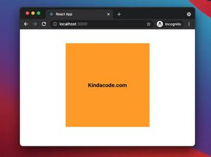
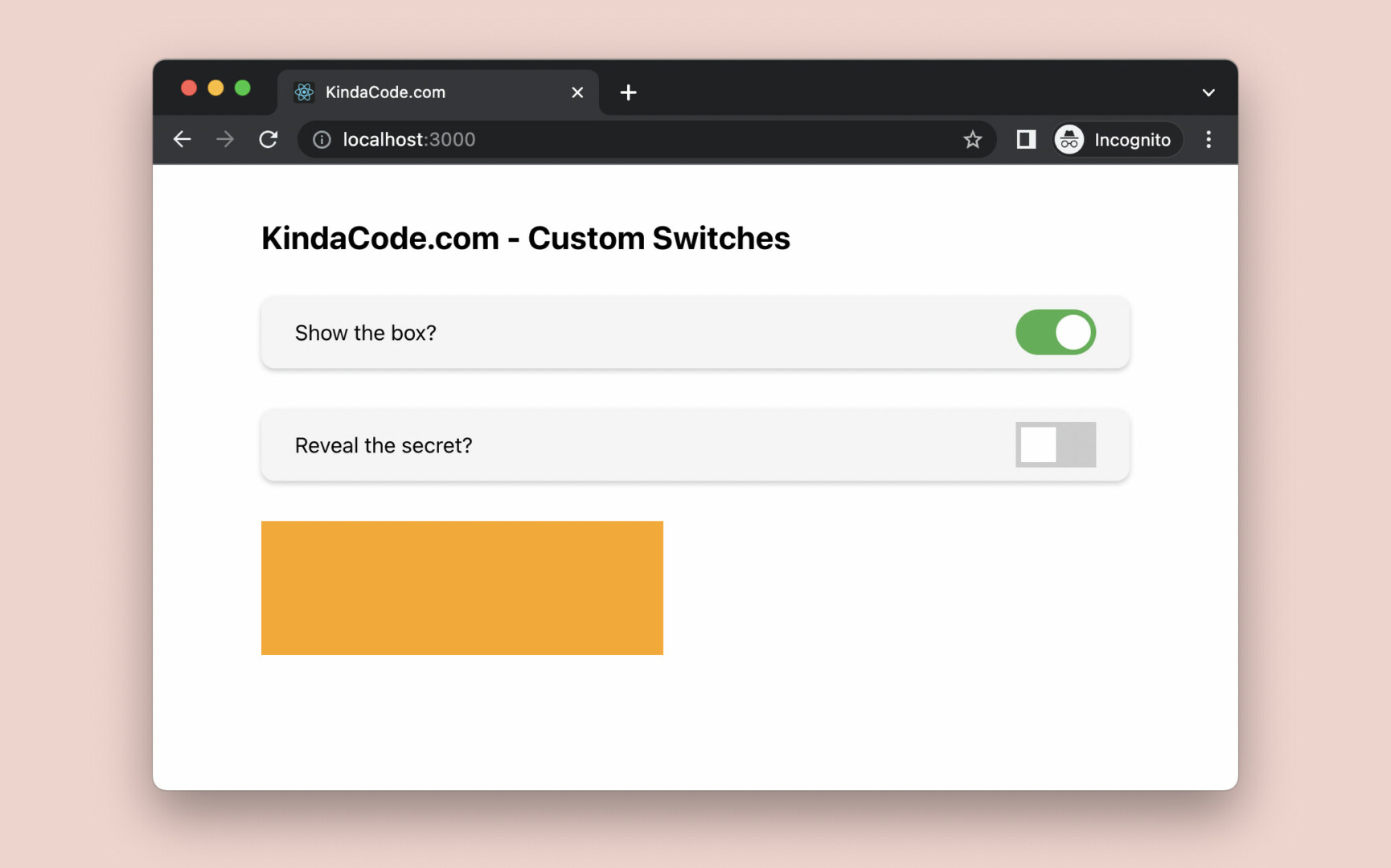
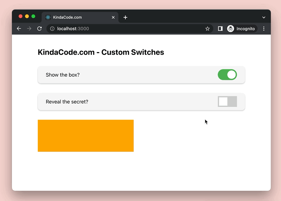
App Preview
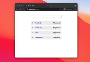
In this example, we’ll construct a switch component named MySwitch that can be reused many times. Its shape can be rounded or rectangular. When it is OFF, the background color of the track is grey. When it is ON, the background color of the track is light green.
In the demo below, we implement 2 switches to show/hide an orange box and a secret message:
The Steps
1. To get started, create a new React project with npx and create-react-app. You can choose whatever name you wish:
npx create-react-app kindacode-custom-switchesFrom now on, we’ll only work with files in the src folder.
2. Create and style the MySwitch component
This step is the focus of this tutorial. Inside your src directory, add a new folder called components. Inside this folder, create 2 new files named MySwitch.js and MySwitch.css.
The code for MySwitch.js:
// KindaCode.com
// src/components/MySwitch.js

// CSS is very important for our switch component
import './MySwitch.css';

export const MySwitch = ({ value, onChange, rounded }) => {
  return (
    <>
      <label className='my-switch'>
        <input type='checkbox' checked={value} onChange={onChange} />
        <span className={`slider ${rounded ? 'rounded' : ''}`}></span>
      </label>
    </>
  );
};
And here’s the CSS code in MySwitch.css:
/* src/components/MySwitch.css */
.my-switch {
  position: relative;
  display: inline-flex;
  width: 60px;
  height: 32px;
}

.my-switch input {
  width: 0;
  height: 0;
}

/* The slider/track of the switch */
.slider {
  position: absolute;
  top: 0;
  left: 0;
  right: 0;
  bottom: 0;
  cursor: pointer;
  background-color: #ccc;
  transition: 0.4s;
}

/* The thumb of the switch */
.slider:before {
  position: absolute;
  content: '';
  height: 25px;
  width: 25px;
  left: 4px;
  bottom: 4px;
  background-color: white;
  transition: 0.4s;
}

/* Style the slider when the switch is ON (the checkbox is checked) */
.my-switch input:checked + .slider {
  background-color: #4caf50;
}

.my-switch input:checked + .slider:before {
  -webkit-transform: translateX(25px);
  -ms-transform: translateX(25px);
  transform: translateX(25px);
}

/* Rounded switch */
.slider.rounded {
  border-radius: 32px;
}

.slider.rounded:before {
  border-radius: 50%;
}
3. Now, it’s time to make use of our custom switch component.
In your src/App.js file, remove all of the default code and add the following:
// KindaCode.com
// src/App.js
import { useState } from 'react';
import './App.css';

import { MySwitch } from './components/MySwitch';

function App() {
  // state for the first swtich
  const [valueOne, setValueOne] = useState(true);

  // state for the second swtich
  const [valueTwo, setValueTwo] = useState(false);

  // this function is called when the first switch is toggled
  const handleChangeOne = () => {
    setValueOne(!valueOne);
  };

  // this function is called when the second switch is toggled
  const handleChangeTwo = () => {
    setValueTwo(!valueTwo);
  };

  return (
    <div className='container'>
      <h2>KindaCode.com - Custom Switches</h2>
      <div className='card'>
        <span>Show the box?</span>
        <MySwitch value={valueOne} onChange={handleChangeOne} rounded={true} />
      </div>

      <div className='card'>
        <span>Reveal the secret?</span>
        <MySwitch value={valueTwo} onChange={handleChangeTwo} rounded={false} />
      </div>

      {valueOne && <div className='box'></div>}
      {valueTwo && <div className='secret'>1 + 1 = 2</div>}
    </div>
  );
}

export default App;
Finally, replace the auto-generated code in your src/App.css with this:
/* KindaCode.com */
/* src/App.css */
.container {
  width: 80%;
  margin: 40px auto;
}

.card {
  margin: 30px 0;
  padding: 10px 25px;
  display: flex;
  justify-content: space-between;
  align-items: center;
  background: rgba(0, 0, 0, 0.04);
  box-shadow: 0 2px 4px rgba(0, 0, 0, 0.2);
  border-radius: 10px;
}

.box {
  margin: 30px 0;
  width: 300px;
  height: 100px;
  background: orange;
}

.secret {
  font-size: 40px;
  font-weight: bold;
  font-style: italic;
  color: blue;
}
4. Launch the app:
npm startAnd enjoy your work.
Final Words
Congratulations! You made it, a solid switch component. You can copy 2 files: MySwitch.js and MySwitch.css, and reuse them for other projects. Try to modify the code, change some CSS values, and see what happens next. This is one of the best and most effective ways to learn to program.
If you would like to explore more new and interesting stuff about modern React, take a look at the following articles:
- React: Programmatically Scroll to Bottom/Top of a Div
- React + TypeScript: Multiple Dynamic Checkboxes
- React + TypeScript: Making a Custom Context Menu
- React: How to Create a Responsive Navbar from Scratch
- React: How to Create an Image Carousel from Scratch
- React Router: 3 Ways to Disable/Inactivate a Link
You can also check our React category page and React Native category page for the latest tutorials and examples.