


A mega menu, as its name implies, is a very large menu with a full-screen width (or nearly so) and containing lots of links, often dropped down when the user hovers or clicks on an element such as a link or button. This practical article will walk you through a complete example of creating a responsive mega menu with Tailwind CSS. Without any further ado (like explaining what Tailwind CSS is or talking about its history), let’s get our hands dirty with code.
Table of Contents
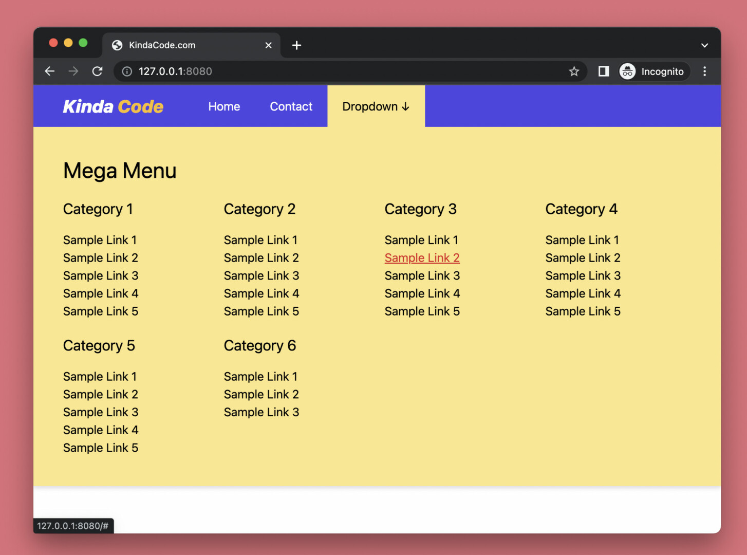
Example Preview
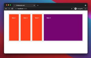
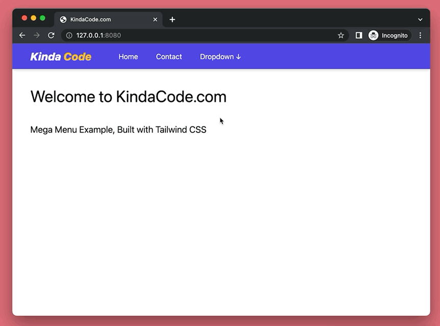
The demo webpage we’re going to build displays an indigo top navbar. This navbar consists of a logo, a couple of links, and a button named “Dropdown”. When you hover over this button, the mega menu will show up. It contains several categories. Each category contains several links.
Word might sound confusing. Here’s how it works in action:
The Code
Here’s the code that produces the webpage above (it seems a little bit long but a large part is just dummy links):
<body>
<div class="relative w-screen flex justify-start items-center bg-indigo-600 text-white drop-shadow-md">
<!-- Logo -->
<div class="px-3 md:px-10 text-2xl text-white font-extrabold italic">
Kinda <span class="text-amber-400">Code</span>
</div>
<a href="#" class="px-5 py-4 hover:bg-amber-200 hover:text-black">Home</a>
<a href="#" class="px-5 py-4 hover:bg-amber-200 hover:text-black">Contact</a>
<!-- Mega menu here -->
<div class="group">
<button class="px-5 py-4 group-hover:bg-amber-200 group-hover:text-black">Dropdown
↓
</button>
<div
class="hidden group-hover:flex flex-col absolute left-0 p-10 w-full bg-amber-200 text-black duration-300">
<div class="pb-5">
<h2 class="text-3xl">Mega Menu</h2>
</div>
<div class="grid grid-cols-2 md:grid-cols-4 gap-5">
<div class="flex flex-col">
<h3 class="mb-4 text-xl">Category 1</h3>
<a href="#" class="hover:underline hover:text-red-600">Sample Link 1</a>
<a href="#" class="hover:underline hover:text-red-600">Sample Link 2</a>
<a href="#" class="hover:underline hover:text-red-600">Sample Link 3</a>
<a href="#" class="hover:underline hover:text-red-600">Sample Link 4</a>
<a href="#" class="hover:underline hover:text-red-600">Sample Link 5</a>
</div>
<div class="flex flex-col">
<h3 class="mb-4 text-xl">Category 2</h3>
<a href="#" class="hover:underline hover:text-red-600">Sample Link 1</a>
<a href="#" class="hover:underline hover:text-red-600">Sample Link 2</a>
<a href="#" class="hover:underline hover:text-red-600">Sample Link 3</a>
<a href="#" class="hover:underline hover:text-red-600">Sample Link 4</a>
<a href="#" class="hover:underline hover:text-red-600">Sample Link 5</a>
</div>
<div class="flex flex-col">
<h3 class="mb-4 text-xl">Category 3</h3>
<a href="#" class="hover:underline hover:text-red-600">Sample Link 1</a>
<a href="#" class="hover:underline hover:text-red-600">Sample Link 2</a>
<a href="#" class="hover:underline hover:text-red-600">Sample Link 3</a>
<a href="#" class="hover:underline hover:text-red-600">Sample Link 4</a>
<a href="#" class="hover:underline hover:text-red-600">Sample Link 5</a>
</div>
<div class="flex flex-col">
<h3 class="mb-4 text-xl">Category 4</h3>
<a href="#" class="hover:underline hover:text-red-600">Sample Link 1</a>
<a href="#" class="hover:underline hover:text-red-600">Sample Link 2</a>
<a href="#" class="hover:underline hover:text-red-600">Sample Link 3</a>
<a href="#" class="hover:underline hover:text-red-600">Sample Link 4</a>
<a href="#" class="hover:underline hover:text-red-600">Sample Link 5</a>
</div>
<div class="flex flex-col">
<h3 class="mb-4 text-xl">Category 5</h3>
<a href="#" class="hover:underline hover:text-red-600">Sample Link 1</a>
<a href="#" class="hover:underline hover:text-red-600">Sample Link 2</a>
<a href="#" class="hover:underline hover:text-red-600">Sample Link 3</a>
<a href="#" class="hover:underline hover:text-red-600">Sample Link 4</a>
<a href="#" class="hover:underline hover:text-red-600">Sample Link 5</a>
</div>
<div class="flex flex-col">
<h3 class="mb-4 text-xl">Category 6</h3>
<a href="#" class="hover:underline hover:text-red-600">Sample Link 1</a>
<a href="#" class="hover:underline hover:text-red-600">Sample Link 2</a>
<a href="#" class="hover:underline hover:text-red-600">Sample Link 3</a>
</div>
</div>
</div>
</div> <!-- end of dropdown -->
</div>
<!-- Other content -->
<div class="container p-10">
<h1 class="text-4xl">Welcome to KindaCode.com</h1>
<h3 class="mt-10 text-xl">Mega Menu Example, Built with Tailwind CSS</h3>
</div>
</body>Explanations
In the beginning, the mega menu is hidden (with the hidden utility).
We add the group utility class to the div parent of the mega menu. When this parent element or any of its children hovers, the mega menu will come to light. The point here is we use the group-hover modifier with the flex utility:
<div class="hidden group-hover:flex ...">We use the grid utility to set up a responsive layout for the mega menu (you can do it another way if you want).
Conclusion
Congratulation! We made it, a standard mega menu. Even though the result isn’t too glamorous, it looks nice and works well enough for production. Feel free to modify the code, change some styles, add some elements, and remove some elements to make it fit your needs.
Building things with code is so interesting. Continue learning and exploring more stuff in the modern frontend development world by taking a look at the following articles:
- Tailwind CSS: How to Create Blurred Background Image
- Tailwind CSS: How to place text over an image
- Tailwind CSS: Create Image Hover Overlay Effects
- Tailwind CSS: How to Create a Back To Top Button
- Using Tailwind CSS with Font Awesome Icons: A Deep Dive
- Tailwind CSS: Custom Checkboxes and Radio Buttons
You can also check out our CSS category page for the latest tutorials and examples.