

When building web apps, there will come a time when you need to display some long text. A smart design in this case is to display only part of the text and add a Show More button for the user to expand the text if needed. When the text has been expanded and fully displayed, there is a Show Less button to collapse it.
The complete example below shows you how to do that.
Table of Contents
The Example
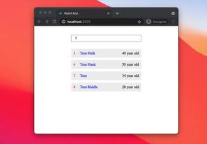
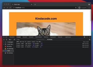
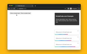
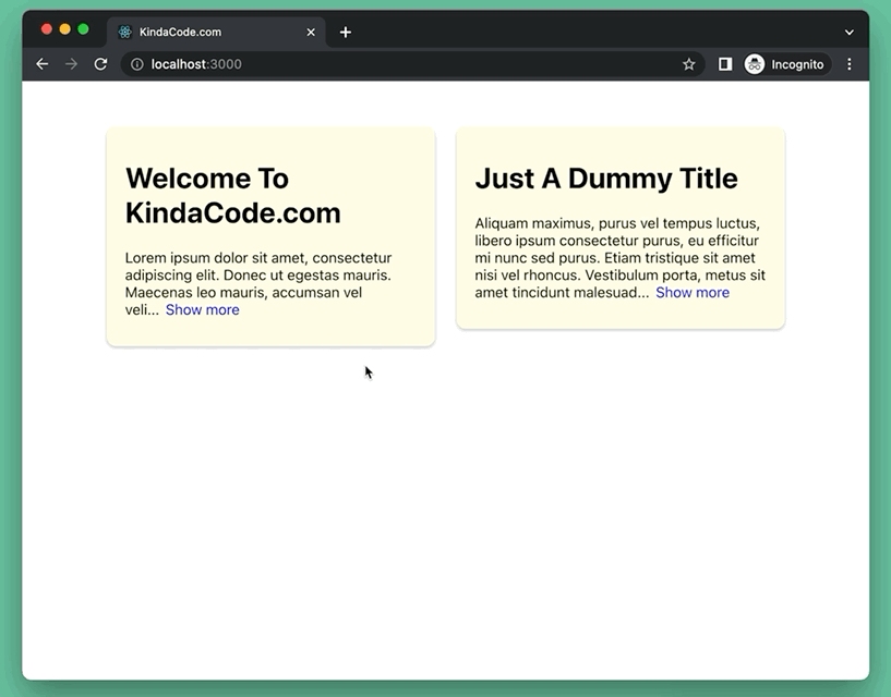
App Preview
The Code
1. Create a brand new React project:
npx create-react-app kindacode-exampleA bunch of files and folders will be generated automatically. Regardless, we’ll only care about 2 files: src/App.js and src/App.css.
2. In src/App.js, we create a reusable component named ExpandableText (you can place it in a separate file to keep things organized). This component can take 2 props: children (the text), and descriptionLength (the maximum number of characters to be displayed at the initial time).
Here’s the full source code for src/App.js with explanations:
// KindaCode.com
// src/App.js
import { useState } from 'react';
import './App.css';
// Createa reusable Read More/Less component
const ExpandableText = ({ children, descriptionLength }) => {
const fullText = children;
// Set the initial state of the text to be collapsed
const [isExpanded, setIsExpanded] = useState(false);
// This function is called when the read more/less button is clicked
const toggleText = () => {
setIsExpanded(!isExpanded);
};
return (
<p className='text'>
{isExpanded ? fullText : `${fullText.slice(0, descriptionLength)}...`}
<span onClick={toggleText} className='toggle-button'>
{isExpanded ? 'Show less' : 'Show more'}
</span>
</p>
);
};
// Main App
function App() {
return (
<>
<div className='container'>
<div className='card'>
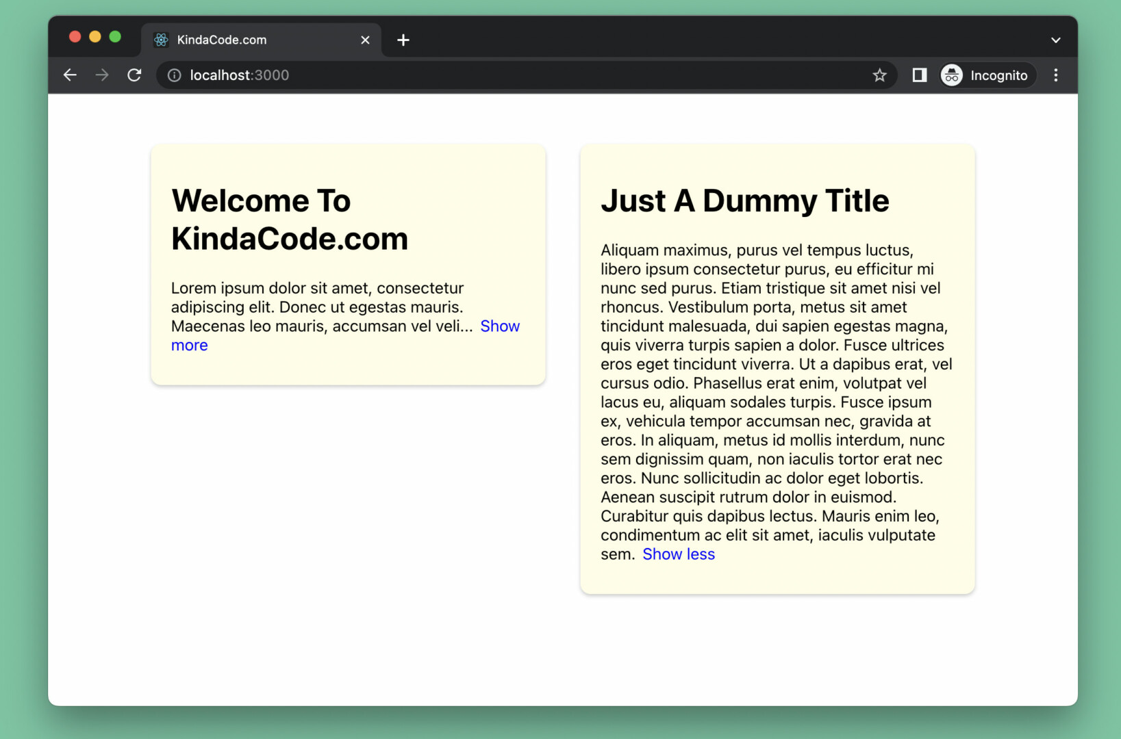
<h1 className='title'>Welcome To KindaCode.com</h1>
<p>
{/* Only show 120 characters in the beginning */}
<ExpandableText descriptionLength={120}>
Lorem ipsum dolor sit amet, consectetur adipiscing elit. Donec ut
egestas mauris. Maecenas leo mauris, accumsan vel velit ac,
blandit lobortis est. Vivamus in erat ac magna faucibus placerat
eget non ligula. Aliquam consequat rhoncus turpis a convallis.
Pellentesque ac sapien rhoncus, congue nibh eget, finibus turpis.
Aenean volutpat malesuada augue, at lacinia dolor volutpat congue.
Ut sit amet nunc ac arcu imperdiet iaculis. Mauris sit amet quam
ut nisi blandit blandit congue nec lorem. Mauris viverra, quam non
aliquet pellentesque, lorem risus fermentum mi, a mollis turpis
velit vitae nulla. Proin auctor, elit a rhoncus vulputate, est
magna facilisis ipsum, non mattis sem odio in neque. Cras at
ultricies eros. Ut risus turpis, consequat sed auctor nec, rutrum
id mauris.
</ExpandableText>
</p>
</div>
<div className='card'>
<h1 className='title'>Just A Dummy Title</h1>
<p>
{/* Show 200 characters in the beginning */}
<ExpandableText descriptionLength={200}>
Aliquam maximus, purus vel tempus luctus, libero ipsum consectetur
purus, eu efficitur mi nunc sed purus. Etiam tristique sit amet
nisi vel rhoncus. Vestibulum porta, metus sit amet tincidunt
malesuada, dui sapien egestas magna, quis viverra turpis sapien a
dolor. Fusce ultrices eros eget tincidunt viverra. Ut a dapibus
erat, vel cursus odio. Phasellus erat enim, volutpat vel lacus eu,
aliquam sodales turpis. Fusce ipsum ex, vehicula tempor accumsan
nec, gravida at eros. In aliquam, metus id mollis interdum, nunc
sem dignissim quam, non iaculis tortor erat nec eros. Nunc
sollicitudin ac dolor eget lobortis. Aenean suscipit rutrum dolor
in euismod. Curabitur quis dapibus lectus. Mauris enim leo,
condimentum ac elit sit amet, iaculis vulputate sem.
</ExpandableText>
</p>
</div>
</div>
</>
);
}
export default App;3. CSS is an important part of this demo. Remove all of the default code in your src/App.css and add the following:
/* src/App.css */
.container {
  width: 80%;
  margin: 50px auto;
  display: flex;
  justify-content: space-between;
  align-items: flex-start;
}

.card {
  width: 43%;
  padding: 15px 20px;
  background: #fffde7;
  box-shadow: 0 2px 4px 0 rgba(0, 0, 0, 0.2);
  border-radius: 10px;
}

.text {
  width: 100%;
}

/* Style the read more/less button */
.toggle-button {
  margin-left: 7px;
  color: blue;
  cursor: pointer;
}

.toggle-button:hover {
  color: red;
  text-decoration: underline;
}
4. Done. Now get your app up and running, then go to http://localhost:3000 to test it.
Conclusion
We’ve walked through an end-to-end example of creating read more/less buttons with the useState hook in React. You can extract the ExpandableText component and the CSS code related to it to use in other projects. Modify the code and make changes if necessary.
The React world is vast, and there is an endless list of things to learn. Pushing yourself forward and keep going by taking a look at the following articles:
- React: Create a Fullscreen Search Overlay from Scratch
- React: How to Detect a Click Outside/Inside a Component
- React + TypeScript: Image onLoad & onError Events
- React + TypeScript: Drag and Drop Example
- React: Show an element when hovering over another element
- React Router: How to Create a Custom Back Button
You can also check our React category page and React Native category page for the latest tutorials and examples.