

This article walks you through a few examples of creating a circle button in CSS. Our strategy is to make a square button then set the border radius to be equal to at least a half of the button’s width.
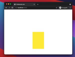
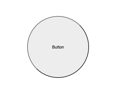
Example 1
Preview:
HTML & CSS:
<!DOCTYPE html>
<html lang="en">
<head>
<title>Circle Button</title>
<style>
* {
/* Reset browser's padding and margin */
margin: 0;
padding: 0;
box-sizing: border-box;
}
.container {
margin: 100px;
}
.my-button {
width: 200px;
height: 200px;
outline-style:initial;
border-radius: 100px;
cursor: pointer;
}
</style>
</head>
<body>
<div class="container">
<button class="my-button">Button</button>
</div>
</body>
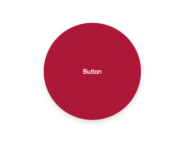
</html>Example 2
Preview:
HTML & CSS:
<!DOCTYPE html>
<html lang="en">
  <head>
    <title>Circle Button</title>
    <style>
      * {
        /* Reset browser's padding and margin */
        margin: 0;
        padding: 0;
        box-sizing: border-box;
      }
      .container {
        margin: 100px;
      }

      .my-button {
        width: 200px;
        height: 200px;
        border: none;
        border-radius: 100px;
        outline: none;
        background: #b71540;
        color: white;
        cursor: pointer;
        box-shadow: 0 5px 10px rgba(0, 0, 0, 0.15);
      }
      .my-button:hover {
        background: #eb2f06;
      }
    </style>
  </head>
  <body>
    <div class="container">
      <button class="my-button">Button</button>
    </div>
  </body>
</html>
That’s it. Further reading:
- CSS: Flipping Card on Hover
- CSS Flexbox: Make an Element Fill the Remaining Space
- CSS: Center Text inside a Div with Flexbox
- CSS: Styling Scrollbar Example
- CSS Gradient Text Color Examples
- CSS @keyframes Examples
You can also check out our CSS category page for the latest tutorials and examples.