
The example below shows you how to create a modal dialog from scratch in ReactJS without any third-party libraries.
Table of Contents
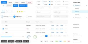
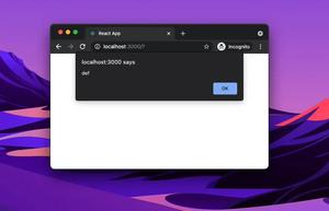
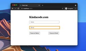
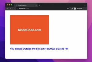
Preview
The sample app we’re going to build contains has a green button. When this button gets clicked, our modal dialog will show up. This modal has a title, some contents, and a close button. Here’s how it works:
The Code
Create a new React project, delete everything in App.js as well as App.css then add the following:
App.js
import React, { useState } from "react";
import "./App.css";
function App() {
const [isOpen, setIsOpen] = useState(false);
const openModal = () => {
setIsOpen(true);
}
const closeModal = () => {
setIsOpen(false);
}
return (
<div className="App">
{isOpen && (
<>
<div className="overlay"></div>
<div className="modal">
<header className="modal__header">
<h2>Modal Title</h2>
<button onClick={closeModal} className="close-button">×</button>
</header>
<main className="modal__main">
<p>Some content here!</p>
</main>
</div>
</>
)}
<h2>Just Some Dummy Text</h2>
<button className="button" onClick={openModal}>Open Modal</button>
</div>
);
}
export default App;
App.css
.App {
  width: 90%;
  padding: 50px;
}

.overlay {
  width: 100%;
  height: 100%;
  background: rgba(0, 0, 0, .7);
  position: fixed;
  top: 0;
  left: 0;
  z-index: 10;
}

.modal {
  position: fixed;
  z-index: 20;
  background: #fff;
  width: 500px;

  /* Center the modal */
  top: 50%;
  left: 50%;
  transform: translateX(-50%) translateY(-50%);
}

.modal__header {
  background: orangered;
  padding: 10px 20px;
  display: flex;
  justify-content: space-between;
}

.modal__main {
  padding: 20px;
}

.close-button {
  border: none;
  background: transparent;
  padding: 10px;
  cursor: pointer;
  color: #fff;
  font-size: 36px;
}

.close-button:hover {
  color: yellow;
}

.button {
  background: green;
  border: none;
  padding: 10px 20px;
  color: #fff;
  cursor: pointer;

}

.button:hover {
  background: orange;
}
Conclusion
We’ve examined a complete example of implementing a real-world-like modal from scratch. If you’d like to explore more new and interesting stuff about modern React, take a look at the following articles:
- React + TypeScript: Re-render a Component on Window Resize
- React Router Dom: Scroll To Top on Route Change
- React: Show Image Preview before Uploading
- 2 Ways to Render HTML Content in React and JSX
- React + TypeScript: Using setTimeout() with Hooks
- React + TypeScript: setInterval() example (with hooks)
You can also check our React category page and React Native category page for the latest tutorials and examples.