The example below shows you how to create a simple responsive layout with a CSS grid. We will use the repeat() function and the auto-fill keyword to get the job done. There’s no need to use media queries at all.
Table Of Contents
A Quick Note
- repeat(): This function allows you to repeat columns as many times as needed.
- auto-fill: Fills the row with as many columns as it can fit.
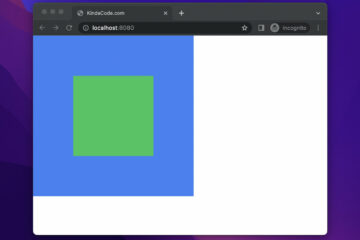
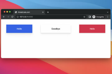
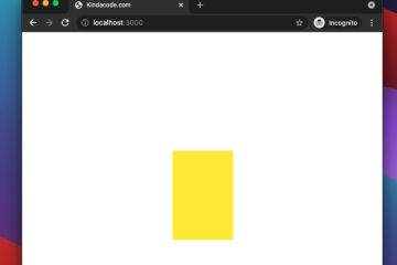
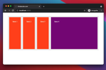
Example Preview
The Code
HTML code:
<!-- index.html -->
<html lang="en">
  <head>
    <link rel="stylesheet" href="style.css" />
    <title>Kindacode.com</title>
  </head>

  <body>
    <div class="container">
      <div class="item item--1">Item 1</div>
      <div class="item item--2">Item 2</div>
      <div class="item item--3">Item 3</div>
      <div class="item item--4">Item 4</div>
      <div class="item item--5">Item 5</div>
      <div class="item item--6">Item 6</div>
      <div class="item item--7">Item 7</div>
      <div class="item item--8">Item 8</div>
      <div class="item item--9">Item 9</div>
      <div class="item item--10">Item 10</div>
    </div>
  </body>
</html>
CSS code:
/* style.css */
.container {
  width: 90vw;
  margin: 30px auto;
  background: #eee;

  display: grid;
  grid-template-columns: repeat(auto-fill, minmax(200px, 1fr));
  grid-gap: 20px;
}

.item {
  padding: 30px;
  background: purple;
  color: white;
  font-size: 24px;
}
Don’t forget to place the 2 files in the same folder.
What’s Next?
If you’d like to learn more about modern CSS, take a look at the following posts:
- CSS Gradient Text Color Examples
- CSS: Styling Scrollbar Example
- CSS: Adjust the Gap between Text and Underline
- CSS @keyframes Examples
- CSS: Make a search field with a magnifying glass icon inside
You can also check out our CSS category page for the latest tutorials and examples.