


A few examples of creating gradient text in CSS.
Example 1: Linear-gradient text.
Screenshot:

The code:
<html lang="en">
<head>
<title>Kindacode.com</title>
<style>
.logo {
margin: 50px;
font-size: 50px;
background: linear-gradient(to right, #1565c0, #e3f2fd 60%);
-webkit-background-clip: text;
-webkit-text-fill-color: transparent;
}
</style>
</head>
<body>
<div>
<h1 class="logo">KINDACODE.COM</h1>
</div>
</body>
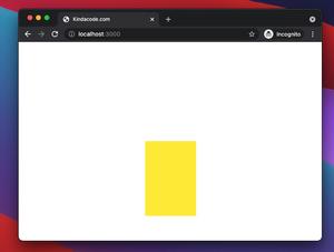
</html>Example 2: Radial-gradient Text
Screenshot:

The code:
<html lang="en">
  <head>
    <title>Kindacode.com</title>
    <style>
      body {
        background:purple;
      }

      .logo {
        margin: 20vh 20vw;
        font-size: 50px;
        background-image: radial-gradient(red, yellow, green);
        -webkit-background-clip: text;
        -webkit-text-fill-color: transparent;
      }
    </style>
  </head>

  <body>
    <div>
      <h1 class="logo">KINDACODE.COM</h1>
    </div>
  </body>
</html>
Example 3: Repeating-linear-gradient Text
Screenshot:

The code:
<html lang="en">
  <head>
    <title>Kindacode.com</title>
    <style>
      body {
        background: #333;
      }

      .logo {
        margin: 20vh 20vw;
        font-size: 50px;
        background-image: repeating-linear-gradient(
          to bottom right,
          red,
          yellow 10%,
          green 20%
        );
        -webkit-background-clip: text;
        -webkit-text-fill-color: transparent;
      }
    </style>
  </head>

  <body>
    <div>
      <h1 class="logo">KINDACODE.COM</h1>
    </div>
  </body>
</html>
Final Words
We’ve gone through some examples of gradient text color. If you’d like to learn more about CSS, take a look at the following:
- CSS: Styling Scrollbar Example
- CSS: Styling Input’s Placeholder Text Examples
- CSS: Adjust the Gap between Text and Underline
- CSS @keyframes Examples
- CSS: Make a search field with a magnifying glass icon inside
You can also check out our CSS category page for the latest tutorials and examples.