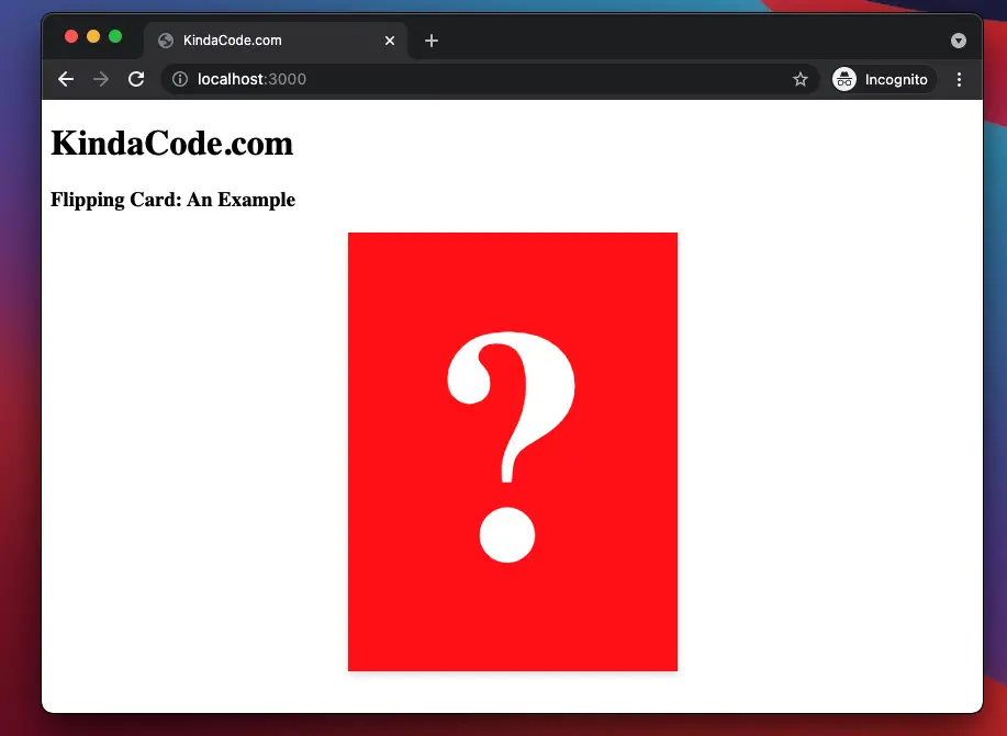
The example below shows you how to create flipping card animation with pure CSS.
Table Of Contents
Example Preview
HTML
<body>
    <h1>KindaCode.com</h1>
    <h3>Flipping Card: An Example</h3>

    <div class="card">
      <div class="card__content">
        <div class="card__front">
          <h1>?</h1>
        </div>
        <div class="card__back">
          <h1>This is a big secret</h1>
        </div>
      </div>
    </div>
  </body>
CSS
.card {
        margin: auto;
        width: 300px;
        height: 400px;
        perspective: 1000px;
        background-color: transparent;
      }

      .card__content {
        position: relative;
        width: 100%;
        height: 100%;
        text-align: center;
        transition: all 1s;
        transform-style: preserve-3d;
        box-shadow: 0 3px 6px 0 rgba(0, 0, 0, 0.15);
      }

      .card:hover .card__content {
        transform: rotateY(180deg);
      }

      .card__front,
      .card__back {
        position: absolute;
        width: 100%;
        height: 100%;
        -webkit-backface-visibility: hidden;
        backface-visibility: hidden;

        display: flex;
        justify-content: center;
        align-items: center;
        color: white;
      }

      .card__front {
        background-color: red;
        font-size: 150px;
      }

      .card__back {
        background-color: indigo;
        transform: rotateY(180deg);
        font-size: 50px;
      }
The Complete Code
<!DOCTYPE html>
<html>
  <head>
    <meta name="viewport" content="width=device-width, initial-scale=1" />
    <style>
      .card {
        margin: auto;
        width: 300px;
        height: 400px;
        perspective: 1000px;
        background-color: transparent;
      }

      .card__content {
        position: relative;
        width: 100%;
        height: 100%;
        text-align: center;
        transition: all 1s;
        transform-style: preserve-3d;
        box-shadow: 0 3px 6px 0 rgba(0, 0, 0, 0.15);
      }

      .card:hover .card__content {
        transform: rotateY(180deg);
      }

      .card__front,
      .card__back {
        position: absolute;
        width: 100%;
        height: 100%;
        -webkit-backface-visibility: hidden;
        backface-visibility: hidden;

        display: flex;
        justify-content: center;
        align-items: center;
        color: white;
      }

      .card__front {
        background-color: red;
        font-size: 150px;
      }

      .card__back {
        background-color: indigo;
        transform: rotateY(180deg);
        font-size: 50px;
      }
    </style>
    <title>KindaCode.com</title>
  </head>
  <body>
    <h1>KindaCode.com</h1>
    <h3>Flipping Card: An Example</h3>

    <div class="card">
      <div class="card__content">
        <div class="card__front">
          <h1>?</h1>
        </div>
        <div class="card__back">
          <h1>This is a big secret</h1>
        </div>
      </div>
    </div>
  </body>
</html>
Final Words
We’ve examined an end-to-end example of implementing a flipping card effect using pure CSS. If you’d like to explore more new and interesting things of modern frontend development then take a look at the following articles:
- CSS Flexbox: Make an Element Fill the Remaining Space
- Most Popular Open-Souce CSS Frameworks
- CSS: Center Text inside a Div with Flexbox
- CSS: Styling Scrollbar Example
- CSS: Styling Input’s Placeholder Text Examples
- CSS: Make a search field with a magnifying glass icon inside
You can also check out our CSS category page for the latest tutorials and examples.