


In React Native, Switch is a built-in controlled component that renders a boolean input. It lets a user turn on or off some functionalities or select between two options (you can see it in the Settings screen of many apps). This article covers the fundamentals of the Switch component and walks you through a complete example of implementing it in practice.
Overview
Import the component:
import { Switch } from "react-native";The table below lists the props of Switch:
| Prop | Type | Description |
|---|---|---|
| value | bool | The value of the switch. Default is false |
| onChange | function | The onChange event handler function, invoked when the switch changes |
| onValueChange | function | Invoked when the user tries to switch on or off. You will receive the new value. |
| thumbColor | color | The color of the thumb (the circle stuff) |
| trackColor | color | The color of the track |
| disable | bool | Enable or disable the switch |
| ios_backgroundColor (iOS-only) | color | Sets the custom color for the background on iOS |
Example
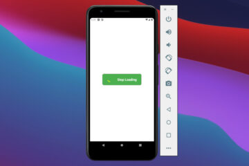
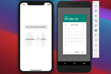
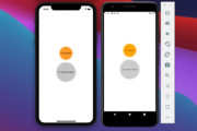
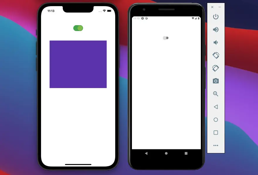
App Preview
The app we are going to make contains a switch. When this switch is ON, a purple box will show up. When the switch is OFF, the box will go away. Here’s how it works on iOS and Android:
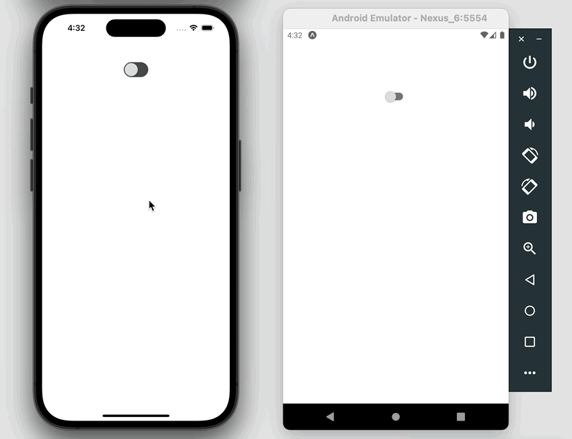
If you have a loser look, you will notice that the color of the thump area and the track area also change based on the state of the switch.
Final Code
The full source code in App.js with explanations:
// App.js
import React, { useState } from "react";
import { StyleSheet, View, Switch } from "react-native";

export default function App() {
  // Show or Hide the purple box
  const [isShown, setIsShown] = useState(false);

  // This function will be triggered when the Switch changes
  const toggleTheBox = () => {
    setIsShown((previousState) => !previousState);
  };

  return (
    <View style={styles.container}>
      <Switch
        trackColor={{ false: "#767577", true: "#4caf50" }}
        thumbColor={isShown ? "#8bc34a" : "#ddd"}
        ios_backgroundColor="#3e3e3e"
        onValueChange={toggleTheBox}
        value={isShown}
      />

      {isShown === true ? <View style={styles.box}></View> : null}
    </View>
  );
}

// Kindacode.com
// Just some styles
const styles = StyleSheet.create({
  container: {
    paddingTop: 100,
    flex: 1,
    flexDirection: "column",
    alignItems: "center",
    justifyContent: "flex-start",
    backgroundColor: "#fff",
  },
  box: {
    marginTop: 50,
    width: 300,
    height: 250,
    backgroundColor: "#673ab7",
  },
});
Conclusions
You’ve learned the fundamentals of the Switch component in React Native and examined a complete example of implementing it in practice. If you’d like to explore more new and interesting things about modern React Native, then take a look at the following articles:
- How to Get the Window Width & Height in React Native
- React Native: Make a Button with a Loading Indicator inside
- How to implement tables in React Native
- How to render HTML content in React Native
- React Native FlatList: Tutorial and Examples
- Working with CheckBox in React Native
You can also check our React topic page and React Native topic page for the latest tutorials and examples.