
This article shows you a couple of different ways to implement checkboxes in React Native applications. For Expo-based projects, you should use the expo-checkbox package. For React Native CLI projects, you can use the @react-native-community/checkbox library (there might be errors if you use this one with one of the most recent versions of Expo SDK).
Note: The CheckBox component used to be a part of React Native core but now it has become a separate module named @react-native-community/checkbox. This module is written mainly in Javascript, C ++, Java, and Objective-C.
Using expo-checkbox
Installing
expo install expo-checkboxExample
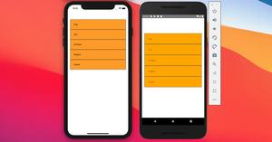
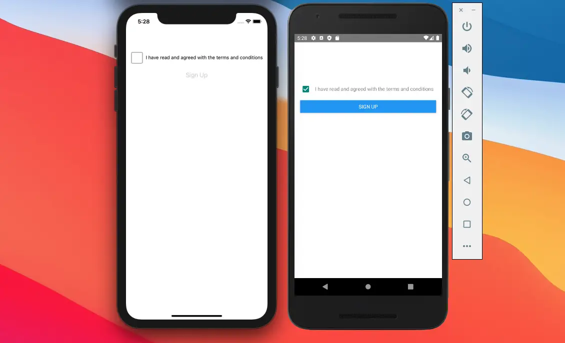
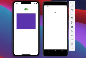
A common real-world scenario is that an app requires people to agree to terms of use by checking a checkbox before they can perform certain actions such as registration, submitting a form, etc.
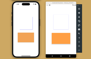
Let’s talk about our example app. It simply contains a checkbox and a button. The button is disabled by default and only becomes touchable when the user checks the checkbox.
Preview:
The complete code:
import React, { useState } from "react";
import { View, StyleSheet, Text, Button, Platform } from "react-native";
import CheckBox from "expo-checkbox";

export default function App() {
  const [agree, setAgree] = useState(false);
  return (
    <View style={styles.container}>
      <View style={styles.wrapper}>
        <CheckBox
          value={agree}
          onValueChange={() => setAgree(!agree)}
          color={agree ? "#4630EB" : undefined}
        />
        <Text style={styles.text}>
          I have read and agreed with the terms and conditions
        </Text>
      </View>
      <Button
        title="Sign Up"
        disabled={!agree}
        onPress={() => {
          /* Do something */
        }}
      />
    </View>
  );
}

const styles = StyleSheet.create({
  container: {
    width: "100%",
    padding: 16,
    paddingTop: 100,
  },
  wrapper: {
    display: "flex",
    flexDirection: "row",
    alignContent: "center",
    paddingVertical: 15,
  },
  text: {
    lineHeight: 30,
    marginLeft: 10,
  },
});
Using @react-native-community/checkbox
Installation
You can add @react-native-community/checkbox to your project by running the following command:
npm install @react-native-community/checkboxOne extra step for iOS:
npx pod-installNow you can import the CheckBox component into your code:
import CheckBox from '@react-native-community/checkbox';Example
This example remakes the I have read and agreed to terms example above. There isn’t much difference.
Preview (iOS + Android)
By default, CheckBox has a circle shape on iOS. In this example, we’ll make it square.
The full code:
import React, { useState } from 'react';
import { View, StyleSheet, Text, Button, Platform } from 'react-native';
import CheckBox from '@react-native-community/checkbox';

export default function App() {
  const [agree, setAgree] = useState(false);
  return (
    <View style={styles.container}>
      <View style={styles.wrapper}>
        {Platform.OS === 'ios' ? (
          <CheckBox
            boxType="square"
            value={agree}
            onChange={() => setAgree(!agree)}
          />
        ) : (
          <CheckBox value={agree} onChange={() => setAgree(!agree)} />
        )}
        <Text style={styles.text}>
          I have read and agreed with the terms and conditions
        </Text>
      </View>
      <Button
        title="Sign Up"
        disabled={!agree}
        onPress={() => {
          /* Do something */
        }}
      />
    </View>
  );
}

const styles = StyleSheet.create({
  container: {
    width: '100%',
    padding: 16,
    paddingTop: 100,
  },
  wrapper: {
    display: 'flex',
    flexDirection: 'row',
    alignContent: 'center',
    paddingVertical: 15,
  },
  text: {
    lineHeight: 30,
    marginLeft: 10,
  },
});
API
The table below listed the most common props which work on both iOS and Android:
| Name | Type | Description |
|---|---|---|
| onChange | function | Invoked on change with the native event |
| onValueChange | function | Invoked with the new boolean value when it changes |
| value | boolean | The default value is false |
| disabled | boolean | The default value is false |
Android props:
| Name | Type | Description |
|---|---|---|
| tintColors | string | An object with the following shape: { true?: ?ColorValue, false?: ?ColorValue } |
iOS common props:
| Name | Type | Description | |
|---|---|---|---|
| lineWidth | number | Default to 2. Defines the width of the checkmark and box | |
| hideBox | boolean | Control if the box should be hidden or not | |
| boxType | enum ‘circle’ or ‘square’ | Controls the shape of the box | |
| tintColor | string | The color of the box when the checkbox is Off | |
| onCheckColor | string | The color of the checkmark when it is On. | |
| onFillColor | string | The color of the box when it is On | |
| onTintColor | string | The color of the line around the box when it is On |
Conclusion
Congratulation. At this point, you should have some confidence in working with CheckBox. If you would like to learn more about React Native, take a look at the following articles: How to set a gradient background in React Native – How to implement tables in React Native – Top free React Native UI libraries for this year. You can also check our React topic page and React Native topic page for the latest tutorials and examples.

![[Solved] React Native Error: No bundle URL present](https://www.kindacode.com/media/thumbnails/2024-11/Screen-Shot-2020-04-28-at-17.44.18-1.png)