
In the old days, React Native core supports a built-in Picker component, but it is now deprecated, and you should no longer import it into your code. The replacement we use nowadays is the @react-native-picker/picker package.
Table of Contents
Installation
If you are using Expo then just execute the command below to install the package:
npx expo install @react-native-picker/pickerIf you confront the incompatible error (this is just a temporary error and will be fixed by the author of the package in a near future) when running the preceding command, try this:
npm i @react-native-picker/picker --legacy-peer-depsFor non-expo projects:
npm i @react-native-picker/pickerIf some errors appear, try this:
npm i @react-native-picker/picker --legacy-peer-depsIf you are developing an app for iOS, you need to perform an extra command:
npx pod-installExample
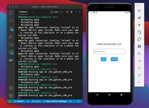
Preview
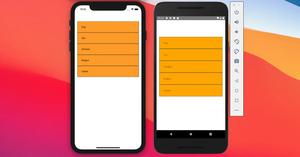
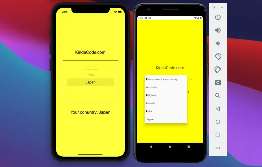
The demo app we are going to build has a picker that lets the user select their country. When a country is selected, its name will be displayed in the Text component right below the picker.
Here’s how it works on iOS and Android:
Note: If you’re using Safari, this demo video might not work nicely or not start at all. Please use Chrome, Edge, Firefox, or another web browser instead.
The Code
This is the complete code for the example:
// App.js
import React, { useState } from "react";
import { View, Text, StyleSheet } from "react-native";

import { Picker } from "@react-native-picker/picker";

function App() {
  const [country, setCountry] = useState('Unknown');

  return (
    <View style={styles.screen}>
      <Text style={styles.text}>KindaCode.com</Text>
      <Picker
        selectedValue={country}
        onValueChange={(value, index) => setCountry(value)}
        mode="dropdown" // Android only
        style={styles.picker}
      >
        <Picker.Item label="Please select your country" value="Unknown" />
        <Picker.Item label="Australia" value="Australia" />
        <Picker.Item label="Belgium" value="Belgium" />
        <Picker.Item label="Canada" value="Canada" />
        <Picker.Item label="India" value="India" />
        <Picker.Item label="Japan" value="Japan" />
      </Picker>
      <Text style={styles.text}>Your conuntry: {country}</Text>
    </View>
  );
}

export default App;

// Just some styles
const styles = StyleSheet.create({
  screen: {
    flex: 1,
    justifyContent: "center",
    alignItems: "center",
    backgroundColor: 'yellow'
  },
  text: {
    fontSize: 24,
  },
  picker: {
    marginVertical: 30,
    width: 300,
    padding: 10,
    borderWidth: 1,
    borderColor: "#666",
  },
});

// For more React Native tutorials
// Visit https://www.kindacode.com/cat/mobile/react-native/
Common Props
The table below lists the most used props of the Picker component:
| Name | Platform | Description |
|---|---|---|
| onValueChange | Android, iOS | The callback function that fired when an item is selected |
| selectedValue | Android, iOS | Value matching value of one of the items (string, integer) |
| style | Android, iOS | Used for styling the picker |
| testID | Android, iOS | Used for testing |
| enabled | Android | Whether the picker is enabled or disabled |
| mode | Android | “dialog” or “dropdown” |
You can see the full list of available props at the GitHub repo of the package.
Conclusion
We’ve covered the basics of implementing a picker, a common element that might appear a lot of times in many mobile apps. If you’d like to learn more about modern React Native, take a look at the following articles:
- Using Switch component in React Native (with Hooks)
- How to Get the Window Width & Height in React Native
- How to Create a Confirm Dialog in React Native
- Using Image Picker and Camera in React Native (Expo)
- Top 4 open-source React Native UI libraries
- How to create round buttons in React Native
You can also check our React topic page and React Native topic page for the latest tutorials and examples.
![[Solved] React Native Error: No bundle URL present](https://www.kindacode.com/media/thumbnails/2024-11/Screen-Shot-2020-04-28-at-17.44.18-1.png)