


This concise and straightforward article shows you how to check/uncheck a checkbox to show/hide another element. We’ll only use Tailwind CSS to get things done. No Javascript is required.
What is the point?
Tailwind CSS offers a utility class and a modifier called peer and peer-* that can be used to style an element based on its sibling. In our case, we add the peer class to the checkbox and add peer-checked:visible to the element we want to show conditionally (this element is invisible when the checkbox is unchecked).
For more clarity, see the practical example below.
Example
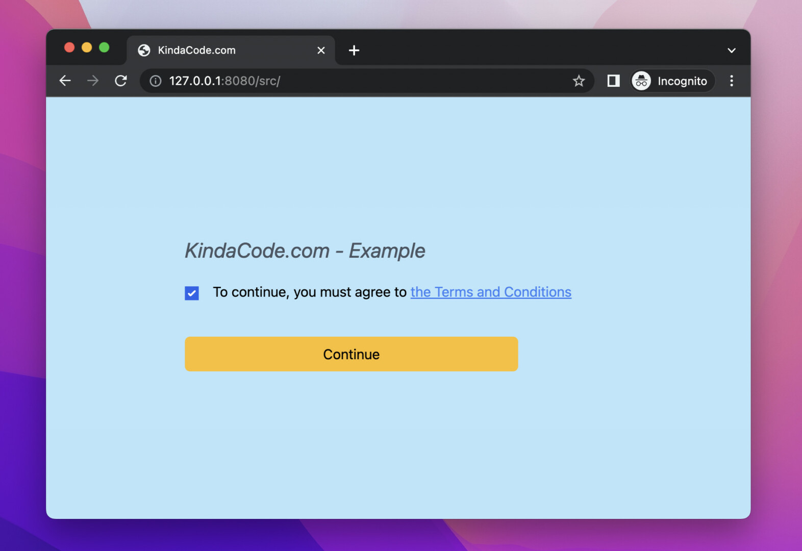
This example mimics a real-world scenario where a user must agree to the terms of service of a website to continue doing something on that website.
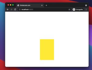
Preview:
The code:
<body class="p-40 bg-sky-200">
    <form class="space-y-5">
        <h1 class="text-2xl text-gray-600 italic">KindaCode.com - Example</h1>
        <div>
            <input type="checkbox" name="agree" id="agree" class="peer" />
            <label for="agree" class="ml-3">To continue, you must agree to
                <a href="#" class="text-blue-500 underline">the Terms and
                    Conditions</a>
            </label>

            <div class="mt-10 invisible peer-checked:visible">
                <button type="submit" class="w-96 px-5 py-2 bg-amber-400 hover:bg-amber-600 rounded-md">Continue</button>
            </div>
        </div>
    </form>
</body>
That’s it. Further reading:
- Tailwind CSS: Create a horizontal line with text in the middle
- CSS: How to Center an Element with Fixed Position
- Tailwind CSS: Light/Dark theme based on system settings
- Tailwind CSS: Width and Height with Arbitrary Values
- Min-Width, Max-Width, Min-Height, and Max-Height in Tailwind CSS
- Tailwind CSS: How to create accordions (collapsible content)
You can also check out our CSS category page for the latest tutorials and examples.